Manage record types
A record type combines fields to form a technically related unit. This unit can be edited by a user with the help of an input mask, e.g. to create a new record or to evaluate data. The following is configured in a record type:
- list view for listing
- standard search definition to search
- visualization to display the contents of this record type in another record. The other record refers to the record type.
- object view for extended display
- analysis, supplement, correction for checking all record types
The following actions are possible for record types:
In addition, there are configurations for:
- comprehensive configuration options for multiple field types
- configuration of the field type character (C) incl. dynamic configuration
- configuration of field types internal link (I) and (@I)
- configuration of the field type multiline (M)
- configuration of the field type file (B)
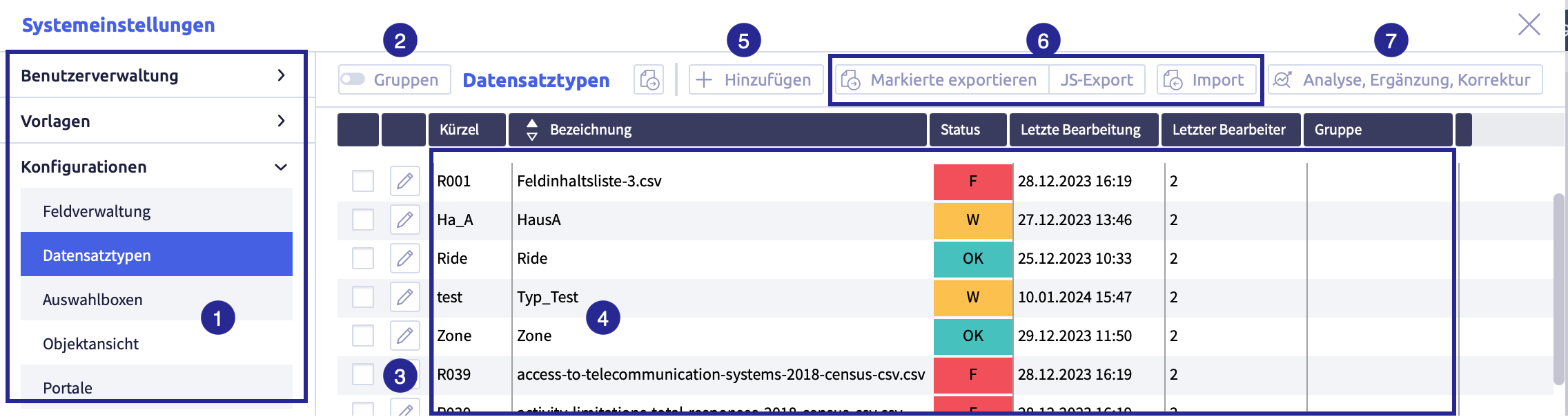
The image shows the record types: (1) navigation, (2) button Groups, (3) button Edit
, (4) list with all record types, (5) button Add
, (6) buttons with export and import options, (7) button Analyze, supplement, correction
Both buttons Edit and Add open the record type editor, which is used to edit the record type.
If the function *Groups is active, the record types can be organized into groups for simplified management.
Warning
- Changes in system settings often only take effect when a restart is carried out after closing the system settings (menu item under the button with the user name at the top right, see also introduction).
- If another user with admin rights is currently editing this system setting, the red icon lock
 appears in the header and a warning message appears with the name of the currently active user.
Status
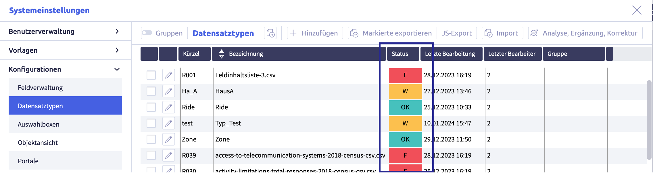
The image shows the different states of record types.
A record type can have different states:
| Status | Description | Note |
|---|---|---|
| OK | error-free record type | - |
| W | record type contains warnings | the elements for which warnings exist are highlighted with a yellow warning triangle in the record type editor |
| F | record type contains errors | the invalid elements are marked with a red warning triangle in the record type editor |
Details on the status of a record type can be viewed with the record type editor. A mouseover over a warning triangle describes the cause of the error.
System relevant record types
System-relevant record types are created by the system and are part of the Uniplex. They can neither be edited nor deleted, just like system fields. The abbreviation (synonym) begins with #.
Record type editor: core data
The core data defines the basic information of a record type.
The record type editor opens when you edit and add record types with the core data:
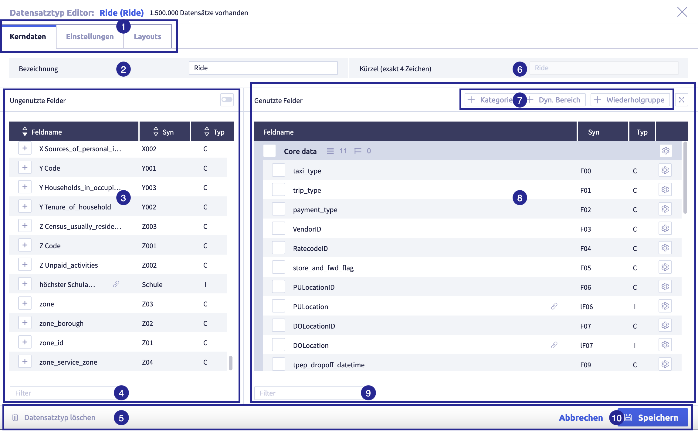
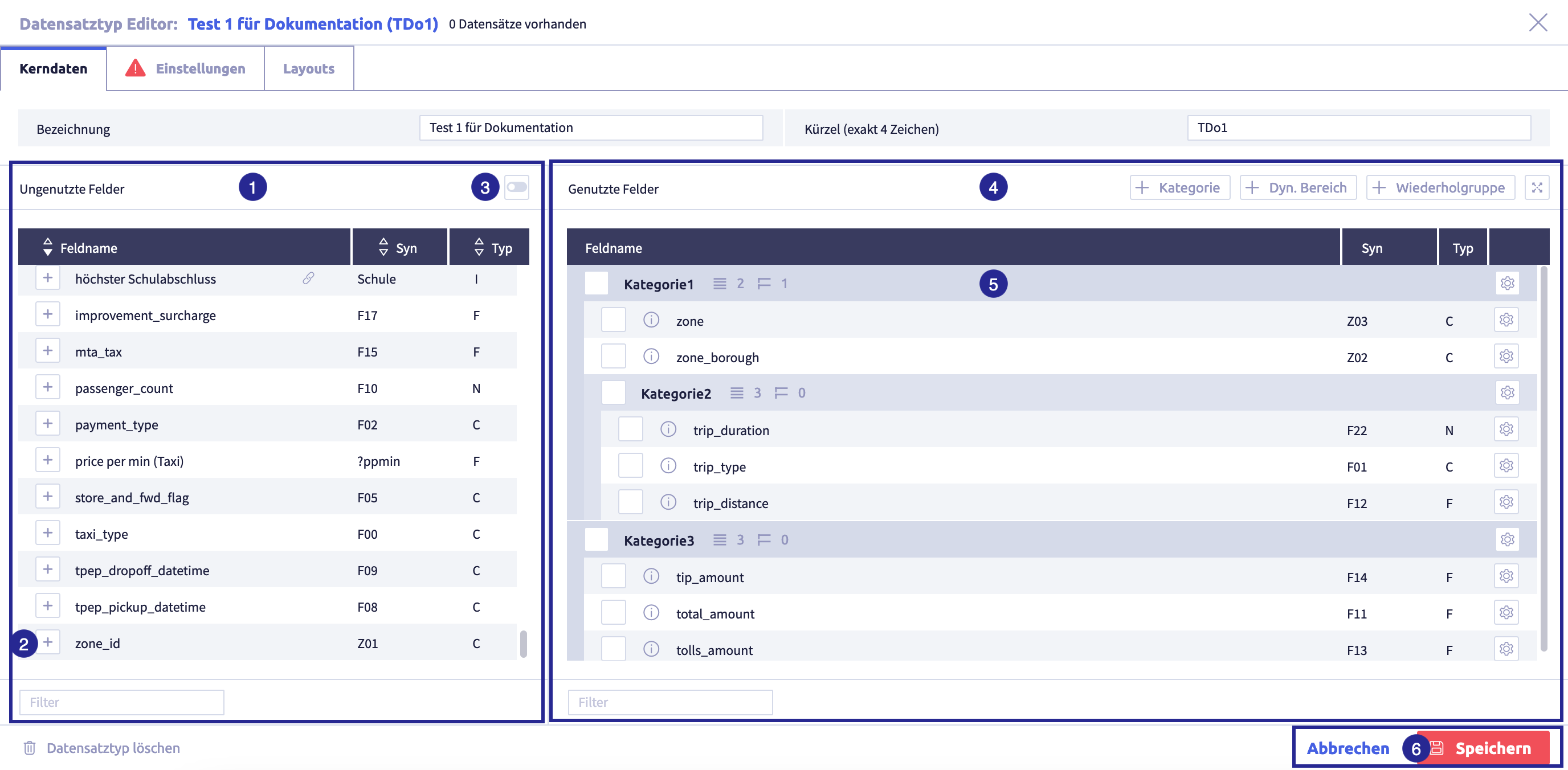
The image shows the record type editor with open core data: (1) tabs for configuration: core data (basic information) / settings (supplementary to the core data) / layouts (customized version of the standard layout), (2) Name field (name) of the record type, (3) fields that have not yet been used in this record type, (4) field Filter for unused fields, (5) footer with button Delete record type
, (6) field Abbreviation (synonym) of the record type, (7) buttons to structure fields with groups in the standard layout, (8) standard layout with all fields used in this record type sorted and grouped, (9) field Filter for used fields, (10) footer with buttons for Cancel and Save
to close the editor
The following table explains all elements under Core data in the record type editor
| Name | Meaning | Editable | Note |
|---|---|---|---|
| configuration, divided into three tabs | tab Core data for basic information (currently open) tab Settings (in addition to the core data) tab Layouts (customized version of the standard layout) |
always | |
| field Designation (name) | (meaningful) name to identify the record type | always | freely selectable text, can consist of several words |
| unused fields | list of all available fields that can be added to the record type | ||
| field Filter | search for fields that have the entered text in the field name | ||
| button Delete record type | not recommended if record type contains records | ||
| field abbreviation (synonym) | exactly 4 characters for the unique identification of the record type | only if the record type does not contain a record | allowed characters: A-Z, a-z, 0-9 and _ (underline) forbidden characters: * (asterisk), . (period), , (comma) and ; (semicolon) |
| buttons for grouping the fields | standard layout can be structured by groups possible groups: category, dyn. area, repetition field group |
always | add groups in the standard layout |
| standard layout | Determines the basic structure of the record type and defines how a record of this type is displayed to a user. The standard layout shows all fields and groups of the record type. | always | The order of fields and groups Categories, Dyn. areas and Repetition fields can be customized. |
| field Filter | search for fields that have the entered text in the field name | ||
| buttons Save / Cancel | all changes are accepted or discarded |
Record type editor: settings
The configuration that goes beyond the basic information is recorded in the settings.
The record type editor opens when you edit and add record types with the core data. The neighboring tab shows the other settings:
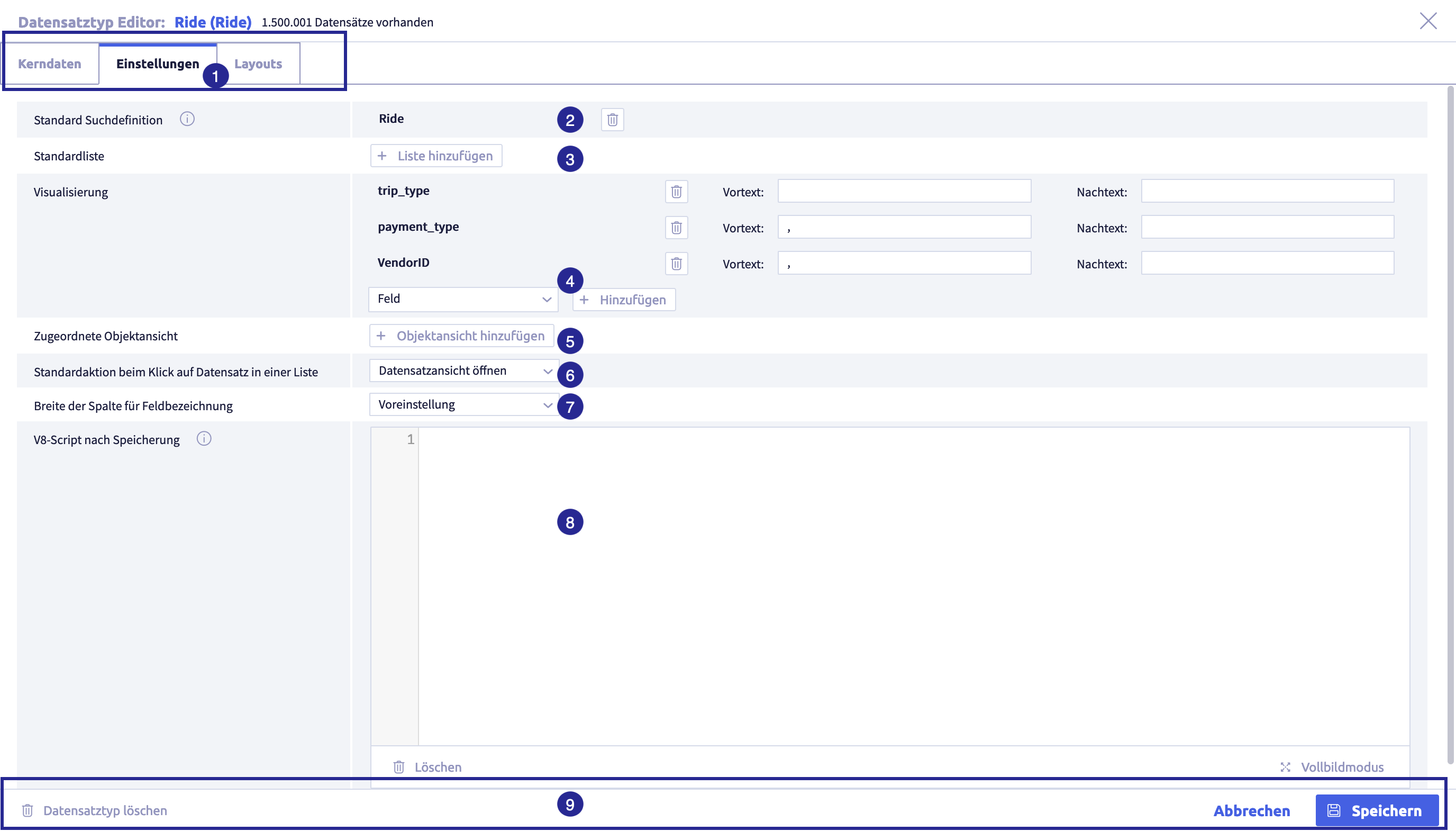
The image shows the record type editor with open settings: (1) tabs for configuration: core data (basic information) / settings (supplementing the core data) / layouts (customized version of the standard layout), (2) assigned search definition, (3) optional: button Add standard list, (4) visualization: which fields of this record type are displayed in another record type? (5) optional: button Add object view, (6) selection for Standard action when clicking on record in a list, (7) selection Column width for field name, (8) optional field V8 script after saving, (9) footer with buttons Delete record type
The following table explains all elements under Settings in the record type editor
| Name | Meaning | Required? | Editable | Note |
|---|---|---|---|---|
| configuration, divided into three tabs | tab Core data for basic information tab Settings for additional information (just opened) tab Layouts (customized version of the standard layout) |
|||
| button Standard search definition | selection of a search definition. This definition is used as the standard for internal references to this record type. | required field | always | |
| button Standard list | selection of a list definition. This definition is used as the default for the list view of the record type. | always | ||
| selection and button Visualization of the record type | determines which fixed text or which fields are used to display the record if another record type refers to this record type (via internal reference) | required field, at least one field/text must be selected | always | |
| button Assigned object view | optional: determines which object view(s) should be available for this record type | always | ||
| selection Standard action when clicking on a record in a list | defines which action is executed by default when a record of this type is clicked in a list. | required field with default setting to Open record view | always | |
| selection Width of the column for field name | globally defines for the record type how wide the field labels of the input fields are displayed in the input mask. | required field with default setting to default | always | default setting is medium |
| field V8-Script after saving | optional: entry of a V8 script that is only executed after a record has been saved. | always | ||
| footer with buttons for Delete record type / Save / Cancel | delete record type / all changes are accepted or discarded | delete is not recommended if record type contains records |
Record type editor: layouts
You can define the standard layout in the tab Core data of the record type editor. In the tab Layouts, so-called customized layouts can also be defined for a record type. For each of these layouts, you can restrict which fields and groups should be visible. A record type can have several customized layouts.
Thanks to customized layouts, particularly extensive record type definitions (e.g. with more than 50 fields) can be reduced in size for better clarity when displayed.
The record type editor opens when you edit and add record types with the core data: the optional layouts can be accessed via the tab on the right:
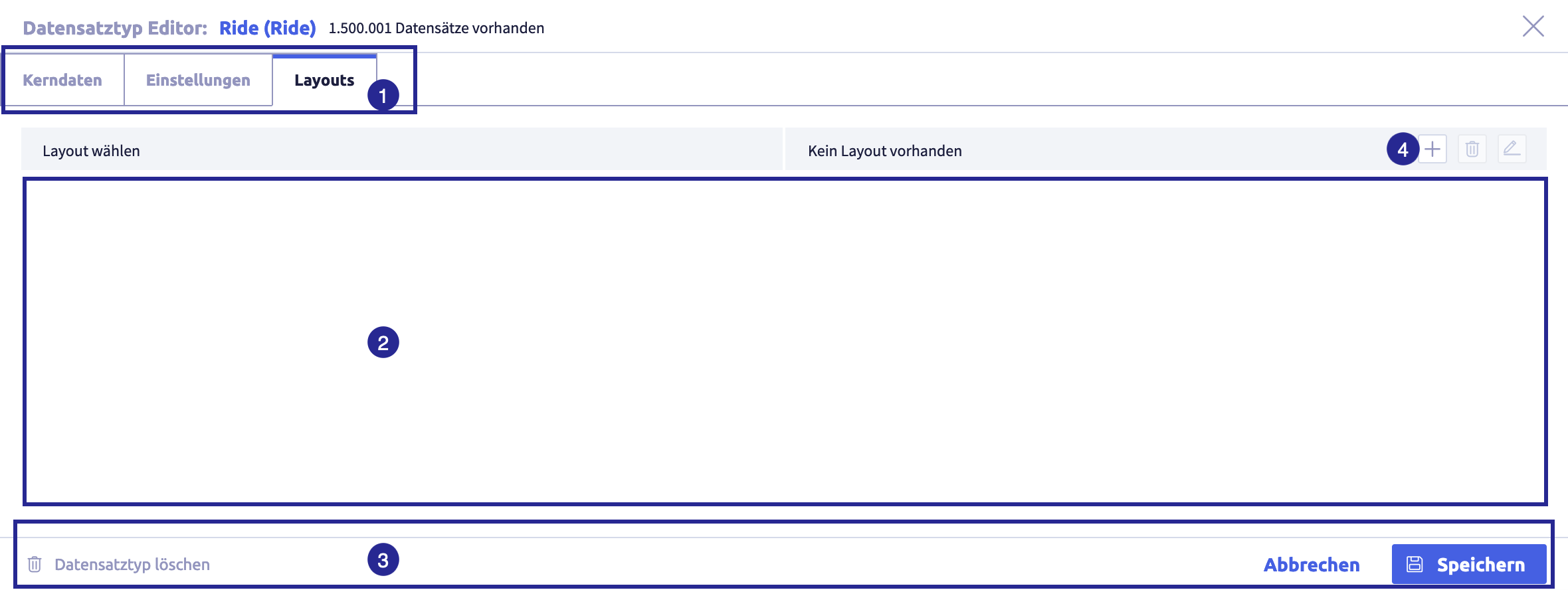
The image shows the record type editor with open settings: (1) tabs for configuration: core data (basic information) / settings (supplementary to the core data) / layouts (customized version of the standard layout), (2) area for layout, (3) footer with buttons Delete record type
The following table explains all elements under Layouts in the record type editor
| Name | Meaning | Note |
|---|---|---|
| configuration, divided into three tabs | tab Core data for basic information tab Settings (in addition to the core data) tab Layouts (just opened) |
|
| if a layout has been selected, it will be displayed here | ||
| button Delete record type / Save / Cancel | delete record type / all changes are applied or discarded | delete is not recommended if record type contains records |
| button Add layout |
Add a record type (core data)
The creation of the core data of a record type can be divided into the following areas:
- add a name
- add fields unsorted
- adjust the order of the fields in use
- add groups for fields in use
- add fields to groups
- field configuration
- delete field/group
Add a name
-
click the button Add
The core data of the record type editor will open
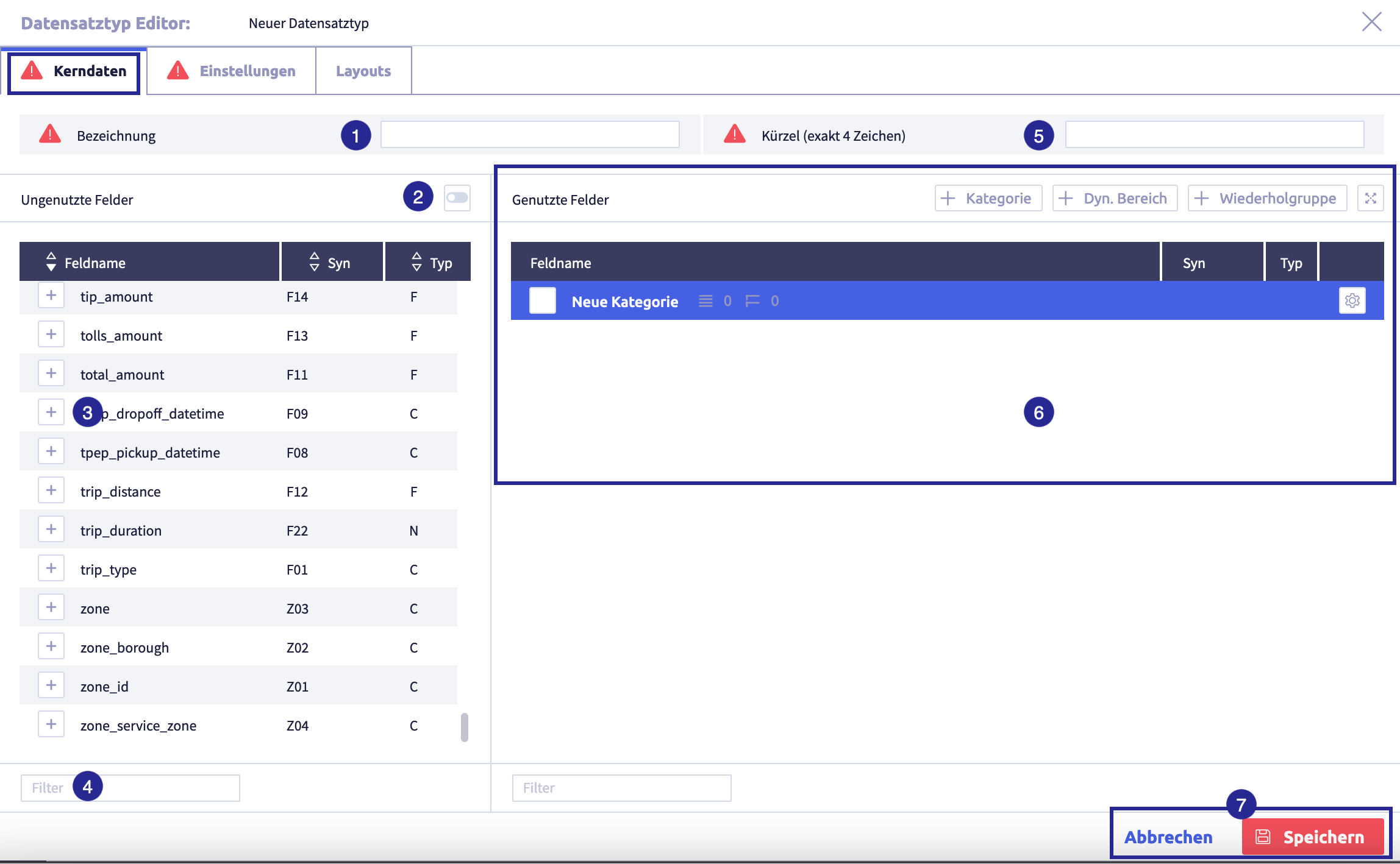
The image shows the record type editor with open core data: (1) Field name (name) of the record type, (2) button to display fields that have not yet been used in any record type, (3) button Add
to add fields to the record type, (4) field Filter for unused fields, (5) field (synonym) Abbreviation, (6) area for fields in use in the record type (default layout), (7) buttons for Cancel and Save to close the editor -
enter a meaningful name in field Name to identify the record type
-
enter the abbreviation (synonym) in field Abbreviation
The abbreviation (synonym) identifies a record type.
- abbreviation must be unique
- field length: exactly 4 characters
- first character must not be a digit
- permitted characters: A-Z, a-z, 0-9 and _ (underscore)
- prohibited characters: * (asterisk), . (period), , (comma) and ;(semicolon)
If the new record type is saved without an abbreviation (synonym), an automatic abbreviation (synonym) will be assigned which can be edited as long as the record type does not contain any records.
Important
The abbreviation (synonym) can not be edited once the record type contains at least one record.
-
optional: click the button Save
(or Cancel) to save the record typeThe record type editor will close and the list with all record types will be displayed again.
-
continue with add fields unsorted resp. add fields to groups
Add fields unsorted
-
if required, click the button Edit
The core data of the record type editor will open
The image shows the record type editor with open core data: (1) Field name (name) of the record type, (2) button to display fields that have not yet been used in any record type, (3) button Add
to add fields to the record type, (4) field Filter for unused fields, (5) field (synonym) Abbreviation, (6) area for fields in use in the record type (default layout), (7) buttons for Cancel and Save to close the editor -
click the button Add field
of an unused field to use this field in the record typeTips
- You can search for fields in field Filter.
- You can use the toggle Unused fields to restrict the list of displayed fields to those fields that are not yet used in any record type.
Important
System fields cannot be integrated into a layout and are therefore not available in the list of unused fields.
The field will be moved to the area Used fields.
-
add all the fields you need to the record type
Tips
- if necessary, add a new field in the field administration.
-
if you have added a field by mistake, click the button Settings
 of this field and then the button .
The field will be moved back to the unused fields.
Important
For data to be added to a record type later, it must contain at least one field.
-
click the button Settings
of an added field to adjust the respective field configuration if requiredThis extends and supplements the system-wide configuration of field properties in field management.
The field configuration defines the display and function of the field in the record view and the input mask.
-
optional: click the button Save
(or Cancel) to save the record typeThe record type editor will close and the list with all record types will be displayed again.
-
continue with adjusting the order of the fields in use
Adjust the order of fields in use
For a better overview, it is possible to drag & drop individual fields or individual groups and several fields and groups simultaneously into the desired group at the desired position in order to visually summarize related information.
When moving layout rows, the Uniplex ensures compliance with the following rules
- Fields, dynamic areas and repetition field groups must always belong to a category.
- Groups cannot be inserted into themselves.
- Repetition field groups can only contain repetition fields and no groups.
- Repetition fields can only exist within repetition field groups.
- Repetition fields that are stored on non-repetition field groups automatically receive a repetition field group as a parent group.
- Repetition fields and non-repetition fields (and groups) cannot be moved together.
-
How-to video on drag & drop of rows and groups:
Drag & drop of a single element
It is possible to move a single layout row using drag & drop. This row may contain a field or a group.
-
if required, click the button Edit
The core data of the record type editor opens:
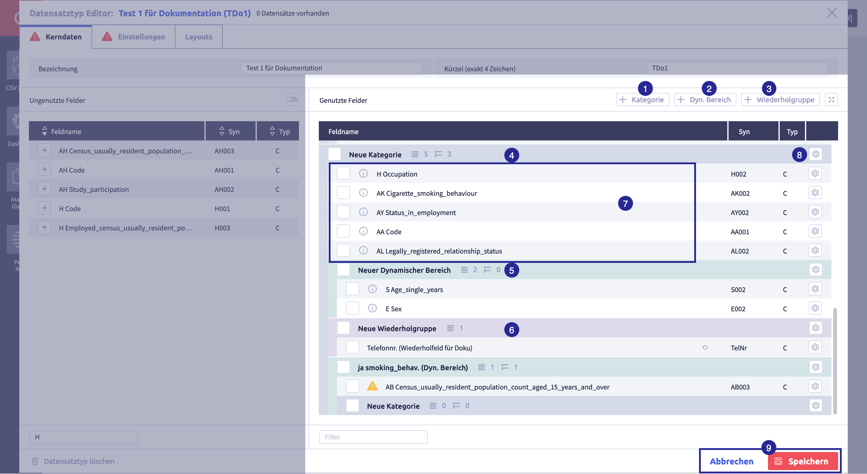
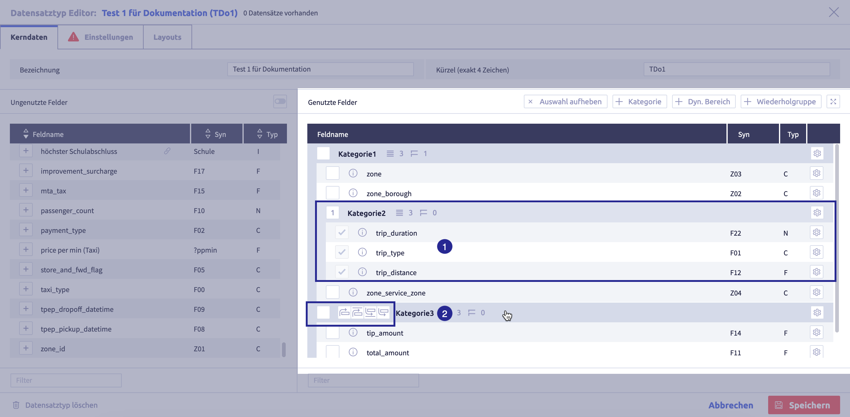
The image shows the record type editor with open core data: (1) button Add another category, (2) button Add (another) dynamic range, (3) button Add (another) repeating group, (4) name of a category, (5) name of a dynamic range, (6) name of a repeating group, (7) some fields of the record type, unsorted, (8) button Edit the category, (9) buttons for Cancel and Save
to close the editor -
move a single used element to the desired group and position using drag & drop
To do this, click the row of the element (field or group) you want to move and drag the row to its destination.
Drag & drop tips
- Elements can be moved across the entire area, i.e. also to another group.
- A group is moved with all fields and all subgroups that it contains.
- Repetition fields can only exist within repetition field groups. Therefore, repetition fields automatically receive a repetition field group as a parent group if they have been moved to non-repetition field groups.
- Add further groups if required.
-
if required, move further individual rows or several rows at the same time using drag & drop
-
click the button Save
(or Cancel) to save the record typeThe record type editor will close and the list with all record types will be displayed again.
Drag & drop multiple selected elements
-
if required, click the button Edit
-
select the elements (fields and groups) you want to move at the simultaneously:
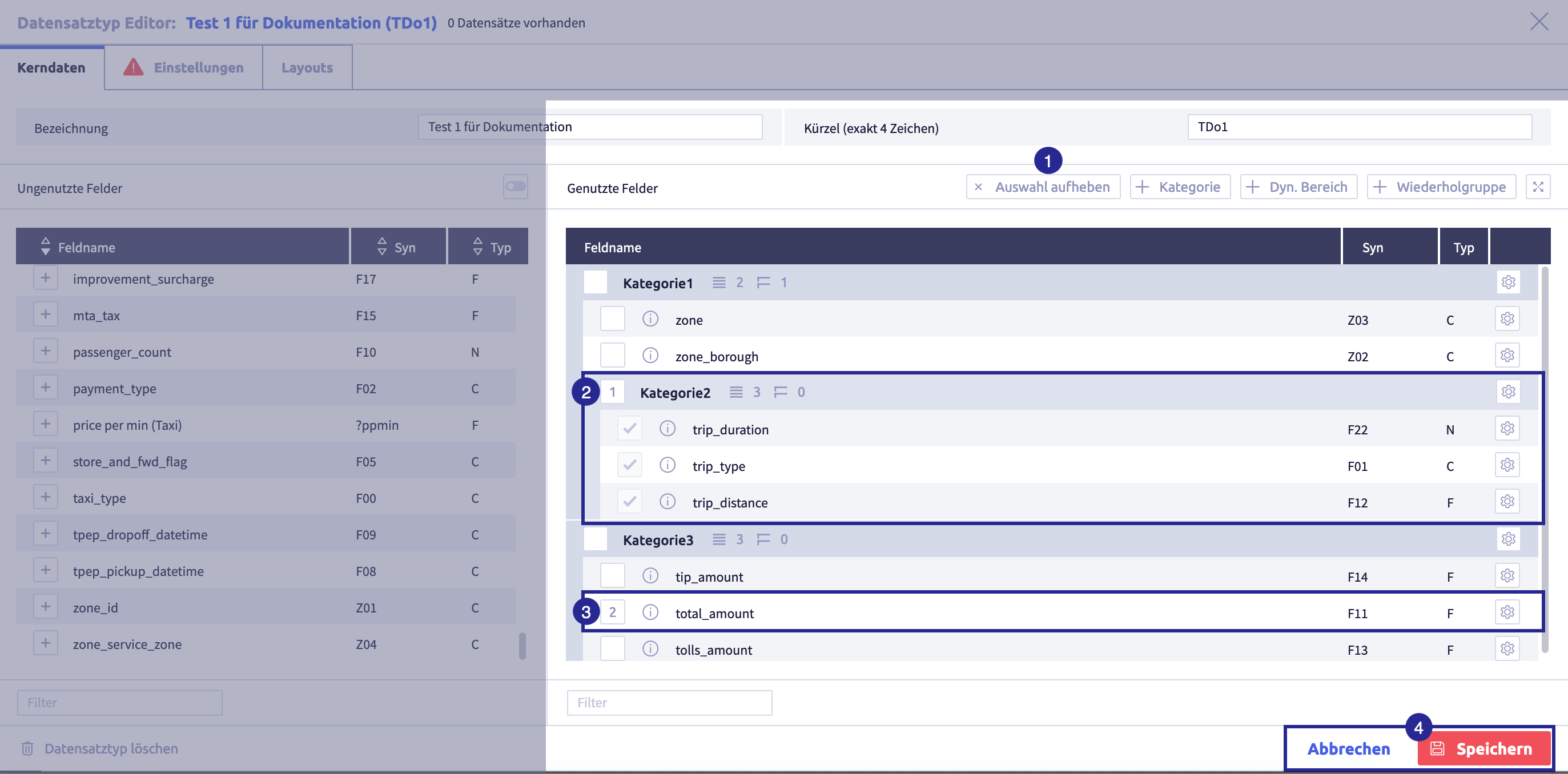
The image shows the record type editor with open core data: (1) button Unselect, (2) selected subgroup, (3) selected single row, (4) buttons for Cancel and Save
to close the editorDrag & drop tips
- Fields and groups can be moved at the same time. Exception: repetition fields and non-repetition fields (and groups) cannot be moved together.
- The numbers that appear during select indicate the order in which the selected elements are inserted into the layout at the destination.
- A group is moved with all fields and all subgroups that it contains.
- A group can be moved at group level or dragged into a category as a subgroup.
- Fields, dynamic areas and repetition field groups must always belong to a category.
- Groups cannot be inserted into themselves.
- Repetition fields can only exist within repetition field groups. Therefore, repetition fields automatically receive a repetition field group as a parent group if they have been moved to non-repetition field groups.
-
to deselect a field, click in the checkbox of the corresponding field
If you want to deselect all selections click the button Unselect.
-
hover with the mouse pointer over the row above or below which you want to add the elements
The target row must be unselected.
In the target row, some buttons appear indicating the position the elements can be inserted:
(1) selected element to be moved, (2) target row with buttons for inserting the select
Button Meaning 
insert selection below row 
insert selection above row 
insert selection above group 
insert selection below group -
click the corresponding button to insert the elements at the desired position
The elements will be inserted at the desired position.
-
if required, move further individual rows or several rows at the same time using drag & drop
-
click the button Save
(or Cancel) to save the record typeThe record type editor will close and the list with all record types will be displayed again.
Add groups for fields in use
Depending on the size of a record type, it may be useful to structure it using groups. For this purpose, the groups Category, Dyn. area and Repetition field group are available.
Tips
- The first category will be created automatically when a record type is created.
- Fields, dynamic areas and repetition field groups can only be added to an existing category.
-
if required, click the button Edit
The core data of the record type editor will open
The core data of the record type editor opens:
The image shows the record type editor with open core data: (1) button Add another category, (2) button Add (another) dynamic range, (3) button Add (another) repeating group, (4) name of a category, (5) name of a dynamic range, (6) name of a repeating group, (7) some fields of the record type, unsorted, (8) button Edit the category, (9) buttons for Cancel and Save
to close the editor -
click the button Settings
, to change the name of the automatically created categoryChoose a meaningful name. The group name will be displayed in the record view and the input mask.
-
if you need more groups, click the buttons Category
, Dyn. area or Repetition group .Table with all groups
Group Meaning Color Note category flexible group, can contain any number of deeply nested subgroups gray one category can contain everything:
- fields
- further (sub) categories
- repetition field groups
- dynamic areas
several categories can exist as main categoriesDyn. area contains fields that can be displayed and hidden in the record view and the input mask. The dyn. area is added to a field of a field type character (C). The configuration of the field determines what is displayed and hidden. green If no dynamic has been set, all fields of the group(s) dynamic area will not be displayed in the record view and the input mask. repetition field group is used to collect information units that may occur more than once purple example: multiple addresses in a single record type "Customer"
Only repetition fields are permitted in repetition field groups. Subgroups are not possible. -
click the button Settings
of the respective group to change the nameChoose a meaningful name. The group name will be displayed in the record view and the input mask.
-
click the button Save
(or Cancel) to save the record typeThe record type editor will close and the list with all record types will be displayed again.
Group: dynamic area
It is possible to display or hide certain fields in the record view and the input mask, e.g. if a checkbox is ticked. This requires the following:
-
at least one group of type Dyn. area
The dynamic area contains the fields that are displayed or hidden.
-
a field with a dynamic configuration
The condition for when the fields are displayed or hidden can be set in the dynamic configuration.
The dynamic configuration is only available for the field type character (C) for the display types checkbox and select box.
Caution
A dynamic area without a connection to a dynamic configuration will never be displayed.
Add fields to groups
-
if required, click the button Edit
The core data of the record type editor will open
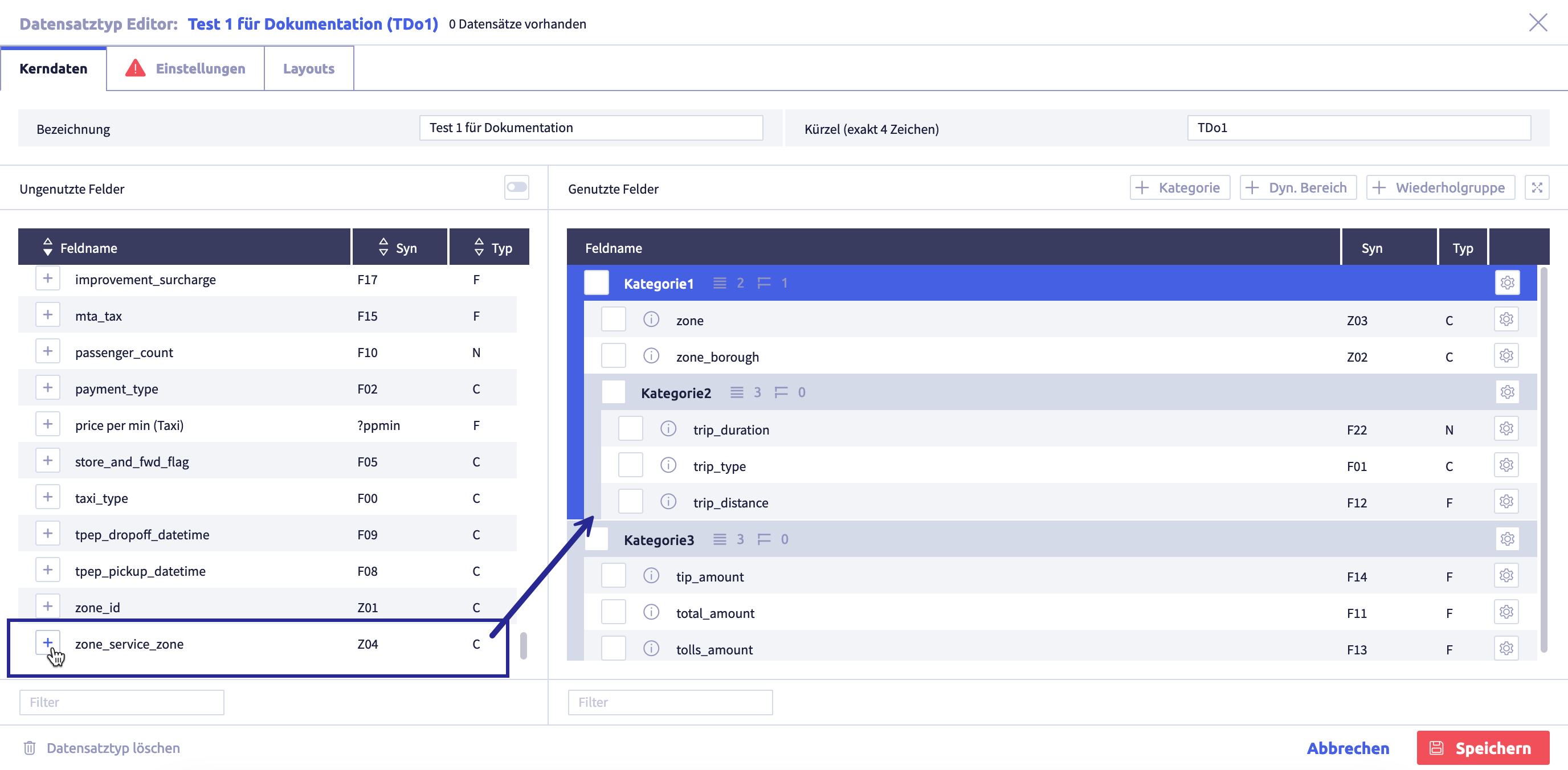
(1) unused fields, (2) button Add field
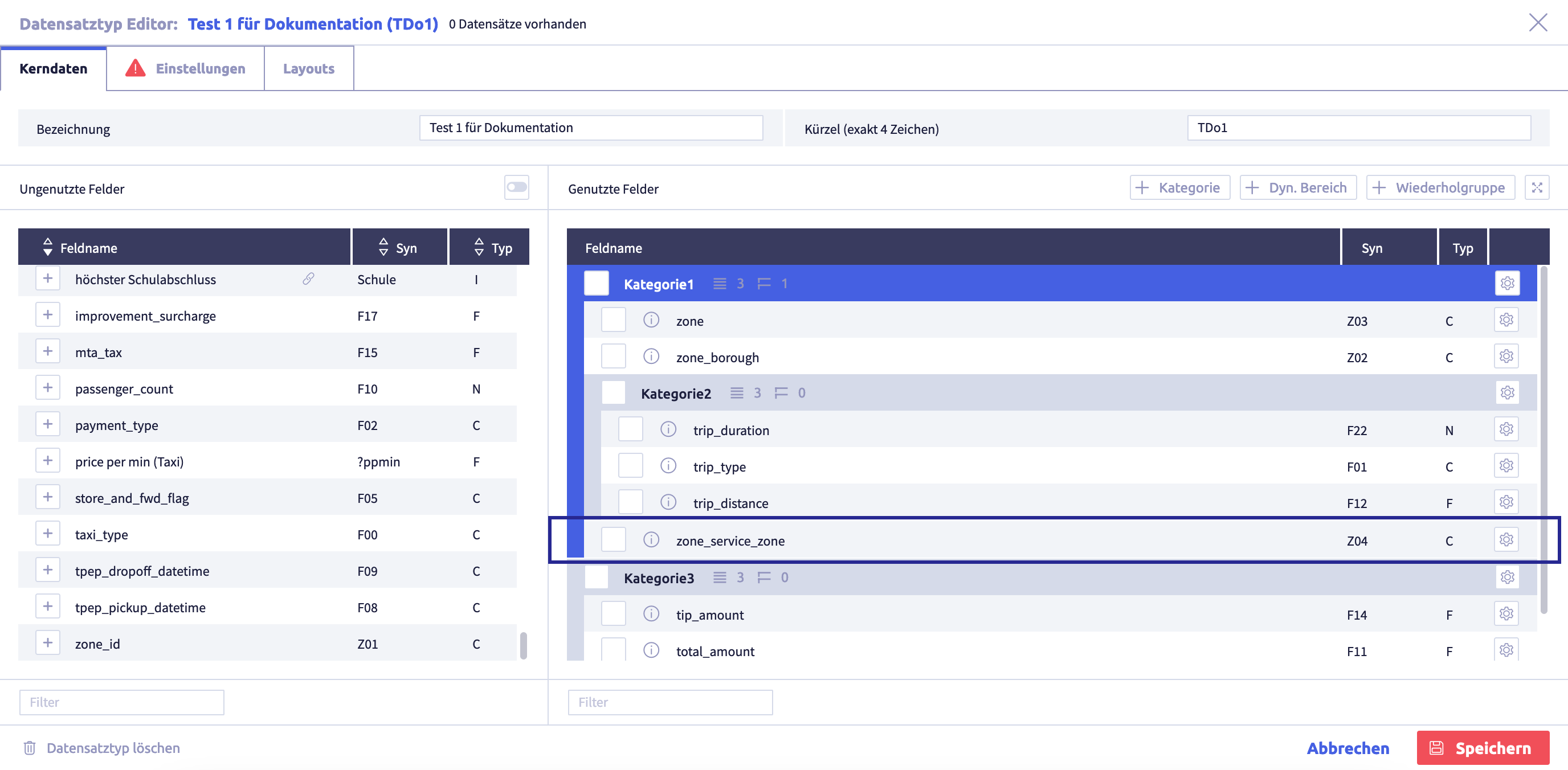
, (3) toggle to display fields that have not yet been used in any record type, (4) standard layout with fields and groups in use, (5) group, (6) buttons for Cancel and Save to close the editor -
click the row with the name of the group to which you want to add a field
The group will turn blue. It is now activated:
-
click the button Add field
of an unused field to use this field in the record type and add it to the activated groupYou can search for fields in the field Filter.
You can use the toggle Unused fields to restrict the list of displayed fields to those fields that have not yet been used in any record type.
Important
System fields cannot be integrated into a layout and are therefore not available in the list of unused fields.
Tips
- If no group is activated, new fields will be added in the last category at the end.
- If a repetition group is activated, only repetition fields will be listed in the list of unused fields (repetition groups can only contain repetition fields).
The added field will be moved to the area Used fields
-
add all the fields you need to the record type
Tips
- if necessary, add a new field in the field administration.
-
if you have added a field by mistake Settings
of this field and then on the button .The field will be moved back to the unused fields.
Important
For data to be added to a record type later, it must contain at least one field.
The field will be moved back to the unused fields.
-
click the button Settings
of an added field and adjust the respective field configuration if necessaryThe field configuration defines the display and function of the field in the input mask.
-
if necessary, adjust the order of fields in use using drag & drop
-
click the button Save
(or Cancel) to save the record typeThe record type editor will close and the list with all record types will be displayed again.
Delete fields / groups
-
if required, click the button Edit
The core data of the record type editor will open
The core data of the record type editor opens:
The image shows the record type editor with open core data: (1) button Add another category, (2) button Add (another) dynamic range, (3) button Add (another) repeating group, (4) name of a category, (5) name of a dynamic range, (6) name of a repeating group, (7) some fields of the record type, unsorted, (8) button Edit the category, (9) buttons for Cancel and Save
to close the editor -
click the button Settings
of the element you want to delete -
click the button
-
The field will be moved back to the unused fields
Warning
When a field is removed, the field configuration defined in this record type will be deleted.
-
The group will be deleted, including all subgroups
Warning
All fields are moved back to the unused fields. The field configuration defined in this record type will be deleted.
-
-
if required, delete further elements
-
click the button Save
(or Cancel) to save the record typeThe record type editor will close and the list with all record types will be displayed again.
Field configuration
The field configuration in the record type extends the system-wide configurations in the field properties in field administration. The display and function of a field in the input mask are defined with the field configuration.
There is no field configuration in the record type for the field link (L) and JSON fields (J).
-
if required, click the button Edit
The core data of the record type editor will open
The core data of the record type editor opens:
The image shows the record type editor with open core data: (1) button Add another category, (2) button Add (another) dynamic range, (3) button Add (another) repeating group, (4) name of a category, (5) name of a dynamic range, (6) name of a repeating group, (7) some fields of the record type, unsorted, (8) button Edit the category, (9) buttons for Cancel and Save
to close the editor -
click the button Settings
of the field you want to configureDepending on the field type, different configuration options are available.
The field configuration opens
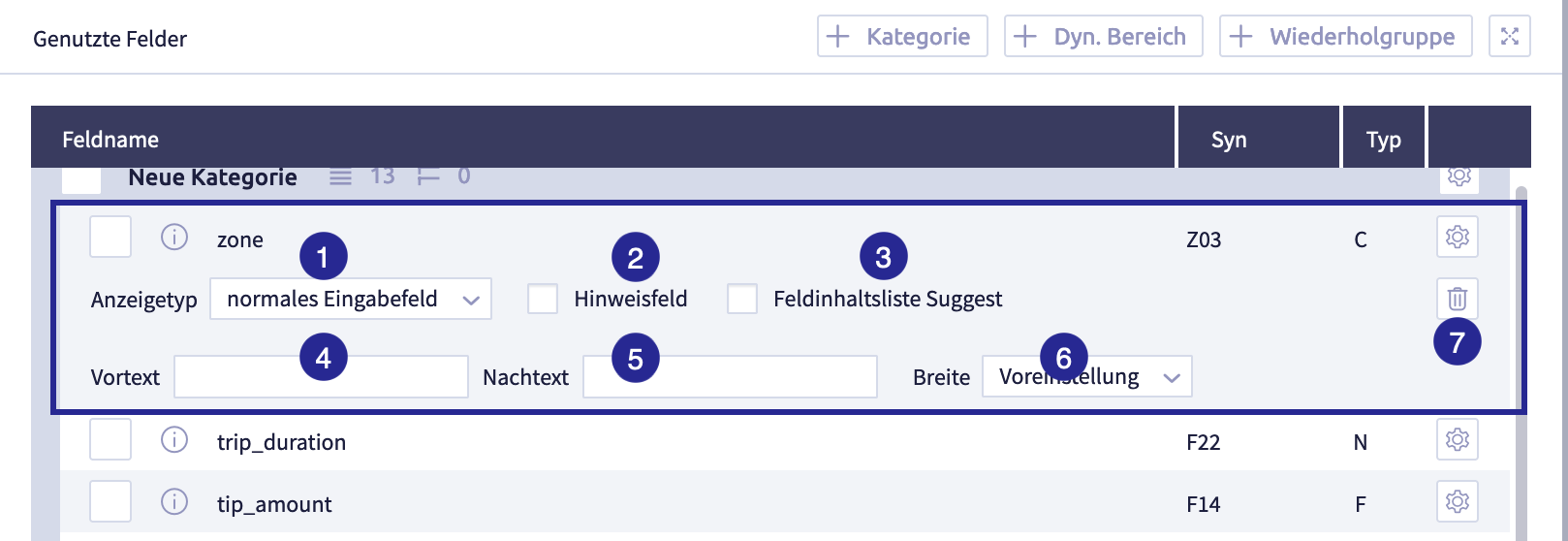
The image shows the field configuration for the field type character (C): (1) selection Display type, (2) checkbox Note field, (3) checkbox Field dictionary suggest, (4) field Pretext, (5) field Suffix, (6) selection Width, (7) button Delete
-
edit the configuration as required
-
to close the current field Settings
or the button Settings of another field -
click the button Save
(or Cancel) to save the record typeThe record type editor will close and the list with all record types will be displayed again.
Comprehensive configuration options for multiple field types
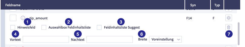
The image shows the field configuration for the field type float/double (F): (1) checkbox Note field, (2) checkbox Select box field dictionary, (3) checkbox Field dictionary suggest, (4) field Pretext, (5) field Suffix, (6) selection Width, (7) button Delete
Tips
- The fields date (D) and float/double (F) contain the configuration options (1) ... (6) in the record type.
- The field timestamp (T) contains the configuration options (2), (4) ... (6).
- The field integer (N) contains the configuration options (2) ... (6).
- The fields character (C), internal link (I) / (@I), multiline (M) contain additional configuration options.
- The field file (B) has a configuration of its own.
The table shows the comprehensive configuration options for several field types:
| Name | Meaning | Field type | Options | Note |
|---|---|---|---|---|
| checkbox Hint field | defines whether this field is a hint field | - character (C) - date (D) - float/double (F) - internal link (I) - multiline (M) |
When saving the input mask, the user receives a warning if the required/hint field has not been filled in. | |
| checkbox Select box field dictionary | defines that the field is displayed as a dropdown select box. The options are generated automatically via the field dictionary. | - date (D) - float/double (F) - internal Link (I) - integer (N) - multiline (M) - timestamp (T) |
If the field dictionary is activated, the button Select field will appear. In the associated popup, a field is selected as the content source. |
|
| checkbox Field dictionary suggest | suggestion based on existing content in existing fields | - character (C) - date (D) - float/double (F) - internal link(I) |
||
| field pretext | defines whether a (fixed) text should be displayed in the user interface before the value of the field | - character (C) - date (D) - float/double (F) - internal link (I) - integer (N) - multiline (M) - timestamp (T) |
example pretext: $ (dollar sign) display in input mask: $[field value] |
|
| field Suffix | determines whether a (fixed) text should be displayed in the user interface after the value of the field | - character (C) - date (D) - float/double (F) - internal link (I) - integer (N) - multiline (M) - timestamp (T) |
example suffix: % (percentage sign) display in input mask: [field value]% |
|
| selection width | determines how wide the field name is displayed in the input mask | - character (C) - date (D) - float/double (F) - internal link(I) - integer (N) - multiline (M) - timestamp (T) |
options: - default - narrow - medium - wide |
for this field: will overwrite the width for field labels configured globally for the record type under settings |
Configuration of the field type character (C)
The image shows the field configuration for the field type character (C): (1) selection Display type, (2) checkbox Note field, (3) checkbox Field dictionary suggest, (4) field Pretext, (5) field Suffix, (6) selection Width, (7) button Delete
The table shows the comprehensive configuration options for several field types:
| Name | Meaning | Field type | Options | Note |
|---|---|---|---|---|
| checkbox Hint field | defines whether this field is a hint field | - character (C) - date (D) - float/double (F) - internal link (I) - multiline (M) |
When saving the input mask, the user receives a warning if the required/hint field has not been filled in. | |
| checkbox Select box field dictionary | defines that the field is displayed as a dropdown select box. The options are generated automatically via the field dictionary. | - date (D) - float/double (F) - internal Link (I) - integer (N) - multiline (M) - timestamp (T) |
If the field dictionary is activated, the button Select field will appear. In the associated popup, a field is selected as the content source. |
|
| checkbox Field dictionary suggest | suggestion based on existing content in existing fields | - character (C) - date (D) - float/double (F) - internal link(I) |
||
| field pretext | defines whether a (fixed) text should be displayed in the user interface before the value of the field | - character (C) - date (D) - float/double (F) - internal link (I) - integer (N) - multiline (M) - timestamp (T) |
example pretext: $ (dollar sign) display in input mask: $[field value] |
|
| field Suffix | determines whether a (fixed) text should be displayed in the user interface after the value of the field | - character (C) - date (D) - float/double (F) - internal link (I) - integer (N) - multiline (M) - timestamp (T) |
example suffix: % (percentage sign) display in input mask: [field value]% |
|
| selection width | determines how wide the field name is displayed in the input mask | - character (C) - date (D) - float/double (F) - internal link(I) - integer (N) - multiline (M) - timestamp (T) |
options: - default - narrow - medium - wide |
for this field: will overwrite the width for field labels configured globally for the record type under settings |
Additional configuration options for characters (C)
| Name | Meaning | Options | Note |
|---|---|---|---|
| selection Display type | determines, which UI element is used for this field in the input mask | options: - normal input field (simple text input field) - checkbox, enables dynamic configuration - select box, enables dynamic configuration - counter field |
|
| checkbox Required field | important: only available for display type - normal input field - select box |
Checkbox
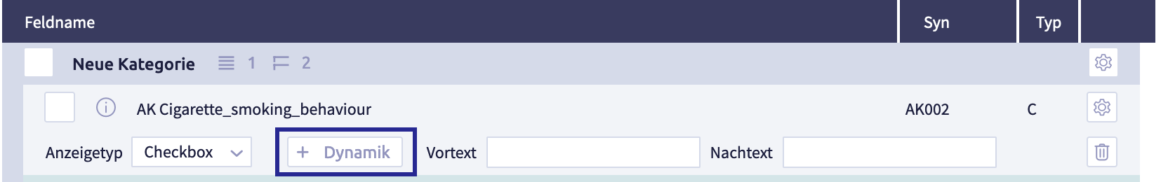
The image shows the field configuration for the field type character (C) with the display type Checkbox.
With this configuration, the field is displayed as a checkbox in the record view and the input mask.
If a dynamic configuration has also been set using the button Dynamic , the field can be hidden and displayed based on the value selected in the field.
Select box
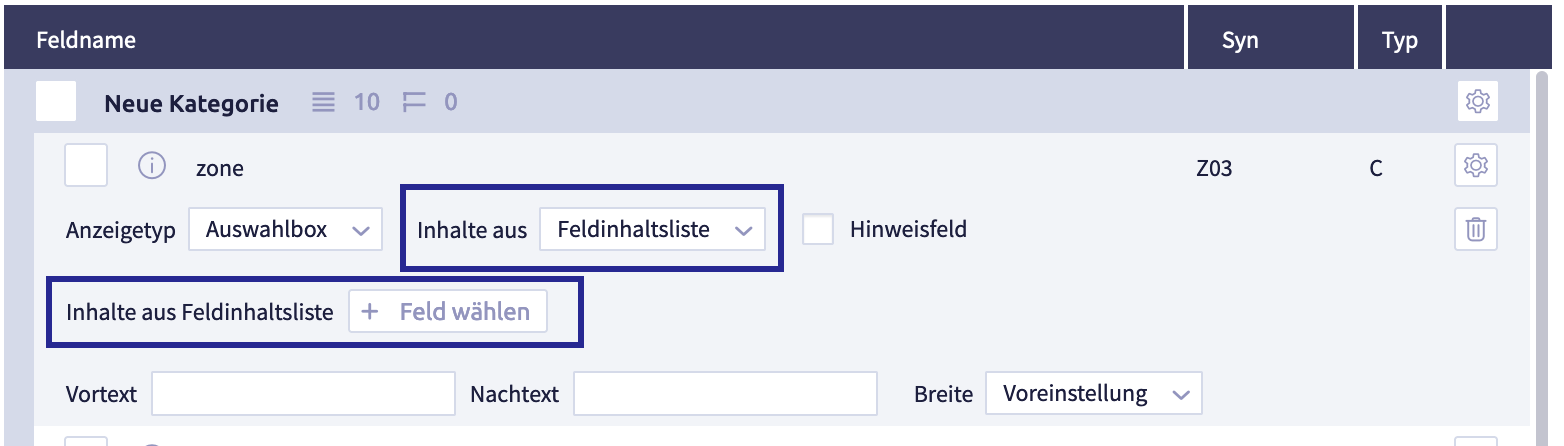
The image shows the field configuration for the field type character (C) with the display type Select box and content from the field dictionary.
This configuration offers content for dropdown select in the input mask. This select is generated automatically using the field dictionary. To do this, use the button Select field to specify which content is to be selected.
As an alternative to select using the field dictionary, the content can originate from a list with global select boxes. For the select from the global select box, there is also the option of dynamic configuration using the button Dynamic ; the field can be displayed and hidden based on the value selected in the field.
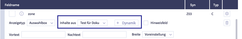
The image shows the field configuration for the field type character (C) with the display type Select box and content from a global select box Test for Documentation.
Add and edit a dynamic configuration
It is possible to display or hide certain fields in the record view and the input mask, e.g. if a checkbox has been ticked. This requires the following:
-
at least one group of the type Dyn. area
The dynamic area contains the fields that can be displayed or hidden.
-
a field with a dynamic configuration
The requirement for when the fields are displayed or hidden is defined in the dynamic configuration.
The dynamic area must be present if a field is configured dynamically. If required, add a new dynamic area and the corresponding fields.
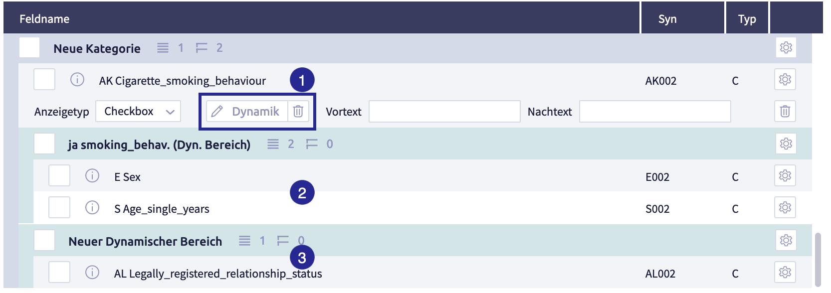
The image shows the field configuration for the field type character (C) with the display type Checkbox.
A dynamic configuration for this field can be added and edited using the button Dynamic:
- options of the checkbox (checked or unchecked)
- each option that is available in the global select box set
The image shows the dynamic definition for the display type Checkbox of the field type character (C): (1) list with the two checkbox options, for each of which a dynamic range can be defined, (2) button Add group
-
click the button Add group
The following window opens:
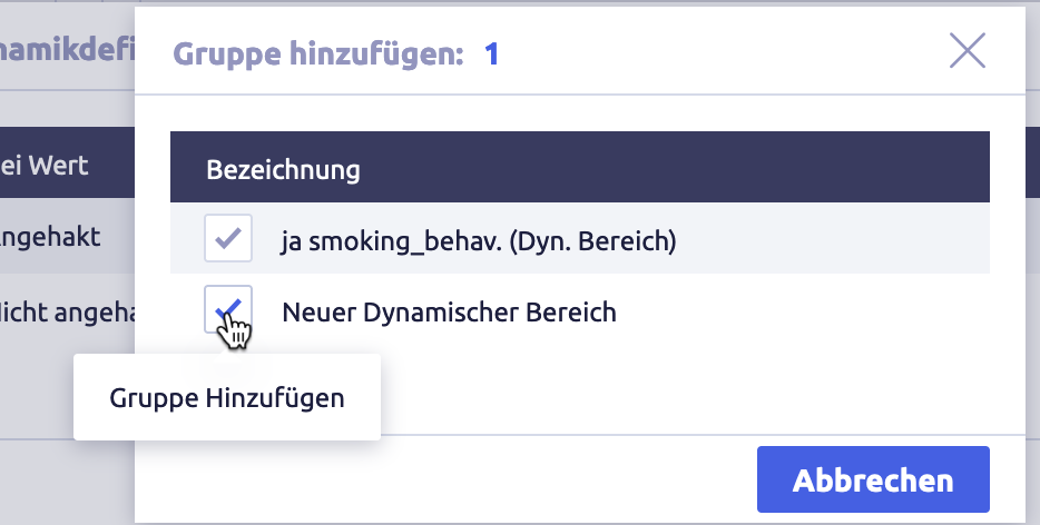
-
select a dynamic group for the option "checkbox checked"
Tips
- The dynamic group contains the fields that are displayed in the record view and the input mask if the checkbox has been ticked.
- Several groups can be added.
- The dynamic groups must already exist when they are added to a dynamic field. If required, add a new dynamic area and the corresponding fields.
-
if required, select a dynamic group for the checkbox not checked option
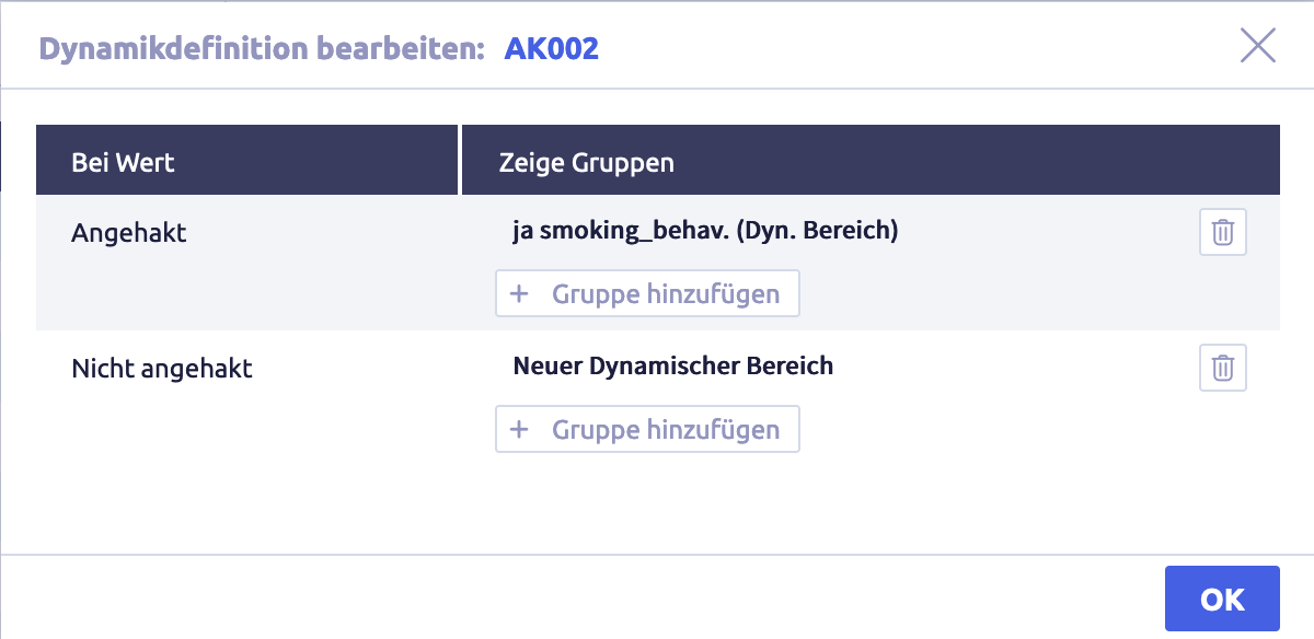
-
if required, select additional groups for both checkbox options
-
click the button Ok
The standard layout will be displayed again.
The image shows the standard layout with an active field: (1) field that is displayed as a checkbox in the input mask and has been dynamically configured, (2) dynamic area that is displayed in the record view and the input mask with the checkbox ticked, (3) dynamic area that is displayed in the record view and the input mask with the checkbox not ticked.
Counter field
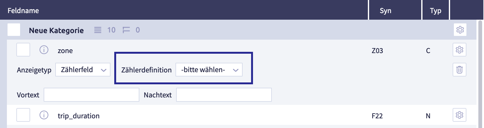
The image shows the configuration options for the display type Counter field of the field type character (C).
The counter definition must be selected so that a counter is displayed in the input mask.
The system settings for counter are used to manage the counter definitions that are used here for select.
Configuration of the field types internal link (I) and (@I)
In the record view and the input mask, fields with an internal link can be displayed. These link fields require a target record type to which the field can refer. This assignment can be done in this configuration.
Tips
- Several target record types can be specified.
- Each connection to a target record type requires a search definition. The standard search definition is to be configured in the target record type. It is also possible to define a search definition that differs from the standard.
- Each connection to a target record type is visualized in the record view and the input mask. The visualization depends on whether the select box field dictionary is checked or not:
- if Select box field dictionary is not checked:
- standard visualization, which is configured in the target record type
- alternatively, a visualization that differs from the standard and is defined in the field configuration (see configure target record type).
- if select box field dictionary is checked:
- dropdown select
- if Select box field dictionary is not checked:
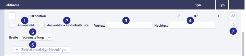
The image shows the field configuration for the field type internal link (I): (1) checkbox Required field, (2) checkbox Select box field dictionary, (3) field pretext, (4) field suffix, (5) select Width, (6) button Add target record type
The table shows the comprehensive configuration options for several field types:
| Name | Meaning | Field type | Options | Note |
|---|---|---|---|---|
| checkbox Hint field | defines whether this field is a hint field | - character (C) - date (D) - float/double (F) - internal link (I) - multiline (M) |
When saving the input mask, the user receives a warning if the required/hint field has not been filled in. | |
| checkbox Select box field dictionary | defines that the field is displayed as a dropdown select box. The options are generated automatically via the field dictionary. | - date (D) - float/double (F) - internal Link (I) - integer (N) - multiline (M) - timestamp (T) |
If the field dictionary is activated, the button Select field will appear. In the associated popup, a field is selected as the content source. |
|
| checkbox Field dictionary suggest | suggestion based on existing content in existing fields | - character (C) - date (D) - float/double (F) - internal link(I) |
||
| field pretext | defines whether a (fixed) text should be displayed in the user interface before the value of the field | - character (C) - date (D) - float/double (F) - internal link (I) - integer (N) - multiline (M) - timestamp (T) |
example pretext: $ (dollar sign) display in input mask: $[field value] |
|
| field Suffix | determines whether a (fixed) text should be displayed in the user interface after the value of the field | - character (C) - date (D) - float/double (F) - internal link (I) - integer (N) - multiline (M) - timestamp (T) |
example suffix: % (percentage sign) display in input mask: [field value]% |
|
| selection width | determines how wide the field name is displayed in the input mask | - character (C) - date (D) - float/double (F) - internal link(I) - integer (N) - multiline (M) - timestamp (T) |
options: - default - narrow - medium - wide |
for this field: will overwrite the width for field labels configured globally for the record type under settings |
Select box field dictionary
With the Select box field dictionary ticked, a dropdown select is available in the input mask:
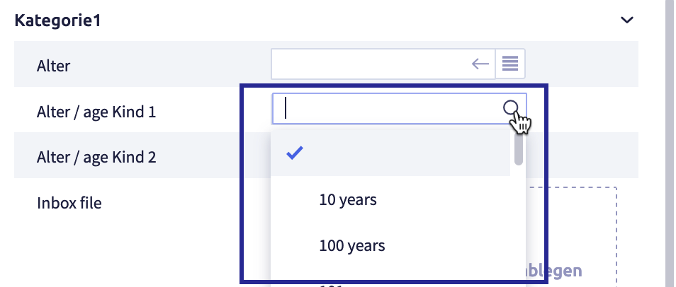
With Select box field dictionary and the target record type unchecked with configured standard search definition and standard list, the button Insert link  is displayed. The button List select
  will appear additionally when the checkbox Select button to display all link targets in list for link fields under Record editing in the user template is active:
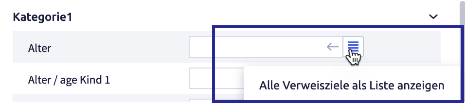
Click the button to display the select list:
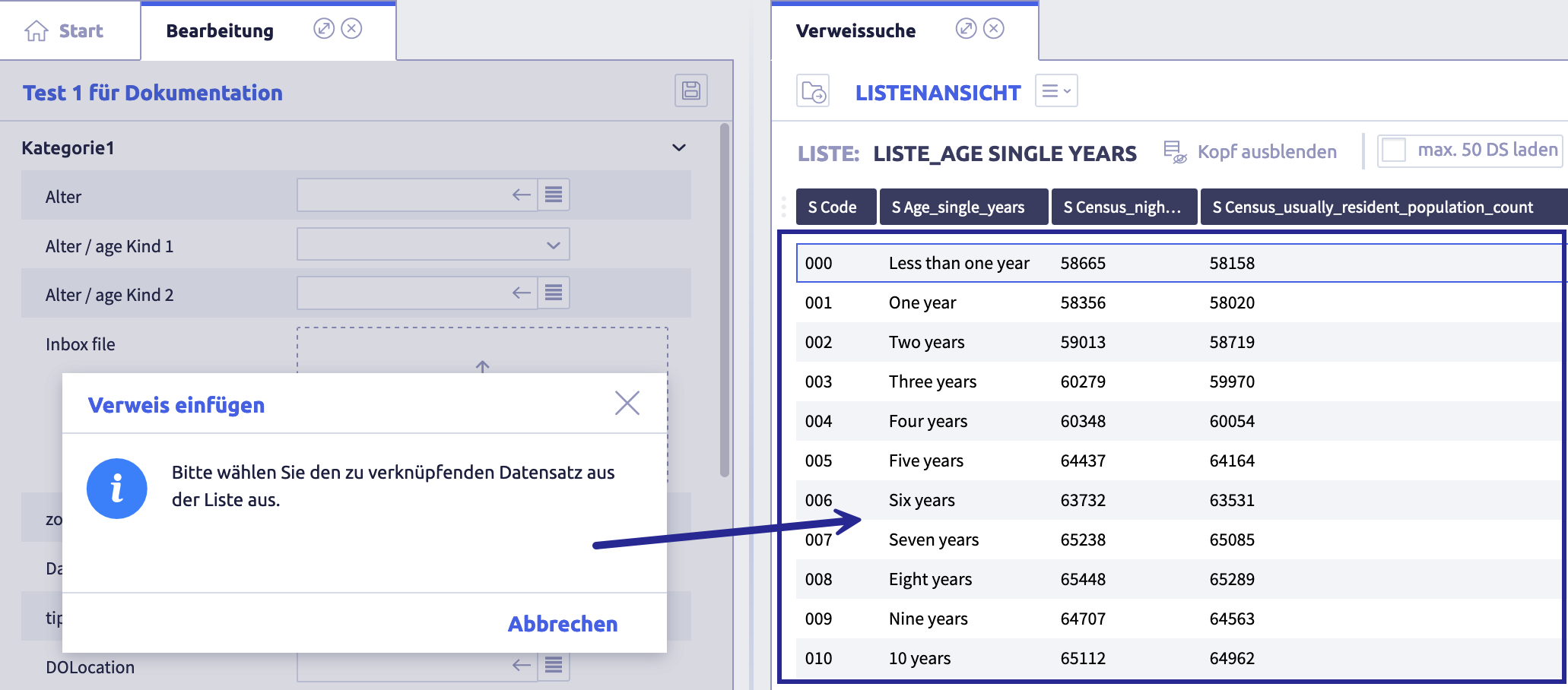
The filled-in fields will appear like this in the input mask:
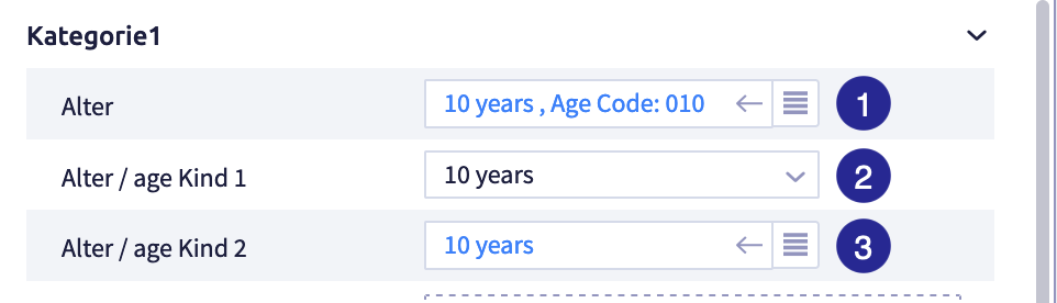
(1) without select box, visualization according to target record type, (2) with select box, visualization of a field content, (3) without select box, customized visualization with an additional field
The field contents (1) and (3) are links and lead to the record referred to.
The field content (2) is a text without a link.
Target record type
In the input mask, the selection of the target record type is displayed for a link field and a record is transferred. The appearance of the transferred record is determined by the visualization of the target record type.
-
click the button Add target record type
The following window opens:
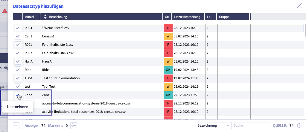
The image shows a list of the available target record types.
-
click the ticked checkbox of a record type to transfer the record type into the configuration of the link field:
The image shows the configuration with a linked record type: (1) linked record type with button Delete
, (2) linked Search definition with button Edit , (3) linked Visualization with button Edit , (4) button Add target record type -
if necessary, adjust the Search definition of the target record type
Click the button Edit
and add another search definition.Standard means that the configured standard search definition of the target record type will be used.
-
if required, adjust the Visualization of the target record type
click the button Edit
and add a field(s) / fixed texts.Standard means that the configured visualization of the target record type is used.
-
if required, add further target record types by clicking the button Add target record type
-
click the button Save
(or Cancel) to save the record typeThe record type editor will close and the list with all record types will be displayed again.
Configuration of the field type multiline (M)
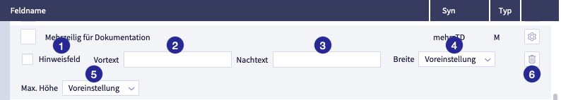
The image shows the field configuration for the field type multiline (M): (1) checkbox Required field, (2) field Pretext, (3) field Suffix, (4) selection Width, (5) selection Maximum height, (6) button Delete
The table shows the comprehensive configuration options for several field types:
| Name | Meaning | Field type | Options | Note |
|---|---|---|---|---|
| checkbox Hint field | defines whether this field is a hint field | - character (C) - date (D) - float/double (F) - internal link (I) - multiline (M) |
When saving the input mask, the user receives a warning if the required/hint field has not been filled in. | |
| checkbox Select box field dictionary | defines that the field is displayed as a dropdown select box. The options are generated automatically via the field dictionary. | - date (D) - float/double (F) - internal Link (I) - integer (N) - multiline (M) - timestamp (T) |
If the field dictionary is activated, the button Select field will appear. In the associated popup, a field is selected as the content source. |
|
| checkbox Field dictionary suggest | suggestion based on existing content in existing fields | - character (C) - date (D) - float/double (F) - internal link(I) |
||
| field pretext | defines whether a (fixed) text should be displayed in the user interface before the value of the field | - character (C) - date (D) - float/double (F) - internal link (I) - integer (N) - multiline (M) - timestamp (T) |
example pretext: $ (dollar sign) display in input mask: $[field value] |
|
| field Suffix | determines whether a (fixed) text should be displayed in the user interface after the value of the field | - character (C) - date (D) - float/double (F) - internal link (I) - integer (N) - multiline (M) - timestamp (T) |
example suffix: % (percentage sign) display in input mask: [field value]% |
|
| selection width | determines how wide the field name is displayed in the input mask | - character (C) - date (D) - float/double (F) - internal link(I) - integer (N) - multiline (M) - timestamp (T) |
options: - default - narrow - medium - wide |
for this field: will overwrite the width for field labels configured globally for the record type under settings |
The following options are available for the maximum height of the field in the record view and the input mask:
- default setting (default, medium)
- small
- medium
- large
Once the maximum height has been reached, a scroll bar to scroll the content will appear.
Configuration of the field type file (B)
In the input mask, you can upload files in the field type file (B). This configuration is used to restrict the upload to certain file types.
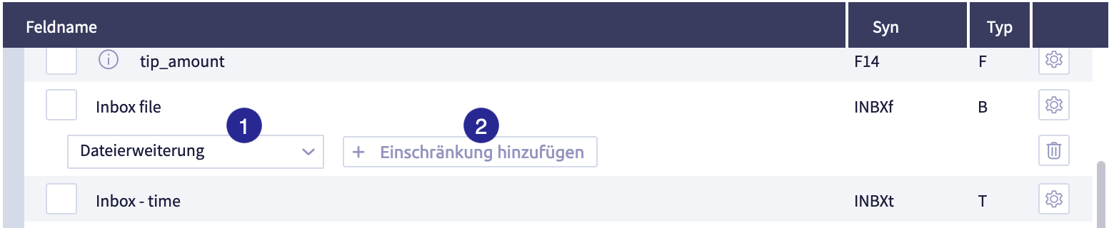
The image shows the field configuration for the field type file (B): (1) selection File extension (or Group), button Add restriction
There are two ways to add restrictions:
| Option | Description | Note |
|---|---|---|
| file extension | restricts based on file type itself | |
| group | restricts based on file type group | a group contains at least one file type |
Important
- Only File extension OR Groups can be used to restrict (not in combination).
- File extensions are case-sensitive (PNG is not the same as png).
After clicking on the button Add restriction the following window opens:
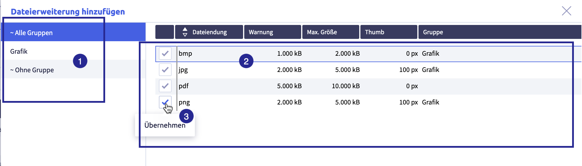
The image shows the restrictions available for selection: (1) groups, are only displayed if at least one group has been created in file type, (2) list with the available file extensions and the respective settings, (3) button to accept a restriction
You can configure multiple restrictions:
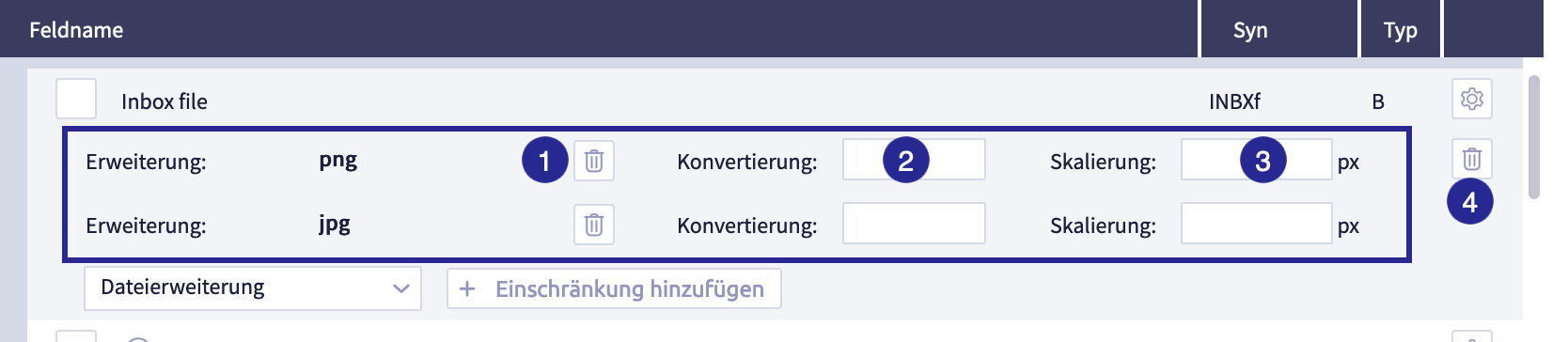
The image shows the selected restrictions: (1) button Delete
| Name | Meaning | Note |
|---|---|---|
| field Conversion | all files are converted to the format specified here when uploaded | valid for files with the defined extension and for files belonging to a group |
| field Scaling | the width of graphics can be limited to a fixed value | the height of the graphic is automatically adjusted to the width |
Add a record type (settings)
The configuration that goes beyond the basic information will be recorded in the settings.
The record type editor opens when you edit and add record types with the core data:
The neighboring tab shows the other settings
The image shows the record type editor with open settings: (1) tabs for configuration: core data (basic information) / settings (supplementing the core data) / layouts (customized version of the standard layout), (2) assigned search definition, (3) optional: button Add standard list, (4) visualization: which fields of this record type are displayed in another record type? (5) optional: button Add object view, (6) selection for Standard action when clicking on record in a list, (7) selection Column width for field name, (8) optional field V8 script after saving, (9) footer with buttons Delete record type
The following table explains all elements in Settings in the record type editor
| Name | Meaning | Required? | Editable | Note |
|---|---|---|---|---|
| configuration, divided into three tabs | tab Core data for basic information tab Settings for additional information (just opened) tab Layouts (customized version of the standard layout) |
|||
| button Standard search definition | selection of a search definition. This definition is used as the standard for internal references to this record type. | required field | always | |
| button Standard list | selection of a list definition. This definition is used as the default for the list view of the record type. | always | ||
| selection and button Visualization of the record type | determines which fixed text or which fields are used to display the record if another record type refers to this record type (via internal reference) | required field, at least one field/text must be selected | always | |
| button Assigned object view | optional: determines which object view(s) should be available for this record type | always | ||
| selection Standard action when clicking on a record in a list | defines which action is executed by default when a record of this type is clicked in a list. | required field with default setting to Open record view | always | |
| selection Width of the column for field name | globally defines for the record type how wide the field labels of the input fields are displayed in the input mask. | required field with default setting to default | always | default setting is medium |
| field V8-Script after saving | optional: entry of a V8 script that is only executed after a record has been saved. | always | ||
| footer with buttons for Delete record type / Save / Cancel | delete record type / all changes are accepted or discarded | delete is not recommended if record type contains records |
Add and delete standard search definition (mandatory field)
A search definition must be assigned to each record type. This search definition is used for fields of field type internal link (I and @I) if a field refers to this (target) record type.
For a link field in the input mask, it can be used to select the field content (see configuration of field types Internal link (I) and (@I)).
It is possible to configure a different search definition for the target record type in the link field.
-
click the button Edit
The core data of the record type editor opens.
-
click the middle tab
The settings of the record type editor will open
The image shows the record type editor with open settings: (1) tabs for configuration: core data (basic information) / settings (supplementing the core data) / layouts (customized version of the standard layout), (2) assigned search definition, (3) optional: button Add standard list, (4) visualization: which fields of this record type are displayed in another record type? (5) optional: button Add object view, (6) selection for Standard action when clicking on record in a list, (7) selection Column width for field name, (8) optional field V8 script after saving, (9) footer with buttons Delete record type
, Cancel and Save to close the editor -
click the button Add search definition in Standard search definition
The following window opens:
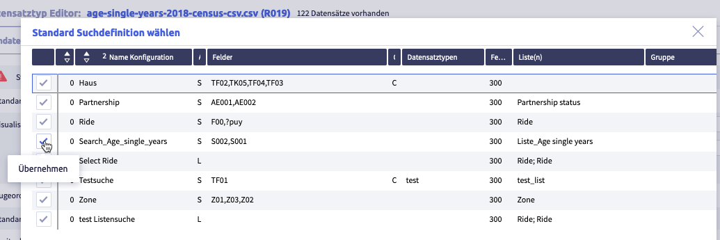
Search definitions are added and managed in search.
-
select the search definitions
-
click the button Save
(or Cancel) to save the record typeThe record type editor will close and the list with all record types will be displayed again.
Delete standard search definition
-
click the button Edit
The core data of the record type editor opens.
-
click the middle tab
The settings of the record type editor will open
The image shows the record type editor with open settings: (1) tabs for configuration: core data (basic information) / settings (supplementing the core data) / layouts (customized version of the standard layout), (2) assigned search definition, (3) optional: button Add standard list, (4) visualization: which fields of this record type are displayed in another record type? (5) optional: button Add object view, (6) selection for Standard action when clicking on record in a list, (7) selection Column width for field name, (8) optional field V8 script after saving, (9) footer with buttons Delete record type
, Cancel and Save to close the editor -
click the button Delete
The element will be removed.
-
select another search definition
-
click the button Save
(or Cancel) to save the record typeThe record type editor will close and the list with all record types will be displayed again.
Add and delete standard list (mandatory field)
A standard list must be assigned to each record type. This list definition is used when you select the list view of records and field dictionaries.
With a link field in the input mask, it can be used to select the field content (see configuration of field types Internal link (I) and (@I)) if no list has been assigned in the search definition of the target record type.
Tips
- If the search definition has already been linked to a list definition, the standard list is only used for the list view of records and field dictionaries.
- The standard list will overwrite the list view configured in the search definition.
- If no standard list has been selected, a selection with the lists that are linked to this record type will be displayed when a list view is opened.
-
click the button Edit
The core data of the record type editor opens.
-
click the middle tab
The settings of the record type editor will open
The image shows the record type editor with open settings: (1) tabs for configuration: core data (basic information) / settings (supplementing the core data) / layouts (customized version of the standard layout), (2) assigned search definition, (3) optional: button Add standard list, (4) visualization: which fields of this record type are displayed in another record type? (5) optional: button Add object view, (6) selection for Standard action when clicking on record in a list, (7) selection Column width for field name, (8) optional field V8 script after saving, (9) footer with buttons Delete record type
, Cancel and Save to close the editor -
click the button Add list in Standard list
The following window opens:
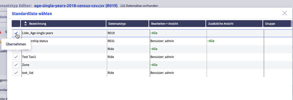
-
select a standard list
-
click the button Save
(or Cancel) to save the record typeThe record type editor will close and the list with all record types will be displayed again.
Delete standard list
-
click the button Edit
The core data of the record type editor opens.
-
click the middle tab
The settings of the record type editor will open
The image shows the record type editor with open settings: (1) tabs for configuration: core data (basic information) / settings (supplementing the core data) / layouts (customized version of the standard layout), (2) assigned search definition, (3) optional: button Add standard list, (4) visualization: which fields of this record type are displayed in another record type? (5) optional: button Add object view, (6) selection for Standard action when clicking on record in a list, (7) selection Column width for field name, (8) optional field V8 script after saving, (9) footer with buttons Delete record type
, Cancel and Save to close the editor -
click the button Delete next to the standard list
The element will be removed.
-
if required, select another list
-
click the button Save
(or Cancel) to save the record typeThe record type editor will close and the list with all record types will be displayed again.
Edit and delete visualization (mandatory field)
Each record type must be assigned a visualization that contains at least one field or a fixed text. In the case of a link field in a record, the visualization determines which field contents of the target record are displayed in this link field. A pretext and a suffix can be defined for each field.
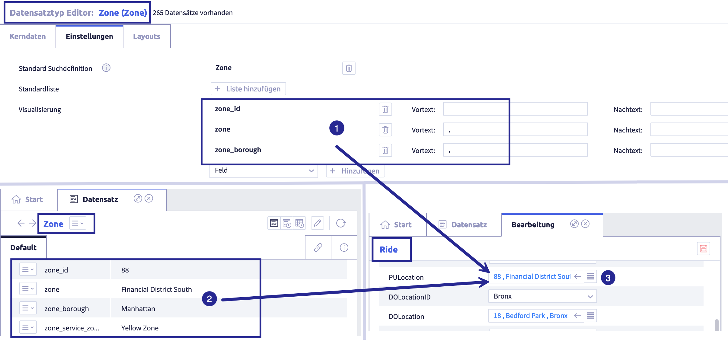
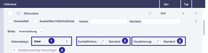
The image shows an example of the visualization of a target record (type Zone) in a link field of another record: (1) visualization settings in the record type Zone, (2) a record of the type Zone, (3) a field in the record of type Ride that refers to data of record type Zone
-
click the button Edit
The core data of the record type editor opens.
-
click the middle tab
The settings of the record type editor will open
The image shows the record type editor with open settings: (1) tabs for configuration: core data (basic information) / settings (supplementing the core data) / layouts (customized version of the standard layout), (2) assigned search definition, (3) optional: button Add standard list, (4) visualization: which fields of this record type are displayed in another record type? (5) optional: button Add object view, (6) selection for Standard action when clicking on record in a list, (7) selection Column width for field name, (8) optional field V8 script after saving, (9) footer with buttons Delete record type
, Cancel and Save to close the editor -
For the visualization of the record type in the record view and in the input mask, select
- fixed text
-
field
You cannot use all field types for visualization.
Allowed are:
- character (C)
- date (D)
- float / double (F)
- integer (N)
- timestamp (T)
-
click the button Add
-
fixed text
A text field opens
- enter your text
-
field
The following window opens:
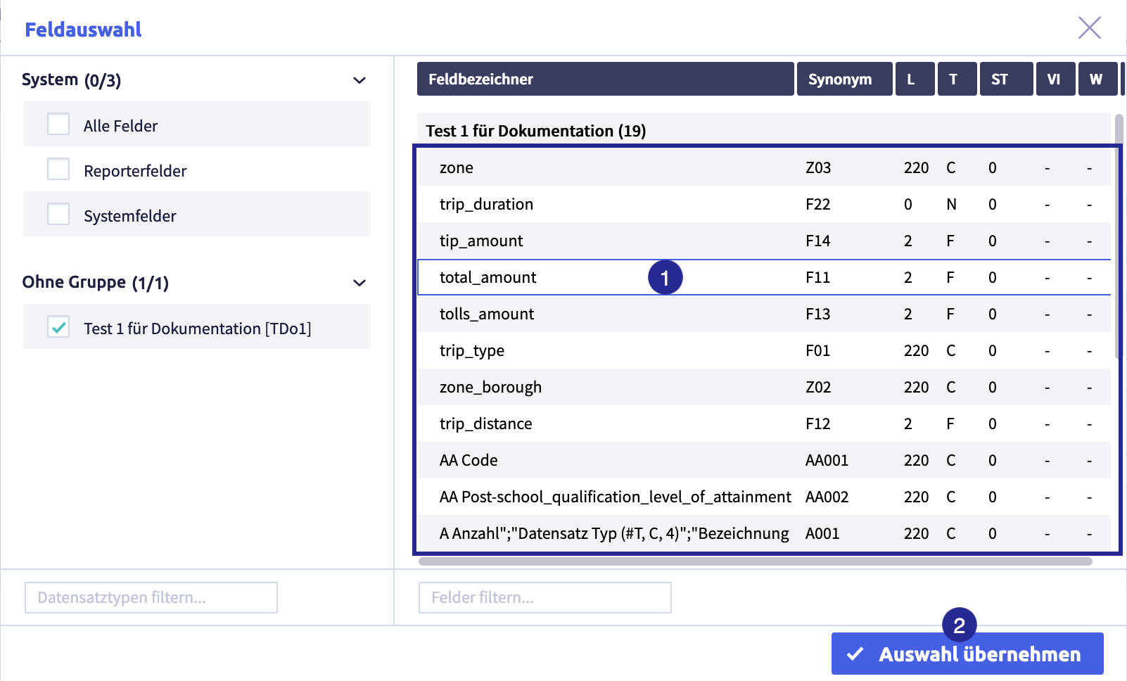
The image shows the field selection for the visualization: (1) fields available for selection, (2) button Accept selection.
- click on a field to select it
- click the button Accept selection
-
-
click the button Save
(or Cancel) to save the record typeThe record type editor will close and the list with all record types will be displayed again.
Delete a field or fixed text
-
click the button Edit
The core data of the record type editor opens.
-
click the middle tab
The settings of the record type editor will open
The image shows the record type editor with open settings: (1) tabs for configuration: core data (basic information) / settings (supplementing the core data) / layouts (customized version of the standard layout), (2) assigned search definition, (3) optional: button Add standard list, (4) visualization: which fields of this record type are displayed in another record type? (5) optional: button Add object view, (6) selection for Standard action when clicking on record in a list, (7) selection Column width for field name, (8) optional field V8 script after saving, (9) footer with buttons Delete record type
, Cancel and Save to close the editor -
click the button Delete
next to the field or text fieldThe element will be removed.
-
click the button Save
(or Cancel) to save the record typeThe record type editor will close and the list with all record types will be displayed again.
Add and delete object view
This determines the object view(s) that will be available for this record type.
-
click the button Edit
The core data of the record type editor opens.
-
click the middle tab
The settings of the record type editor will open
The image shows the record type editor with open settings: (1) tabs for configuration: core data (basic information) / settings (supplementing the core data) / layouts (customized version of the standard layout), (2) assigned search definition, (3) optional: button Add standard list, (4) visualization: which fields of this record type are displayed in another record type? (5) optional: button Add object view, (6) selection for Standard action when clicking on record in a list, (7) selection Column width for field name, (8) optional field V8 script after saving, (9) footer with buttons Delete record type
, Cancel and Save to close the editor -
click the button Add object view
in Assigned object viewThe following window opens:
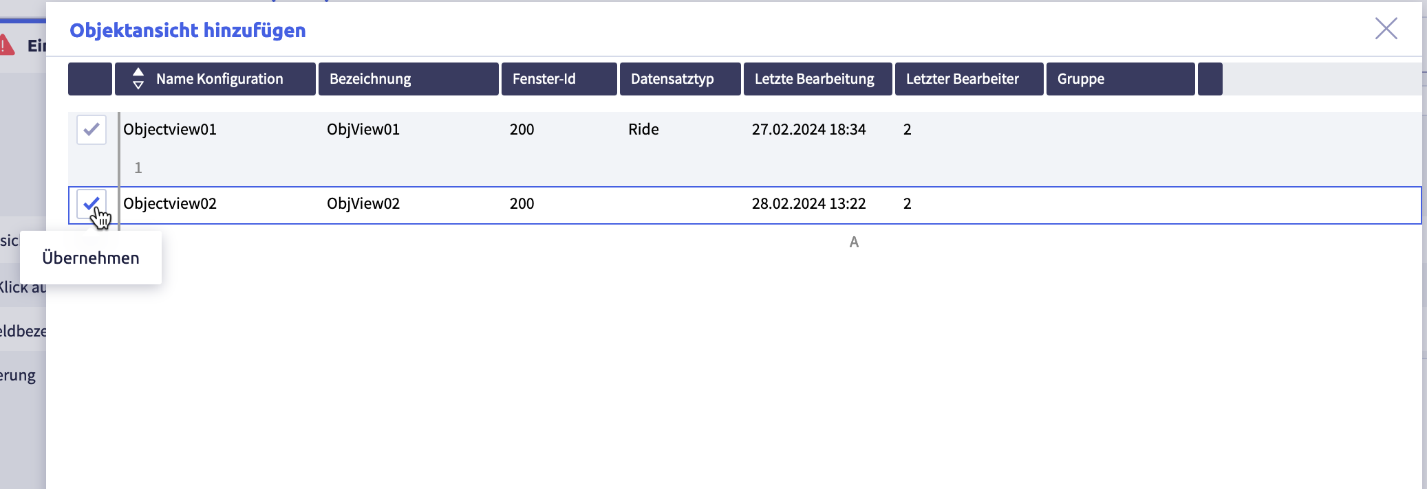
-
select an object view by clicking on the ticked checkbox
The tab Settings will be displayed again.
-
add further object views if required
-
click the button Save
(or Cancel) to save the record typeThe record type editor will close and the list with all record types will be displayed again.
Delete object view
-
click the button Edit
The core data of the record type editor opens.
-
click the middle tab
The settings of the record type editor will open
The image shows the record type editor with open settings: (1) tabs for configuration: core data (basic information) / settings (supplementing the core data) / layouts (customized version of the standard layout), (2) assigned search definition, (3) optional: button Add standard list, (4) visualization: which fields of this record type are displayed in another record type? (5) optional: button Add object view, (6) selection for Standard action when clicking on record in a list, (7) selection Column width for field name, (8) optional field V8 script after saving, (9) footer with buttons Delete record type
, Cancel and Save to close the editor -
click the button Delete directly next to the object view
The object view will be removed.
-
click the button Save
(or Cancel) to save the record typeThe record type editor will close and the list with all record types will be displayed again.
Standard action when clicking on a record in a list (mandatory field)
This defines which action is executed by default when a record of this type is clicked in a list.
-
click the button Edit
The core data of the record type editor opens.
-
click the middle tab
The settings of the record type editor will open
The image shows the record type editor with open settings: (1) tabs for configuration: core data (basic information) / settings (supplementing the core data) / layouts (customized version of the standard layout), (2) assigned search definition, (3) optional: button Add standard list, (4) visualization: which fields of this record type are displayed in another record type? (5) optional: button Add object view, (6) selection for Standard action when clicking on record in a list, (7) selection Column width for field name, (8) optional field V8 script after saving, (9) footer with buttons Delete record type
, Cancel and Save to close the editor -
for Standard action when clicking on record in a list, select between
- open record view (default)
- start object view of the record
-
click the button Save
(or Cancel) to save the record typeThe record type editor will close and the list with all record types will be displayed again.
Select column width for field labels (mandatory field)
Here you define universally how wide the field names of the fields in the record view and the input mask are displayed for the record type.
The default setting is medium.
This can be overwritten for individual fields in the respective field configuration.
-
click the button Edit
The core data of the record type editor opens.
-
click the middle tab
The settings of the record type editor will open
The image shows the record type editor with open settings: (1) tabs for configuration: core data (basic information) / settings (supplementing the core data) / layouts (customized version of the standard layout), (2) assigned search definition, (3) optional: button Add standard list, (4) visualization: which fields of this record type are displayed in another record type? (5) optional: button Add object view, (6) selection for Standard action when clicking on record in a list, (7) selection Column width for field name, (8) optional field V8 script after saving, (9) footer with buttons Delete record type
, Cancel and Save to close the editor -
for the width of the column for the field name, choose between
- default (default; medium)
- narrow
- medium
- wide
-
click the button Save
(or Cancel) to save the record typeThe record type editor will close and the list with all record types will be displayed again.
Add and delete V8 script after saving
An optional V8 script can be entered here, which is only executed after a record has been saved.
-
click the button Edit
The core data of the record type editor opens.
-
click the middle tab
The settings of the record type editor will open
The image shows the record type editor with open settings: (1) tabs for configuration: core data (basic information) / settings (supplementing the core data) / layouts (customized version of the standard layout), (2) assigned search definition, (3) optional: button Add standard list, (4) visualization: which fields of this record type are displayed in another record type? (5) optional: button Add object view, (6) selection for Standard action when clicking on record in a list, (7) selection Column width for field name, (8) optional field V8 script after saving, (9) footer with buttons Delete record type
, Cancel and Save to close the editor -
enter this script in V8 script after saving
The script is run AFTER a record has been saved.
-
click the button Save
(or Cancel) to save the record typeThe record type editor will close and the list with all record types will be displayed again.
Delete V8 script after saving
-
click the button Edit
The core data of the record type editor opens.
-
click the middle tab
The settings of the record type editor will open
The image shows the record type editor with open settings: (1) tabs for configuration: core data (basic information) / settings (supplementing the core data) / layouts (customized version of the standard layout), (2) assigned search definition, (3) optional: button Add standard list, (4) visualization: which fields of this record type are displayed in another record type? (5) optional: button Add object view, (6) selection for Standard action when clicking on record in a list, (7) selection Column width for field name, (8) optional field V8 script after saving, (9) footer with buttons Delete record type
, Cancel and Save to close the editor -
click the button Delete below the script
The editor will be empty again.
-
click the button Save
(or Cancel) to save the record typeThe record type editor will close and the list with all record types will be displayed again.
Add record types (Layout)
Optionally, so-called customized layouts can be defined for a record type. For each customized layout, you can restrict which fields and groups should be visible. A record type can have several customized layouts.
Thanks to customized layouts, particularly extensive record type definitions (e.g. with more than 50 fields) can be reduced in size for better clarity when displayed.
The following actions are possible for customized layouts:
The interfaces for the customized layouts can be accessed from the right tab in the header of the record type editor.
Add and edit a customized layout
-
click the button Edit
The core data of the record type editor opens.
-
click the right tab Layouts
The layouts overview of the record type editor will open
The image shows the record type editor with open settings: (1) tabs for configuration: core data (basic information) / settings (supplementary to the core data) / layouts (customized version of the standard layout), (2) area for layout, (3) footer with buttons Delete record type
, Cancel and Save to close the record type editor, (4) button Add layout -
click the button Add
The following window opens:
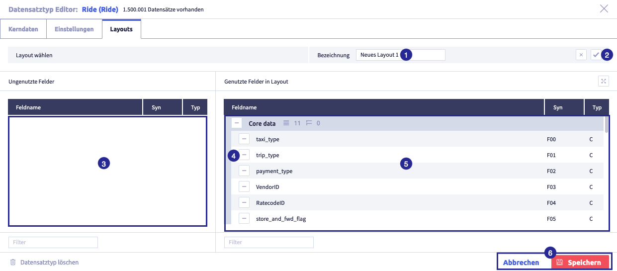
The image shows the standard layout that can be customized: (1) field Name, (2) button Save
 for description, (3) area Unused fields, (4) button Remove field
  , (5) layout of record type, (6) buttons for Cancel and Save to close the editor
 -
recommended: rename the name New layout1 and enter a meaningful name
-
click the button Save
, to confirm the renamingTips
- Existing customized layouts can also be renamed.
- To rename a layout, click the button Edit .
-
edit the layout of the record type:
-
click the button Remove field
, to exclude a field so that it is not displayed in the customized layoutThis field will be moved to the area Unused fields.
Tips
- The group of the moved field is also listed under Unused fields. This display provides information about where in the customized layout the field will be inserted again if required.
- If you have removed a field by mistake, click the button Add field
 of this field. It will be inserted in its original group at the end.
 - It is also possible to remove or re-add a group.
Caution
If the parent group of a field/group changes in the standard layout under core data, the field/group will be automatically removed from all customized layouts and moved to the list of unused fields.
You can decide again whether the changed field/group should continue to be included in the customized layout in the new position.
-
remove all fields that you do not need in this layout
-
if necessary, move the remaining fields / groups using drag & drop to arrange information differently from the standard layout under core data.
Important
Fields or groups cannot have parent groups that differ from the standard layout in a customized layout. They can only be moved within their parent group.
-
-
click the button Save
(or Cancel) to save the record typeThe record type editor will close and the list with all record types will be displayed again.
Delete a customized layout
-
click the button Edit
The core data of the record type editor opens.
-
click the right tab
The window with customized layouts will open
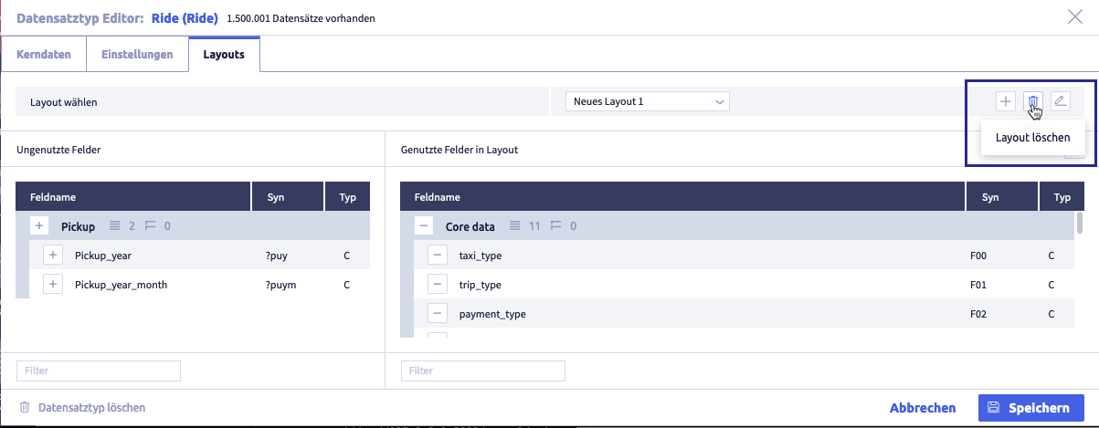
-
click the button Delete
of the layout you want to deleteThe following window opens:
-
click the button Ok (or Cancel)
The tab Layout will be displayed again.
Edit a record type
-
click the button Edit
The core data of the record type editor will open
The image shows the record type editor with open core data: (1) tabs for configuration: core data (basic information) / settings (supplementary to the core data) / layouts (customized version of the standard layout), (2) Name field (name) of the record type, (3) fields that have not yet been used in this record type, (4) field Filter for unused fields, (5) footer with button Delete record type
, (6) field Abbreviation (synonym) of the record type, (7) buttons to structure fields with groups in the standard layout, (8) standard layout with all fields used in this record type sorted and grouped, (9) field Filter for used fields, (10) footer with buttons for Cancel and Save to close the editor -
edit as required
- field Name
-
standard layout (Used fields)
Caution
When a field is removed, the field configuration specific to this record type will be deleted.
-
click the button Save
(or Cancel) to save the record typeThe record type editor will close and the list with all record types will be displayed again.
-
if required, click the button Edit
, to open the editor -
click the tab Settings
The settings of the record type editor will open
The image shows the record type editor with open settings: (1) tabs for configuration: core data (basic information) / settings (supplementing the core data) / layouts (customized version of the standard layout), (2) assigned search definition, (3) optional: button Add standard list, (4) visualization: which fields of this record type are displayed in another record type? (5) optional: button Add object view, (6) selection for Standard action when clicking on record in a list, (7) selection Column width for field name, (8) optional field V8 script after saving, (9) footer with buttons Delete record type
, Cancel and Save to close the editor -
edit as required
- standard search definition: delete current list and add another list
- standard list (add fields, delete fields)
- assigned object view
- standard action when clicking on a record in a list
- width of the column for field name
- V8-Script after saving
- optional: click the button Save (or Cancel) to save the record type
The record type editor will close and the list with all record types will be displayed again.
Tip
Editing is described under add record type (settings).
-
if required, click the button Edit
, to open the editor -
click the tab Layouts
The layouts overview of the record type editor will open
The image shows the record type editor with open settings: (1) tabs for configuration: core data (basic information) / settings (supplementary to the core data) / layouts (customized version of the standard layout), (2) area for layout, (3) footer with buttons Delete record type
, Cancel and Save to close the record type editor, (4) button Add layout -
customize the standard layout as required
Editing is described in add record type (layouts).
-
click the button Save
(or Cancel) to save the record typeThe record type editor will close and the list with all record types will be displayed again.
Delete a record type
-
click the button Edit
The core data of the record type editor will open
The image shows the record type editor with open core data: (1) tabs for configuration: core data (basic information) / settings (supplementary to the core data) / layouts (customized version of the standard layout), (2) Name field (name) of the record type, (3) fields that have not yet been used in this record type, (4) field Filter for unused fields, (5) footer with button Delete record type
, (6) field Abbreviation (synonym) of the record type, (7) buttons to structure fields with groups in the standard layout, (8) standard layout with all fields used in this record type sorted and grouped, (9) field Filter for used fields, (10) footer with buttons for Cancel and Save to close the editor -
click the button Delete record type
A confirmation window opens
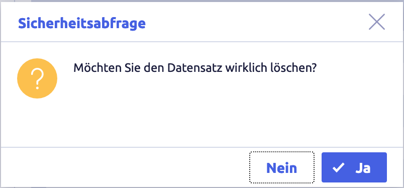
-
click the button Yes (or the button No resp. the button X at the top right if you want to cancel)
The record type editor will close and the list with all record types will be displayed again.
Organize record types into groups
If the function Groups is active, the record types can be organized into groups for simplified management.
The following actions are possible:
- create groups
- rename groups
- delete groups
- add elements to a group
- remove elements from a group
Note
The actions are shown using the example Field management.
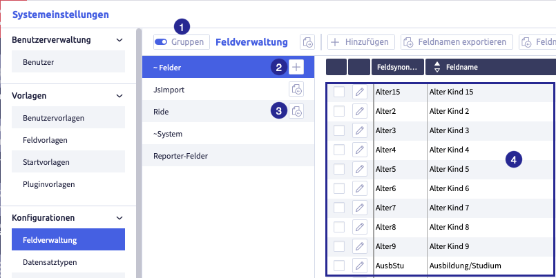
The image shows the field administration with active groups: (1) button Activate groups, (2) button Add group
, (4) fields from the currently active group
Create a group
The image shows the field administration with active groups
Create user-defined groups
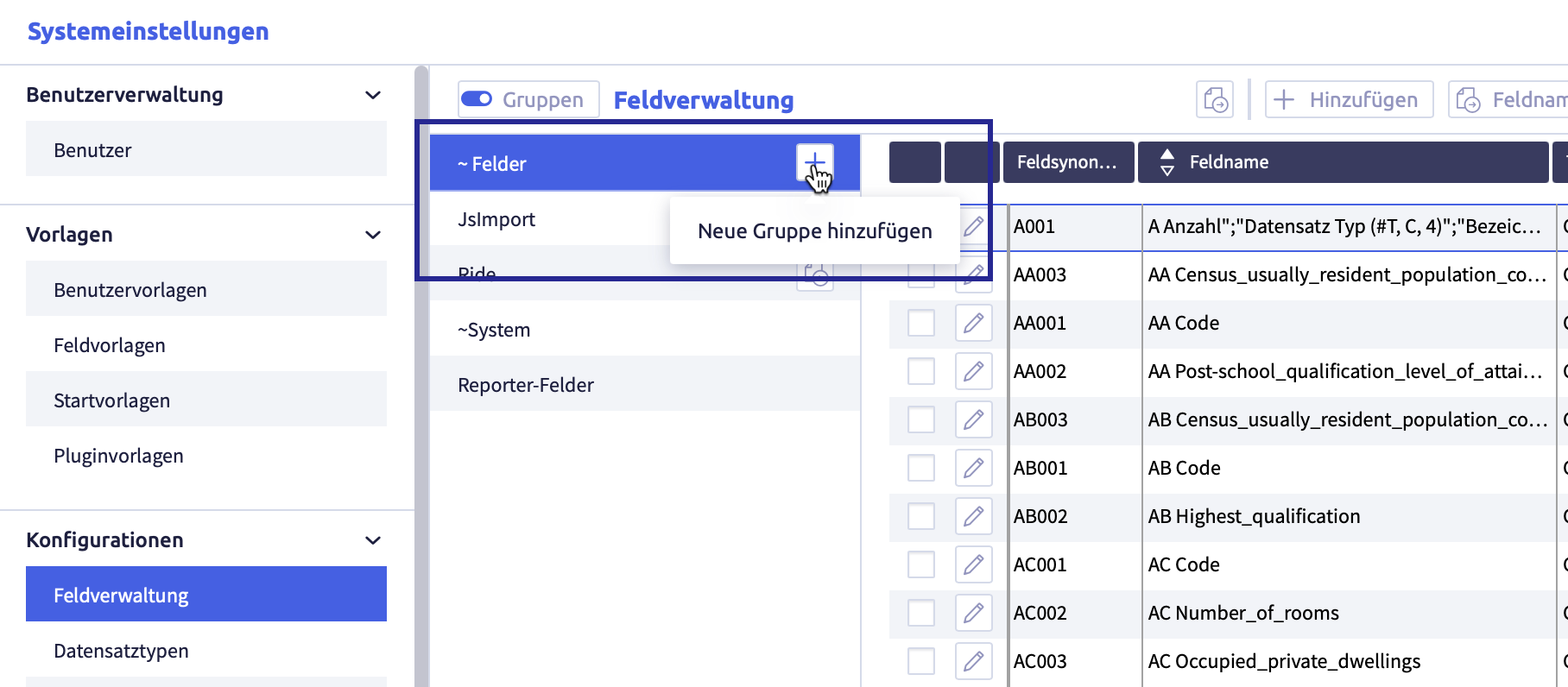
-
click the button Add group
A new row will be added:
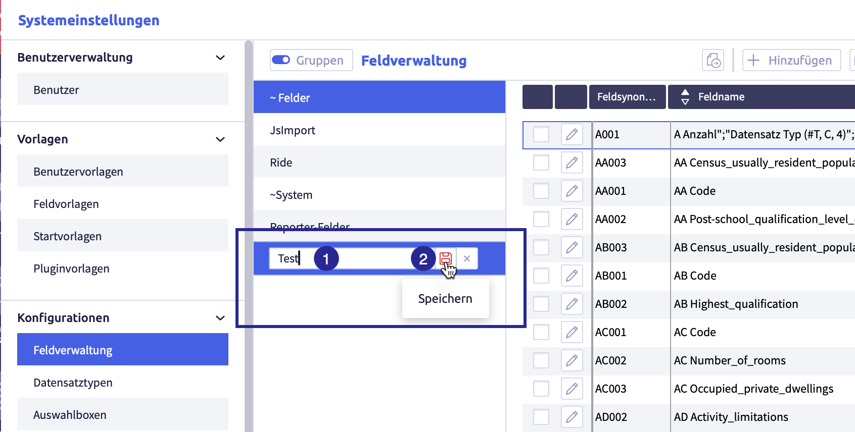
-
enter the name of the group
-
click the button Save
The list with the group names will be updated, the group has been sorted alphabetically.
Rename a group
-
click the group you want to edit
The button Edit
will appear.The image shows the group that can be edited:
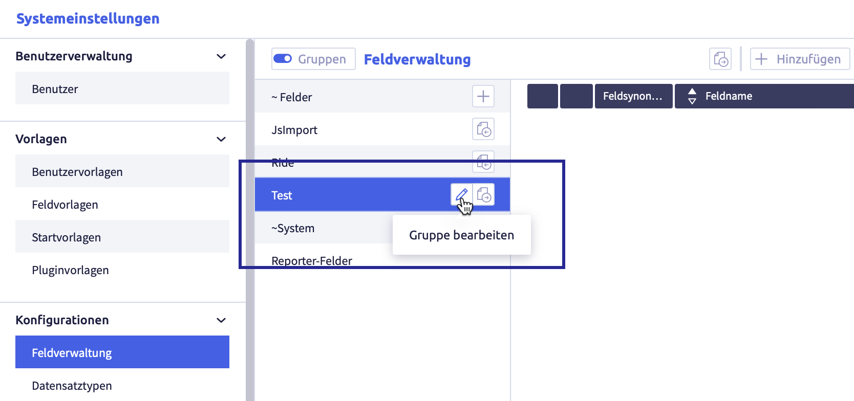
-
click the button Edit
The element can be edited or deleted.
The image shows the edit possibilities of the group:
-
edit the group name
-
click the button Save
(or Cancel)The list with the group names will be updated, the group has been sorted alphabetically.
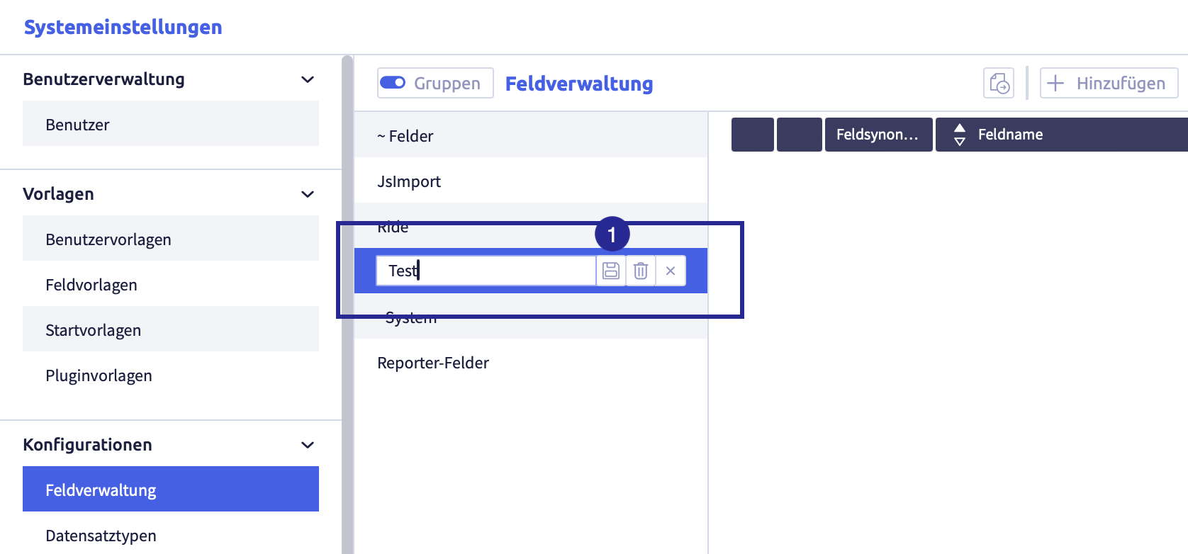
Delete a group
-
click the group you intend to edit
The button Edit
will appear.The image shows the group that can be edited:
-
click the button Edit
The element can be edited.
The image shows the edit possibilities of the group:
-
click the button Delete
The following confirmation window opens:
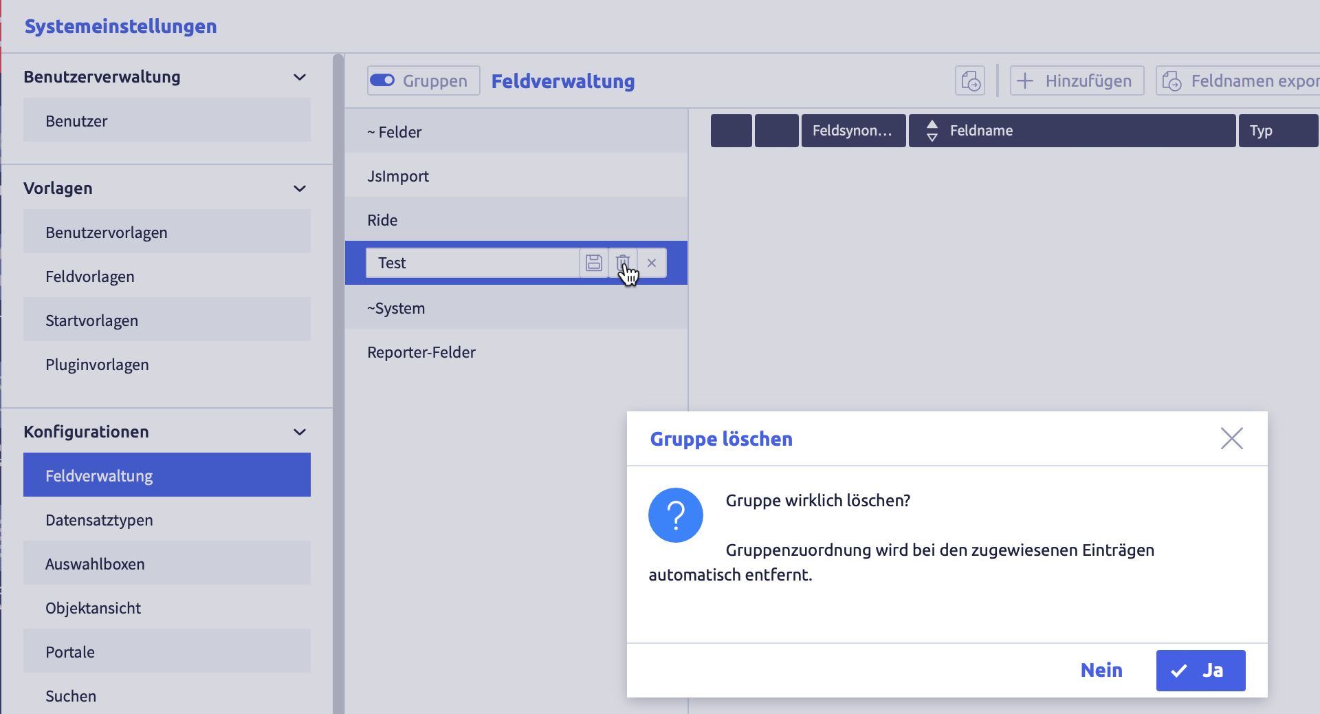
-
click the button Yes (or No)
The group will be deleted and the list of groups will be updated.
Links of elements to this group are automatically deleted.
Add elements to a group
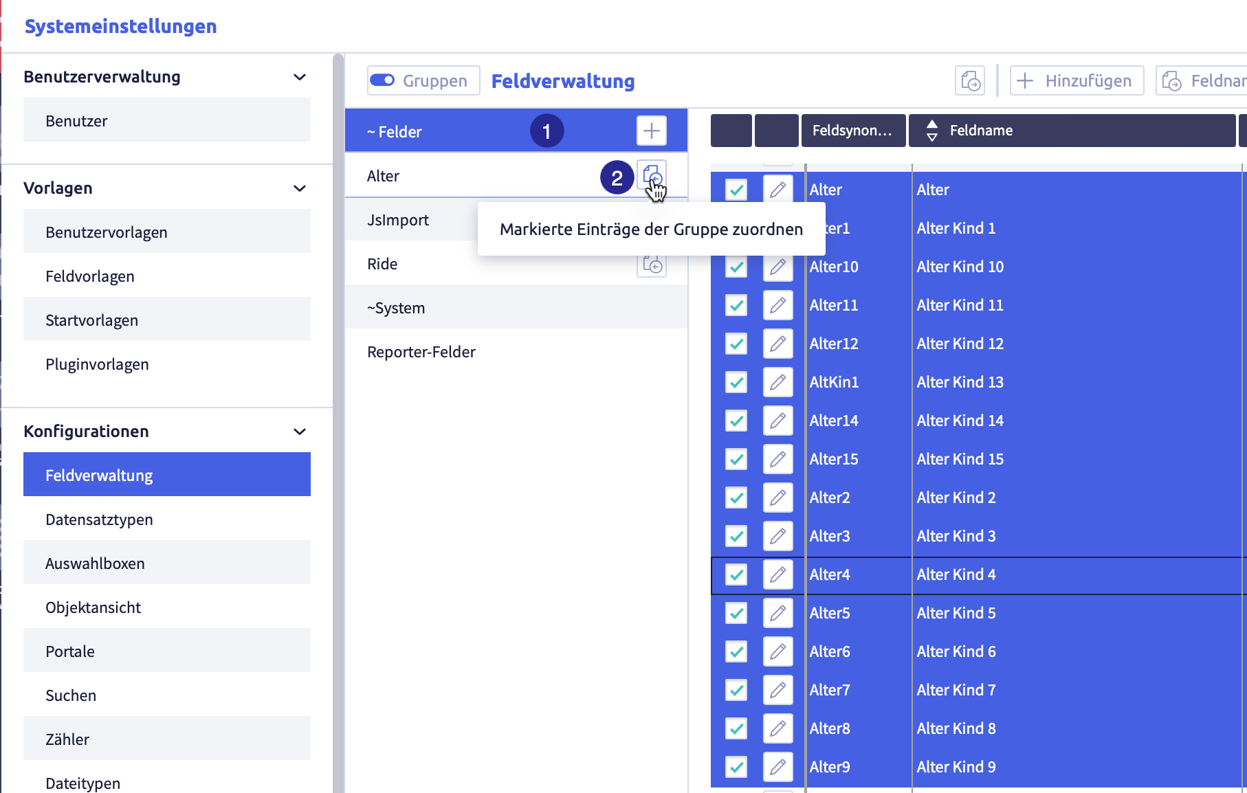
(1) selected group with selected elements you want to add to another group, (2) button Assign selected entries to the group
-
select a group from which you want to add elements to another group
-
select all the elements you want to add to the group
-
click the button Assign selected items to group
of the new groupThe elements are added to the group.
An element can belong to several groups.
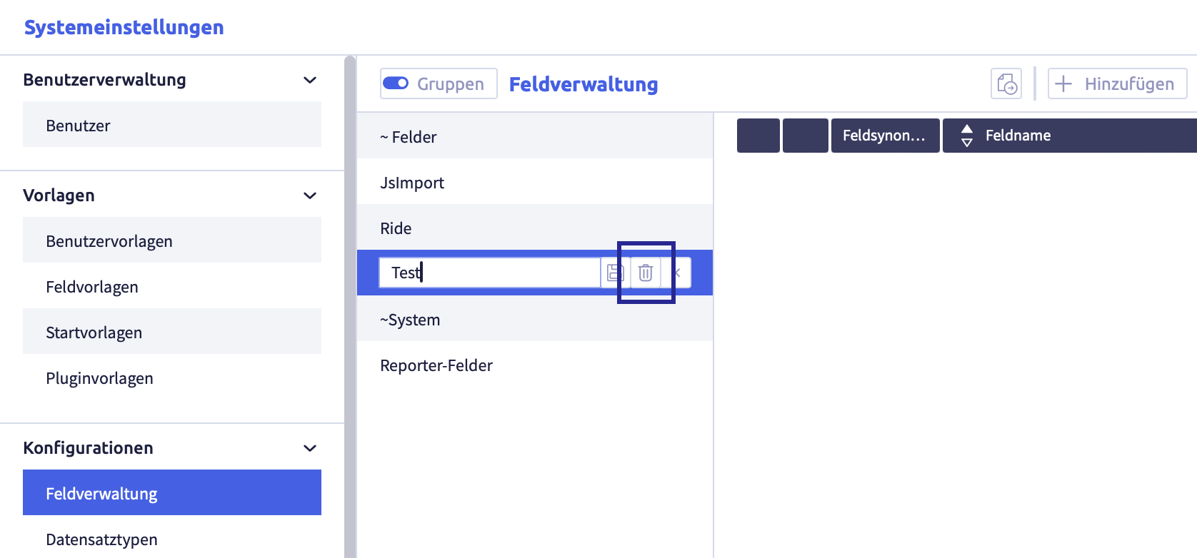
Remove elements from a group
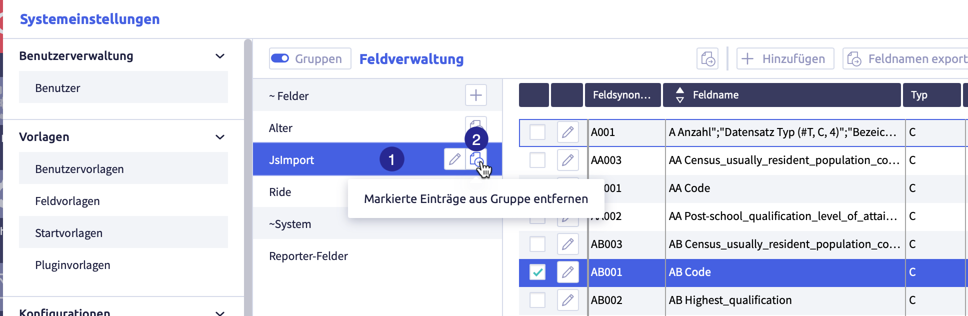
(1) selected group with selected elements to be removed from the group, (2) button Remove selected entries from group
-
click the group from which you want to remove elements
-
select all the elements you want to remove from the group
-
click the button Remove selected items from group
 of the group
The elements will be removed from the group.
Analysis, supplement, correction
The button Analysis, add, correction is used to check all record types with regard to
- links: links without a target will be added
- invalid links: will be resolved
- repetition fields: will be repaired if necessary
In addition, the cache will be cleared and the status of all record types will be updated.
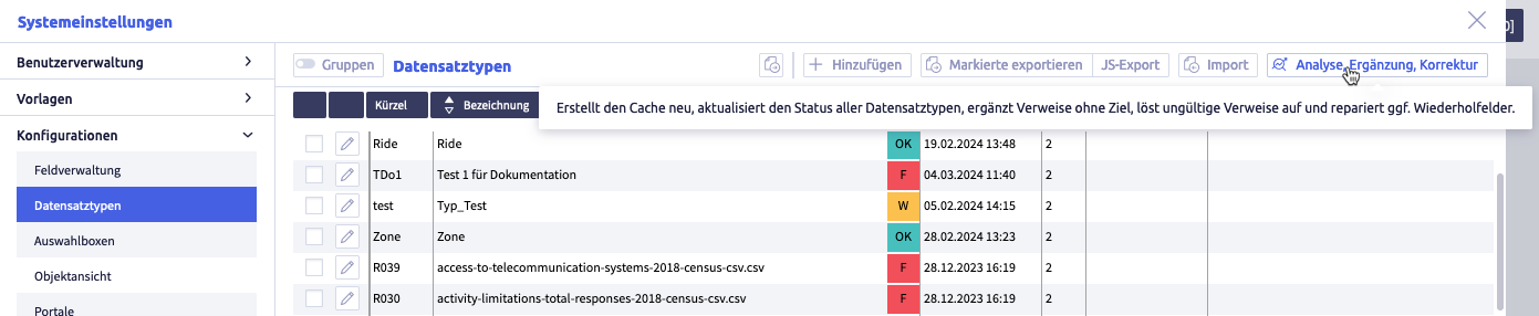
-
click the button Analysis, supplement, correction
The following window opens:
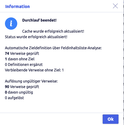
-
click the button Ok
The list in record types is displayed again.
Export and import record types
The following exports and imports are possible for record types:
- export selected data as a CSV
- export record types with record type definition and field definition
- export record types as JS file
- import record types
Each export is only carried out for selected rows in the list of record types.
Image with buttons for export and import
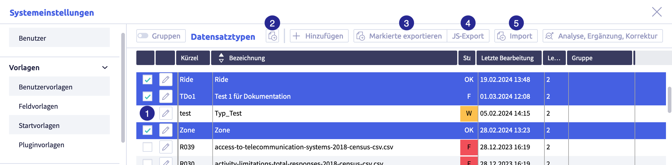
The image shows the export and import buttons: (1) checkbox to select row, (2) button Export selected data as CSV
Export selected data as CSV file
Image with buttons for export and import
The image shows the export and import buttons: (1) checkbox to select row, (2) button Export selected data as CSV
-
select the rows you want to export
-
click the button Export selected data as CSV file
The CSV file will be downloaded and saved in the download folder (or the folder that was set for it in the browser).
The file name will be generated automatically and is called Record-type-definition#.csv.
A list with the following information will be exported:
| Column | Meaning | Note |
|---|---|---|
| abbreviation (synonym) | abbreviation of the record type | |
| name | name of the record type | |
| status | status of the record type | options: OK = record type is error-free W = there are hints for entries / configuration F= there are incorrect entries or missing required fields |
| last edit | date of last editing | |
| last editor | user ID of the last editors | |
| group | name of the group(s) of the record type |
Export selected record types completely
This export comprises
- all field definitions in the current data inventory
- record type definitions of the selected entries
Record types exported in that way can be imported back into a CortexEngine.
Image with buttons for export and import
The image shows the export and import buttons: (1) checkbox to select row, (2) button Export selected data as CSV
-
select the rows you want to export
-
click the button Export selected
The following window opens:
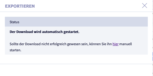
A .tar file will be downloaded and saved in the download folder (or the folder that was set for this in the browser).
The file name will be generated automatically.
Export selected record types as JS file
This export comprises all field definitions in the current data inventory.
Image with buttons for export and import
The image shows the export and import buttons: (1) checkbox to select row, (2) button Export selected data as CSV
-
select the rows you want to export
-
click the button JS export
A .js file will be downloaded and saved in the download folder (or the folder that was set for this in the browser).
The file name will be generated automatically.
The JavaScript of selected record types can be exported dedicatedly with the button JS export.
Import record types
Completely exported record types from another CortexEngine can be imported with the button Import into the current CortexEngine.
Image with buttons for export and import
The image shows the export and import buttons: (1) checkbox to select row, (2) button Export selected data as CSV
-
click the button Import
The following window opens:
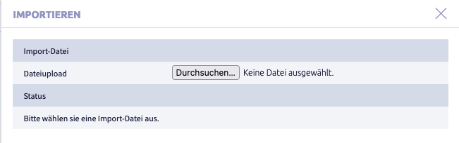
-
click the button Select file
A window with a file folder opens.
-
select a file
The following formats are suitable for import:
- .tar
- .tar.gz
- Fld.json
- #Dst.ctxexp
-
click the button Import
The following window opens (as an example import of a .tar file):
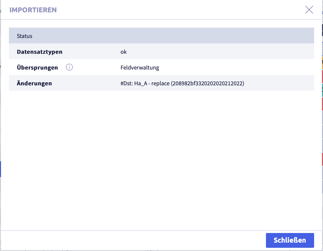
-
click the button Close
The list in record types will be displayed again.