Object view
An underestimated, but also very simple and powerful function of the Uniplex is the Object View. Starting from a record, this function enables the compact display of networked information on the selected record. The type, scope and selection depth are defined using the configuration of the object view and the lists used. Here, all set user permissions and the function permissions apply, which means that not every user can see and use all data fields and/or all object views.
Warning
- Changes in system settings often only take effect when a restart is carried out after closing the system settings (menu item under the button with the user name at the top right, see also introduction).
- If another user with admin rights is currently editing this system setting, the red icon lock
 appears in the header and a warning message appears with the name of the currently active user.
Configuration
Object views, as with all configurations, can also be configured in the system settings. To do this, simply click on Object view in the system settings menu to access the selection of existing configurations or to create new ones. In this list, you can (1) add, (2) export or (3) import new configurations.
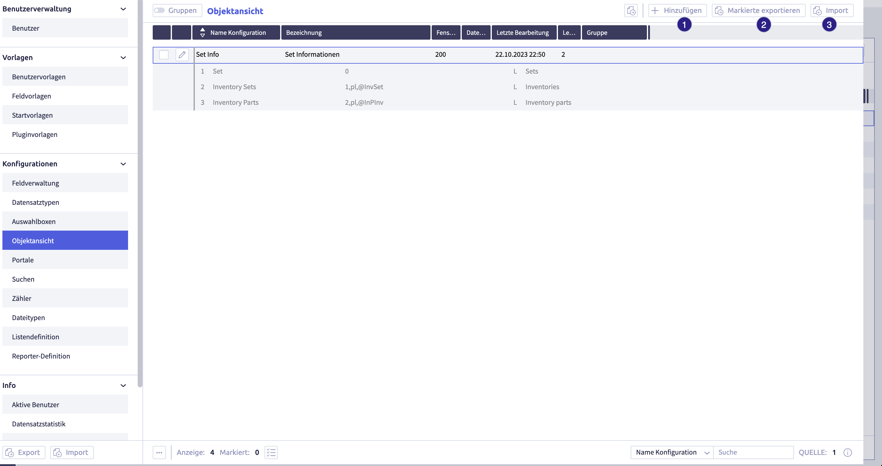
To create a new object view, click the button (1) Add 
The dialogue for carrying out the configuration opens.

Dialogue
Configuration name (1)
Here you assign a name for the configuration that is used only internally in the list of all object views in the system settings shown above.
Name (2)
A name is also required, which will later be displayed as a heading in the object view.
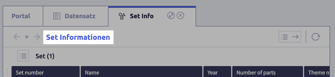
Example from Lego®DB
Name tab (3)
A name for the tab when the object view is displayed.
Example from Lego®DB

Window-Id (200-299) (4)
By assigning a unique window ID, the assignment for the object view tabs is defined in the Uniplex. Tabs with the same ID replace each other, while tabs with different IDs can be opened simultaneously.
Root record type (optional) (5)
Object views can also be based on record types other than the one currently selected.
Example
This data model consists of three main entities that are linked as follows:
Persons <- Projects <- Activities
Activities can be linked to projects, which in turn are assigned to persons. If an object view is called up starting from an activity, the parent project is used as the root by default. However, in rare cases it may be useful to specify an optional root record type. This is selected in the corresponding field.
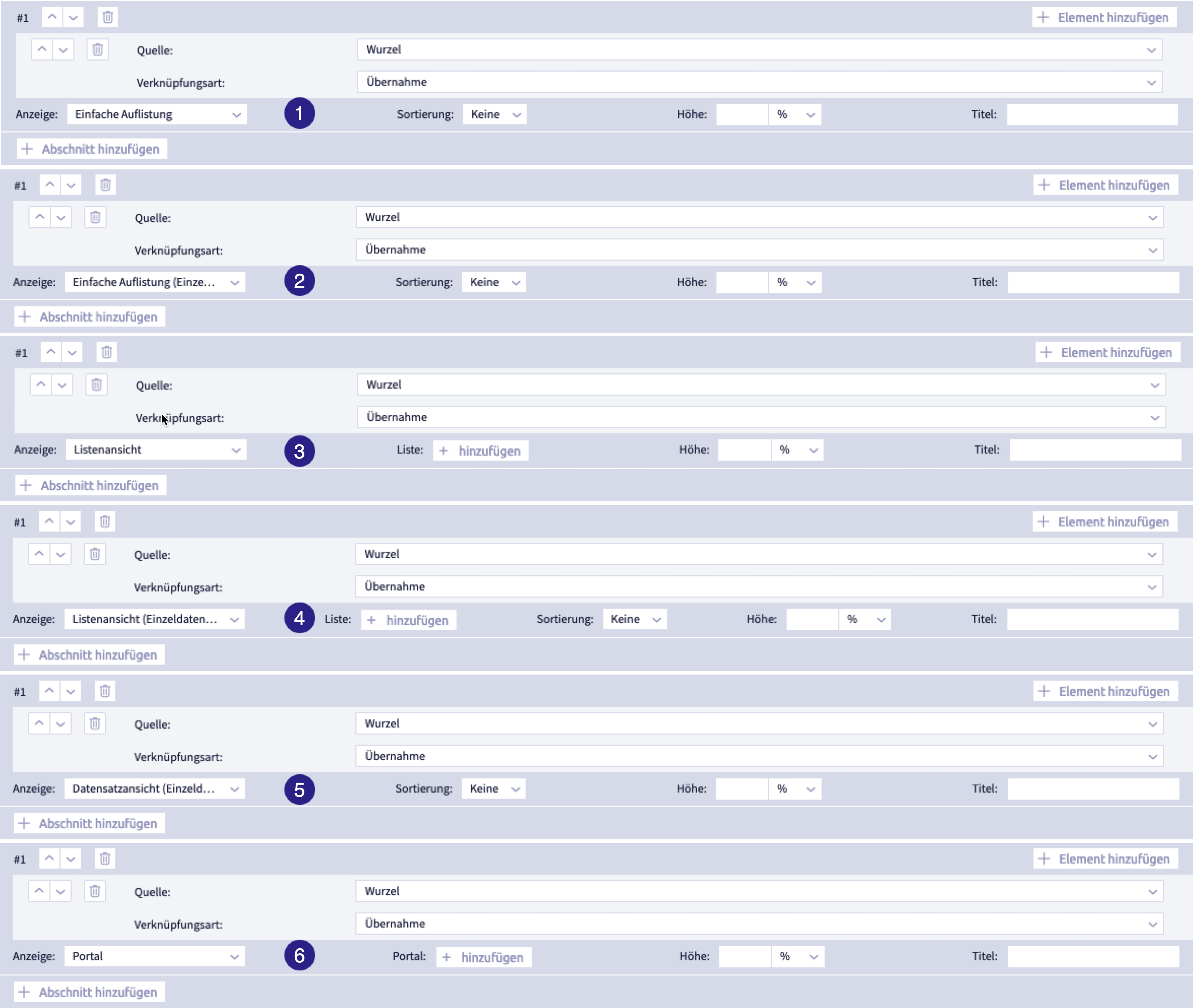
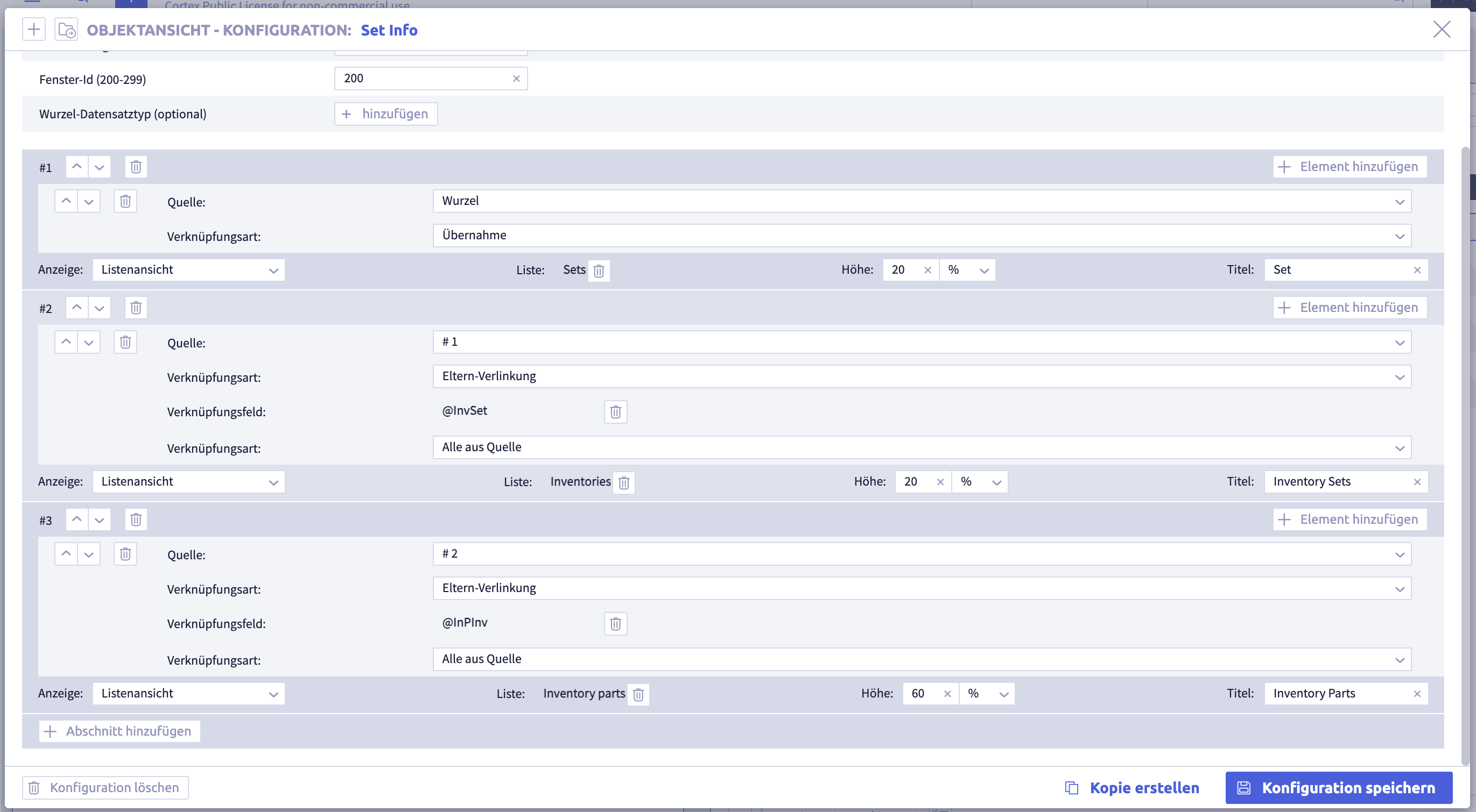
Add a section (6)
Once the basic settings have been defined, the individual sections can be configured.
Sections
click the button (1) Add element . Each section can contain a list (a simple system list or previously defined list) to display information on the selected records.

Source (2)
In order to obtain a result, it is first necessary to select the data source. In the image above, the first section accesses the root (in this case always the selected record).
Link type(3)
The link types are used to define how information will be selected.
Takeover (A)
With takeover, information from the selected record is selected and can be referenced in another section.
Parent linking (B)
The parent linking selects the records that refer to the source.
Example
If you have the following data model: Persons <- Projects, the projects referencing the person selected as the source will be selected.
Normal linking (C)
Normal linking shows the source to other records.
Example
If you have the following data model: Projects -> Persons, the persons for the project will be displayed here.
Field content link (D)
The field content link is an implicit reference based on the same field content in different (rarely identical) fields.
Display
Then, you can select whether the results should be displayed (in a simple list or list view) or not. In this case, the selected records only serve as a further source for a subsequent section.

Optionally, you can then assign each section a title and a size. The size specification only serves as a guideline in percent. The object view uses your specification as a key for distributing the space. For example, if you define two sections and assign 10% to one and 5% to the other, the available space is divided in a ratio of 2:1.
View after selection
(1) Simple listing
The Simple listing shows the selected records in a list in short form.
(1) View using the example Lego®DB

(2) Simple listing (single record)
In the Simple listing (single record), the selected records are displayed individually and can be selected via the navigation  .
.
(2) View using the example Lego®DB

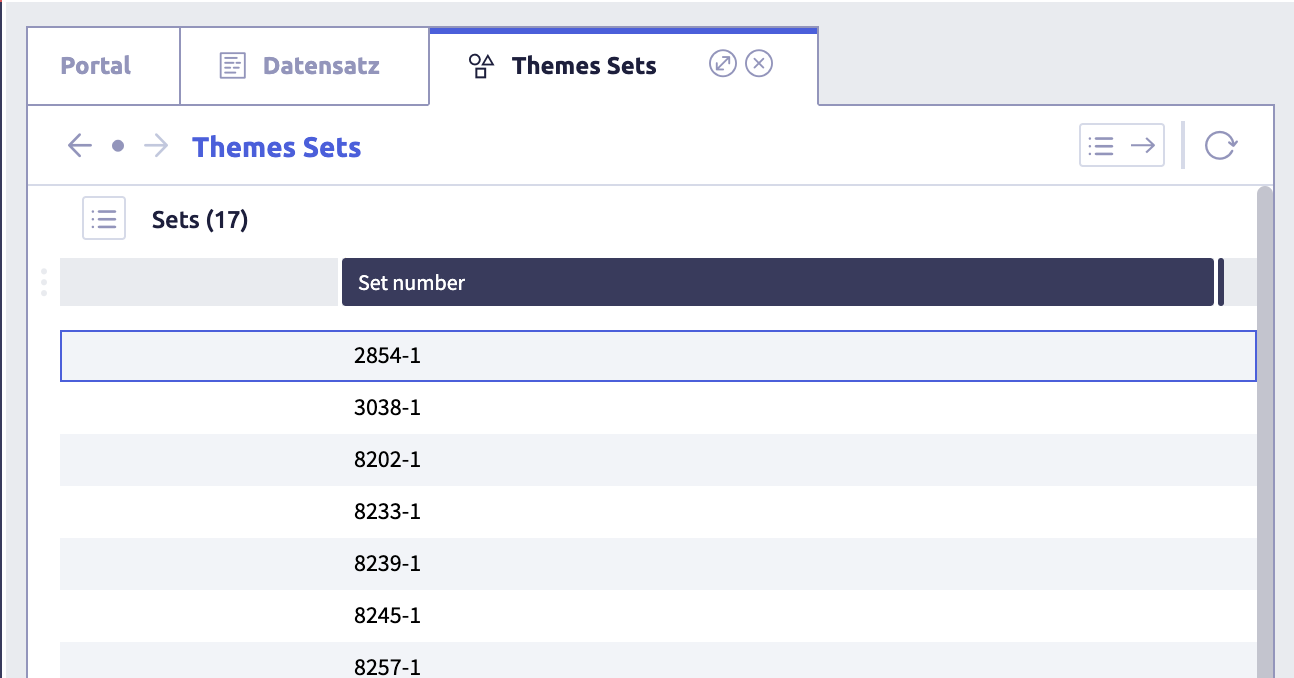
(3) List view
In the List view, the selected records are displayed in a list. You can define these in advance with customized columns.
(3) View using the example Lego®DB
(4) List view (single record)
In the List view (single record), the selected records are displayed individually in a list. You can define these in advance with customized columns.
Navigation between the records is done using the buttons.
(4) View using the example Lego®DB

(5) Record view (single record)
In the Record view (single record), the selected records are displayed individually as a record view.
Navigation between the records is done using the buttons.
(5) View using the example Lego®DB

(6) Portal
In the Portal display, the selected records are displayed in a portal view.
(6) View using the example Lego®DB
Info
Once you have configured an object view and saved the configuration, please select the record type to which you want to assign the object view in the system settings. You can then assign one or more object views in the main information for the record type.
Examples
Simple
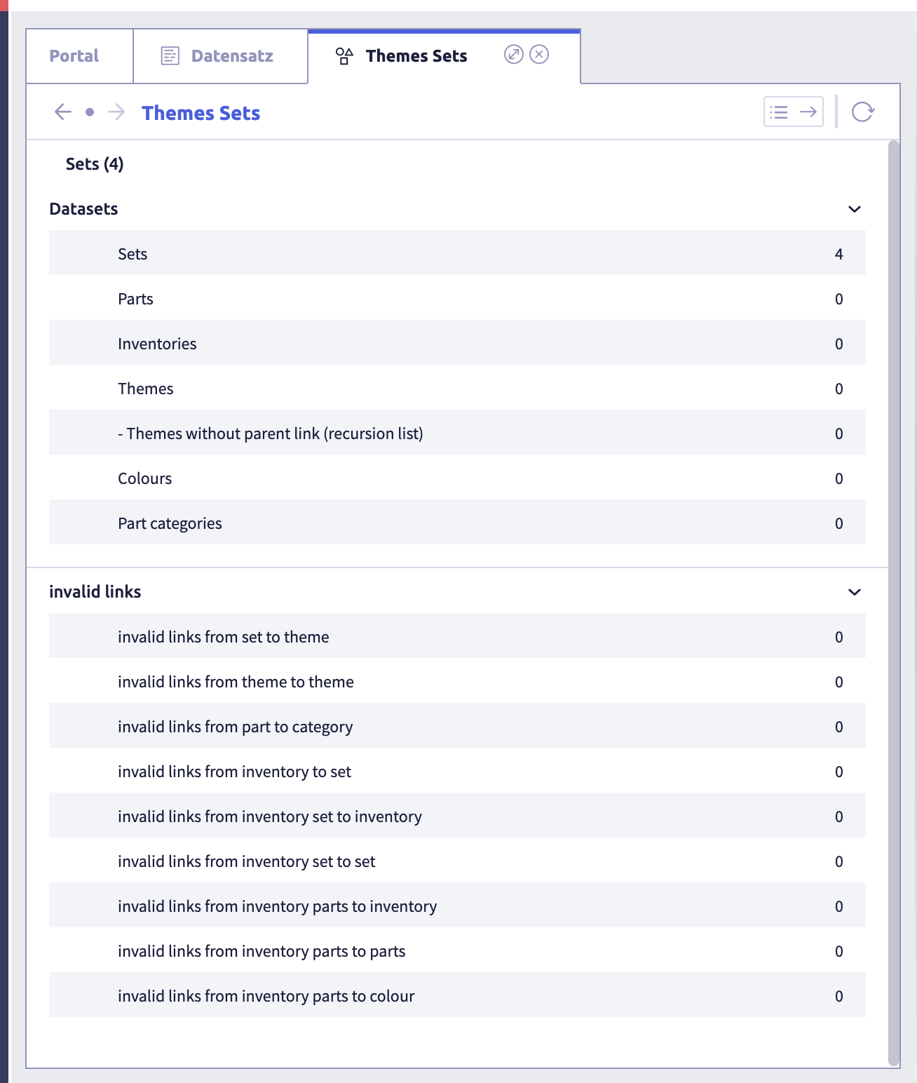
A simple object view has been configured below. In an example of the Lego®DB, this shows all sets for a specific theme.

Settings of a simple object view
Display of a simple object view
The screenshot also shows a list function that can be used to call up the object view directly in the record row. Further information on the configuration of such a list can be found here.
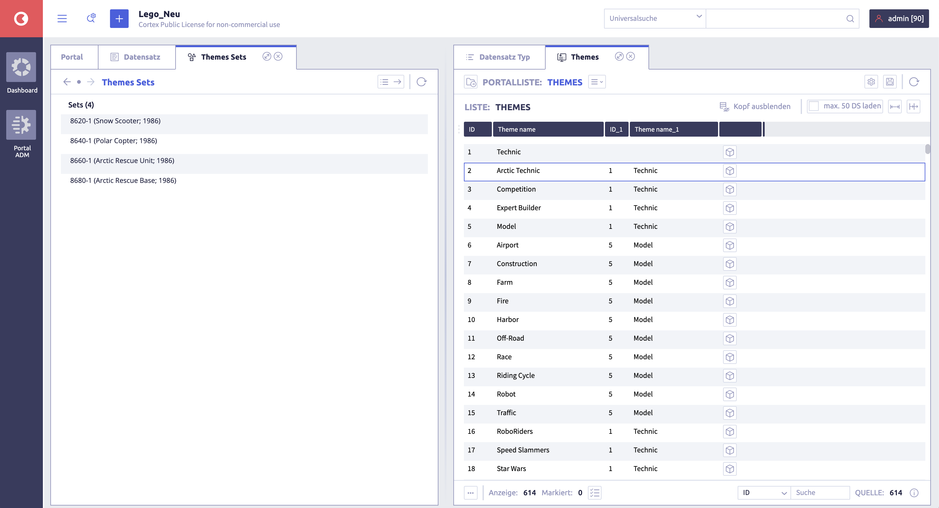
Complex
A more complex object view can be configured, as shown in the following example. Note that each section can access any source, including other sections as well as the original root.
Settings of a complex object view
With the help of these functions it is possible, for example, to list all the individual parts used from a Lego® set and thereby generate a parts list.

Display of a complex object view
Info
Depending on the complexity of the data model and the previously configured lists, object viewers can also reach a high level of complexity. You should therefore consider the available space and limit yourself to the necessary information and list configurations.
Wherever networked structures can be displayed, it may make sense to use an object view.
Hint
Please note that the permissions in the user templates must be set accordingly for the configured object views.
Organize object views into groups
If the function Groups is active, the record types can be organized into groups for simplified management.
The following actions are possible:
- create groups
- rename groups
- delete groups
- add elements to a group
- remove elements from a group
Note
The actions are shown using the example Field management.
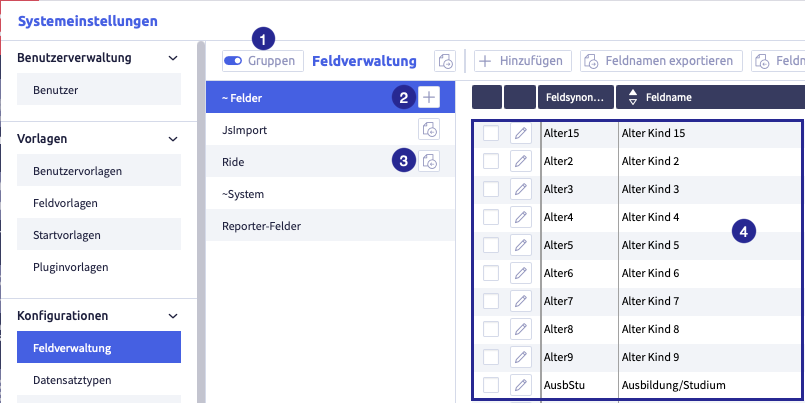
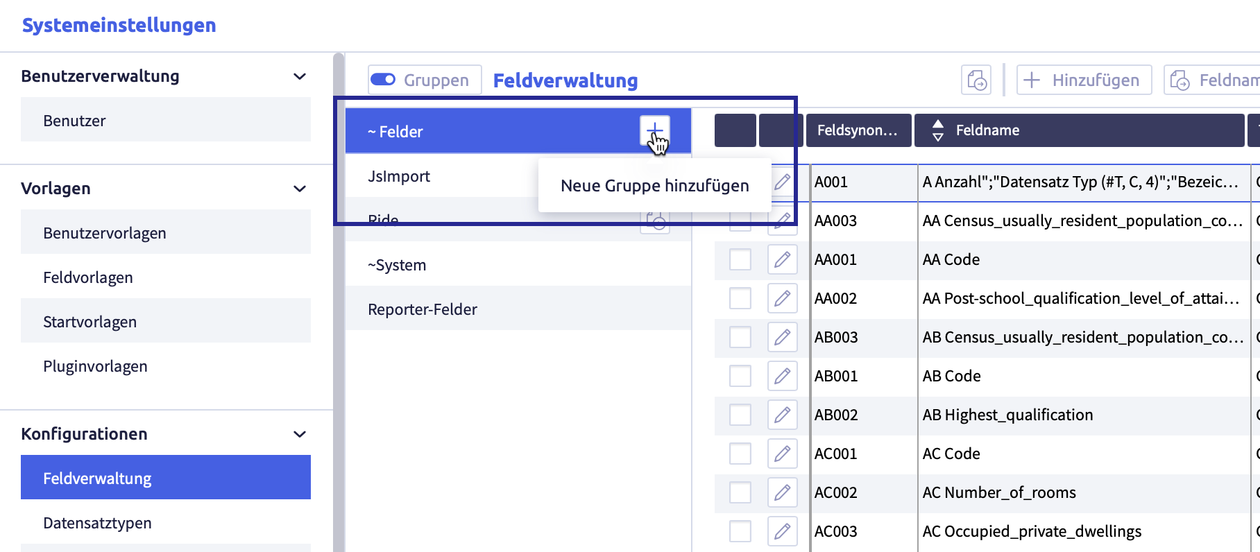
The image shows the field administration with active groups: (1) button Activate groups, (2) button Add group
, (4) fields from the currently active group
Create a group
The image shows the field administration with active groups
Create user-defined groups
-
click the button Add group
A new row will be added:
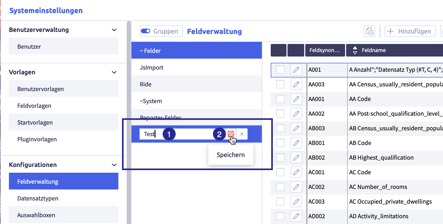
-
enter the name of the group
-
click the button Save

The list with the group names will be updated, the group has been sorted alphabetically.
Rename a group
-
click the group you want to edit
The button Edit
 will appear.
The image shows the group that can be edited:
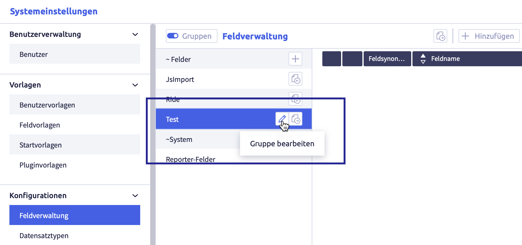
-
click the button Edit
The element can be edited or deleted.
The image shows the edit possibilities of the group:
-
edit the group name
-
click the button Save
(or Cancel)The list with the group names will be updated, the group has been sorted alphabetically.
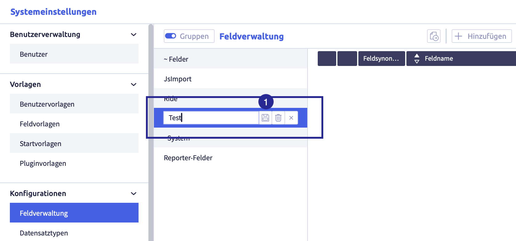
Delete a group
-
click the group you intend to edit
The button Edit
will appear.The image shows the group that can be edited:
-
click the button Edit
The element can be edited.
The image shows the edit possibilities of the group:
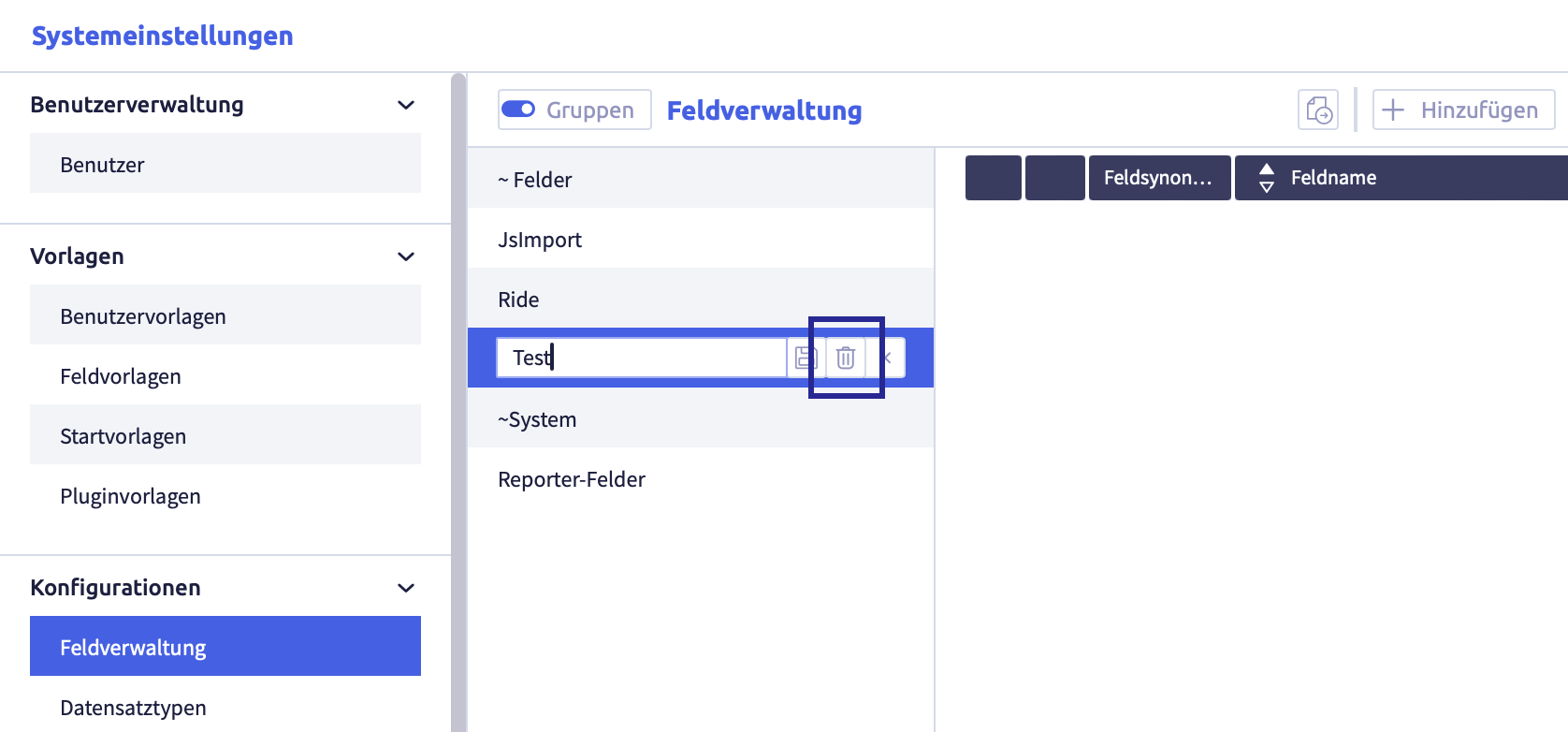
-
click the button Delete

The following confirmation window opens:
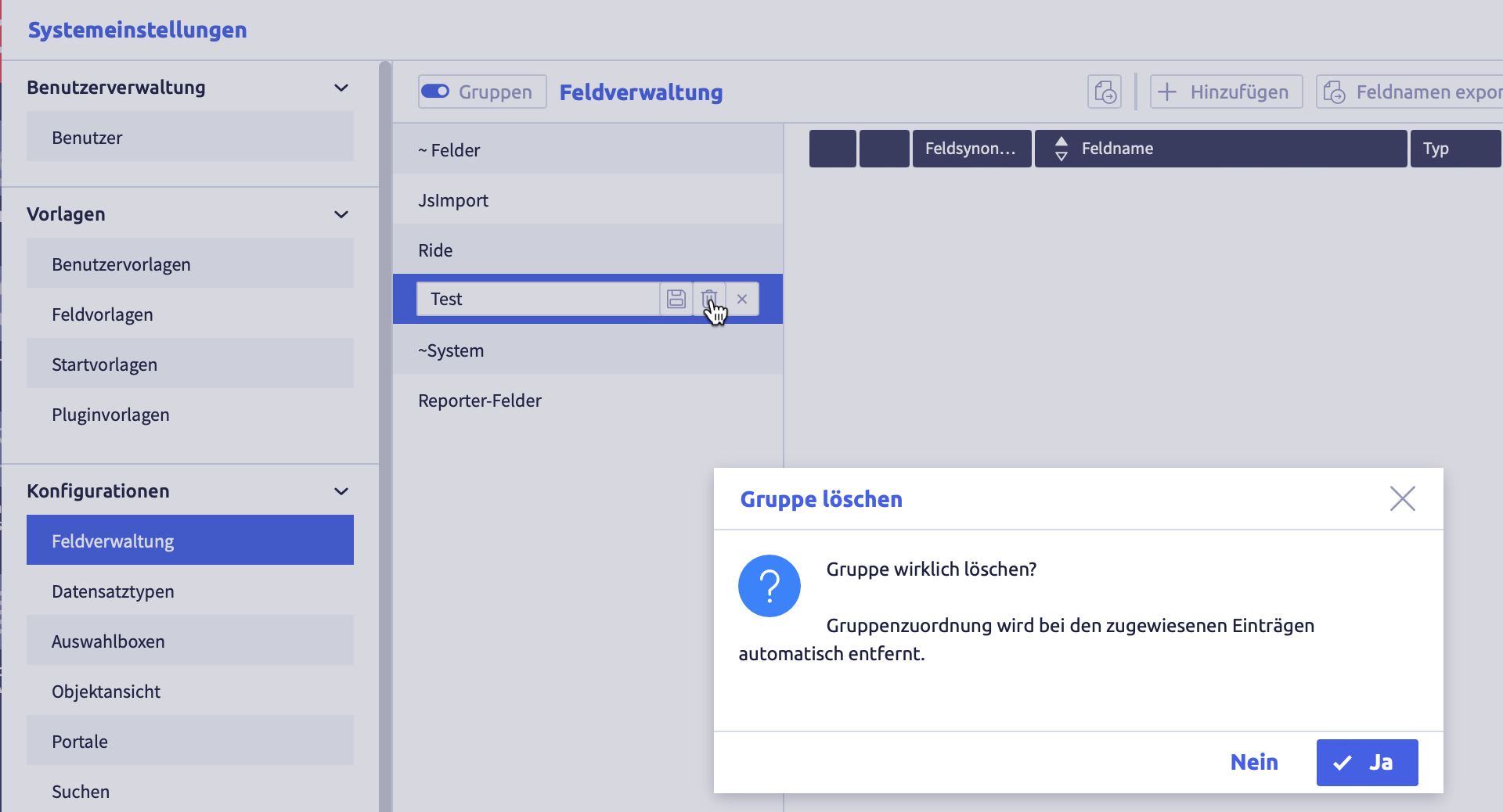
-
click the button Yes (or No)
The group will be deleted and the list of groups will be updated.
Links of elements to this group are automatically deleted.
Add elements to a group
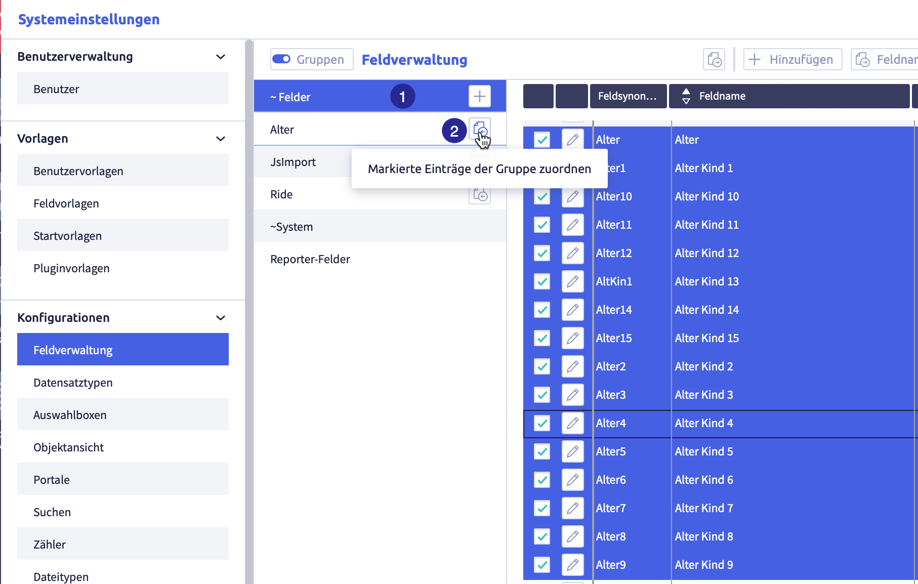
(1) selected group with selected elements you want to add to another group, (2) button Assign selected entries to the group
-
select a group from which you want to add elements to another group
-
select all the elements you want to add to the group
-
click the button Assign selected items to group
of the new groupThe elements are added to the group.
An element can belong to several groups.
Remove elements from a group
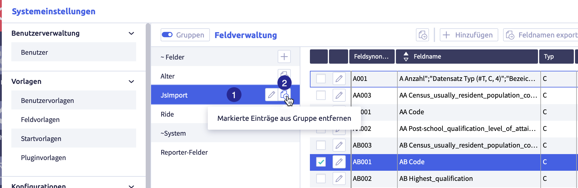
(1) selected group with selected elements to be removed from the group, (2) button Remove selected entries from group
-
click the group from which you want to remove elements
-
select all the elements you want to remove from the group
-
click the button Remove selected items from group
 of the group
The elements will be removed from the group.
Export and import object views
The following exports and imports are possible for object views:
Each export is only carried out for selected rows in the object view list.
Image with buttons for export and import
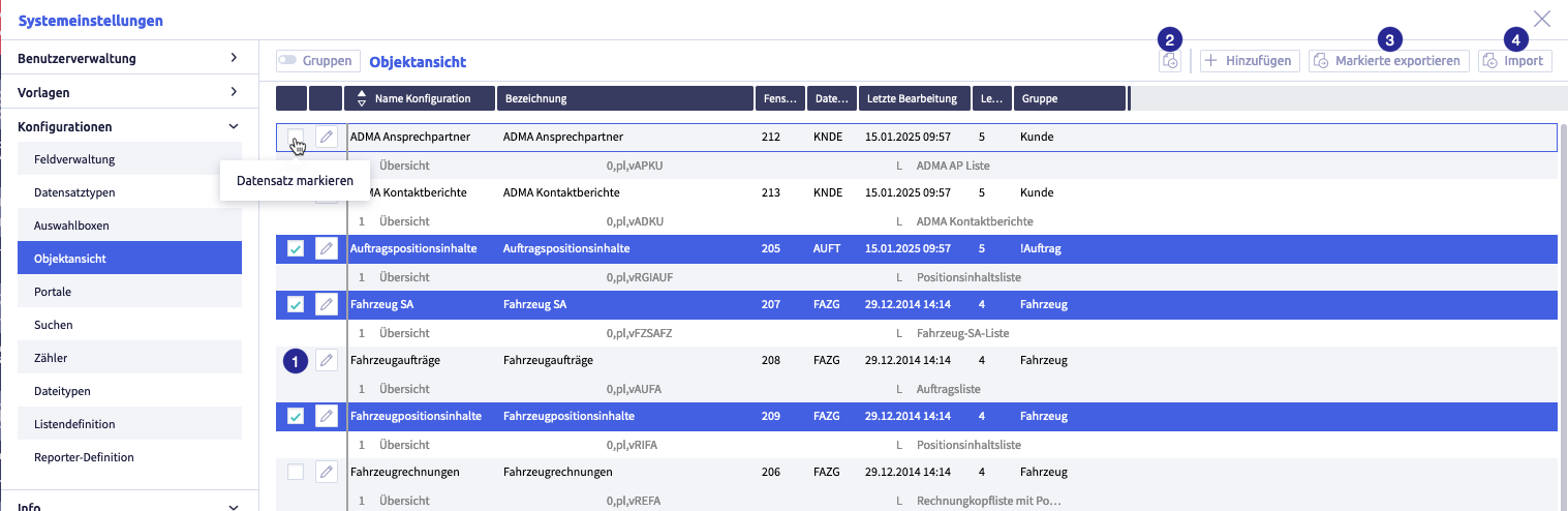
The image shows the export and import buttons: (1) checkbox to select row, (2) button Export selected data as CSV
Export selected data as CSV file
Image with buttons for export and import
The image shows the export and import buttons: (1) checkbox to select row, (2) button Export selected data as CSV
-
select the rows you want to export
-
click the button Export selected data as CSV file
The CSV file will be downloaded and saved in the download folder (or the folder that was set for this in the browser).
The file name will be generated automatically and will be called #Object viewer definitions.csv.
A list with the following information will be exported:
| Row | Meaning | Note |
|---|---|---|
| configuration name | name of the object view configuration | internal name, only visible in system settings |
| name | name of the object view | |
| window Id | ||
| record type | abbreviation of root record type | |
| last edit | date of last editing | |
| last editor | user ID of the last editors | |
| group | name of the group(s) of the object view configuration | |
| section | number of sections in object view | |
| title | title of the view | |
| source | includes the following information: source (root, in case of several sections, all previous sections are additionally possible as source), link type (not specified / pl / nl / cl), field synonym of linked field | 0=root, >br> not specified=take over pl=parent linking nl=normal linking cl=field content link |
| type | display type | options: - no display - simple listing (A) - simple listing (single record) (AS) - list view (L) - list view (single record) (LS) - record view (single record) (R) - portal (P) |
| list | assigned list definition to display the object view | |
| portal | assigned portal to display the object view |
Export selected configurations
This export includes the configurations of the selected entries.
Search configurations exported that way can be imported back into a CortexEngine.
Image with buttons for export and import
The image shows the export and import buttons: (1) checkbox to select row, (2) button Export selected data as CSV
-
select the rows you want to export
-
click the button Export selected
The following window opens:
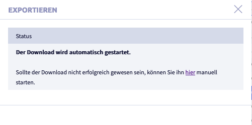
A .tar file will be downloaded and saved in the download folder (or the folder that was set for this in the browser).
The file name will be generated automatically.
Import configurations
Selected exported configurations from another CortexEngine can be imported into the current CortexEngine using the button Import.
Image with buttons for export and import
The image shows the export and import buttons: (1) checkbox to select row, (2) button Export selected data as CSV
-
click the button Import
The following window opens:
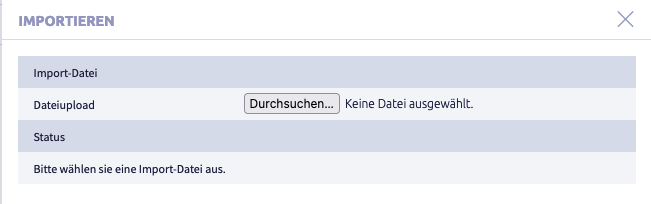
-
click the button Select file
A window with a file folder opens.
-
select a file
The following formats are suitable for import:
- .tar
- .tar.gz
- #Obj.ctxexp
-
click the button Import
The following window opens:
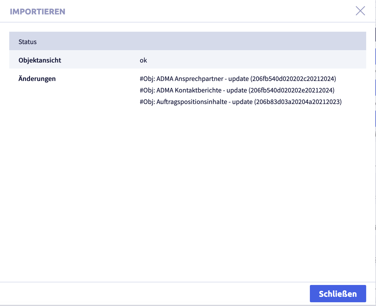
-
click the button Close
The list in Object view will be displayed again.