Simple lists
Introduction
Within Uniplex, lists are one of the main functions for displaying results and content. Simple displays and further functions depend on the configuration of a list via its list definition.
Every output of results and content uses the standard list function.
Lists are used for:
- result lists for searches and portals as simple list with rows and columns
- substructured outputs (sublists)
- sublists with calculated content (JavaScript in lists), which may also be evaluated as pivot table
- pivot tables for analyzing and evaluating data in lists
- simple lists with direct link fields for the list selects function
Any number of complex lists with sublists etc. can be created from simple lists.
List results serve as the basis for:
- displaying the data in dashboards
- provision of the information in other applications via CortexProtocol
- bulk deletion of records
Within the lists, similar functions are possible as in Excel, e.g.
- sorting and filtering
- summarizing text fields / summing numeric fields
Simple list
Lists are used to display search results or selections, for example. In the simplest form, lists consist of one row per record, with the information displayed in columns. Clicking on a row displays the corresponding record in the other half of the screen.
If no list has been defined yet
If you have not yet defined a list, the selected results can be displayed in a new, empty list, e.g. via
Depending on the permission of the user account (defined in user templates), a user has access to various functions.
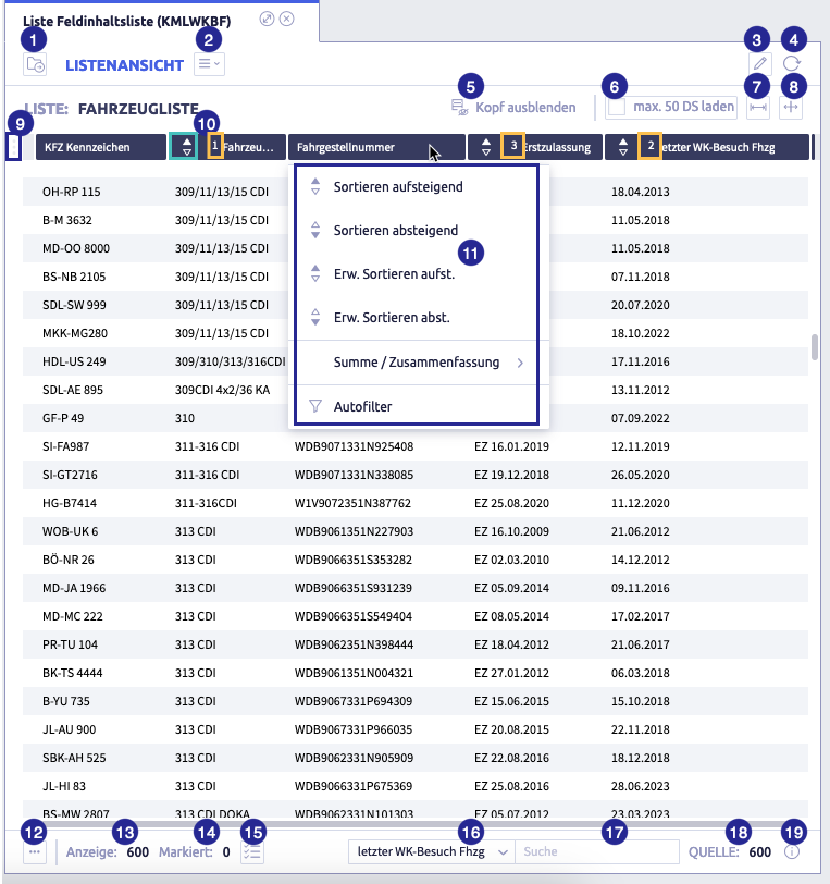
The image shows a list view: (1) button Load list definition
, (2) selection menu
, (3) button Edit
, (4) button Refresh records
, (5) button Hide header, (6) button Load a maximum of 50 records, (7) button Enlarge workspace
, (8) button Move columns active
or Move separator active
, (9) button Total row view / single row view
, (10) column header with sorting elements, (11) options for column header, (12) button Context action for current row
, (13) information on the number of displayed/loaded rows, (14) information on the number of selected rows, (15) button Select all
, (16) selection Search column, (17) field Search, (18) information on the number of sources, (19) button Info
Table with all elements of the list view
| Name | Meaning | Note |
|---|---|---|
| button Load list definition | select a different list definition | |
| Selection menu | display menu | |
| button Edit | edit the existing list definition | depending on user permissions |
| button Reload records | ||
| button Hide header | hide column headers of the list | |
| button Load a maximum of 50 records | ||
| button Enlarge workspace | Enlarges the space for the list within the window to the right. A horizontal scrollbar appears and columns can be drawn wider. | |
| button Move separator active / Move columns active | adjust column widths | |
| button Total row view / single row view | display of the list header | single row view shows the column headers of the main list total row view shows the headers of sublists, additional rows etc. |
| column header with sorting elements | green frame: Sort column in ascending/descending order yellow frame: when sorting into several columns, the number indicates the order. In the example, first by vehicle type, then within the type by the last day in the workshop and for same day, by day of first registration |
|
| Options for column header | click on column header to open the options | |
| button Context action for current row | object views for the current record type can be opened using this button | object views are managed and record types assigned in the system settings. |
| information on the number of displayed/loaded rows | ||
| information on the number of selected rows | ||
| button Select all | select all rows | |
| select Search column | which column will be searched after the entry in the search field | |
| field Search | enter the search text for which the selected column is to be searched | not case-sensitive, also finds partial content, e.g. inter for sprinter |
| information number of sources | ||
| button Info | information on the loading time of the list |
Button Move separator active
If you move the separator between two columns, one becomes wider and the other narrower, as the "outer" separators are not affected.
You can also drag the left separator of a column to another position in the list to move the column.
Button Move columns active
All columns to to the right of the separator are moved as a block. The widths of the moved columns remain the same, only the width of the column that is adjusted will change.
Button Total row view / Single row view
Clicking on this button switches the view between total row view incl. sublists and single row view.
Example screenshot for a list without sublist
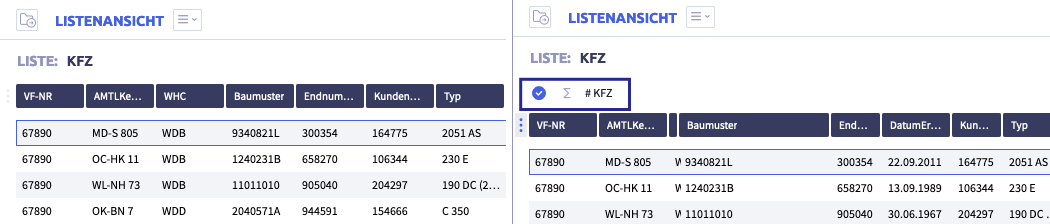
The image shows on the left: Single row view, right: total row view
Example screenshot for a list with sublist
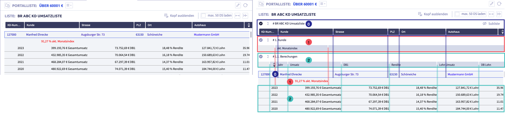
The image shows on the left: Single row view, right: total row view.
In the total row view, the pairs of numbers show the header and the corresponding rows and the colored lines indicate the column borders.
Selection menu
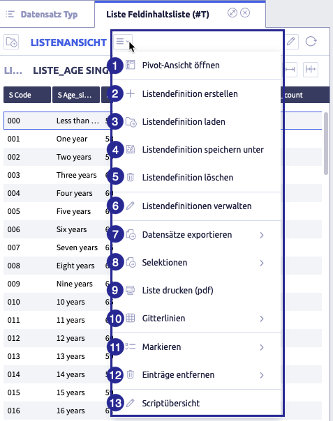
The image shows the selection menu of the list view: (1) open pivot view
, (2) create list definition
, (3) load list definition
, (5) delete list definition
, (6) manage list definitions
, (8) selections
, (10) grid lines
, (11) select
, (12) remove entries
Table with all elements of the selection menu
| Name | Meaning | Note |
|---|---|---|
| Open pivot view | only available in list view | |
| Create list definition | add a new list definition | |
| load list definition | load an existing list definition | |
| Save list definition as | ||
| Delete list definition | ||
| Manage list definitions | ||
| export records | possible options: export all or selected records as CSV or XML file; not relevant in the editor | |
| Selections | create extract from a list | possible options: - load selection - save selection - delete selection - edit selections not relevant in the editor |
| print list | not relevant in the editor | |
| grid lines | list view with grid | possible options: - create grid lines - remove all grid lines |
| select | select list entries | possible options: - select all - invert selections - deselect not relevant in the editor |
| remove entries | selected list entries are temporarily removed from this list view | not relevant in the editor |
| script overview | shows available scripts | not relevant in the list definition editor |
Selections
Selections are subsets from a list.
The following actions are possible:
- add and save a selection
- load a selection
- delete a selection
- edit a selection: add or delete entries
Add a new selection
-
open a list definition or create a new list view
If no list has been defined yet
If you have not yet defined a list, the selected results can be displayed in a new, empty list, e.g. via
-
mark the entries you want to create a selection for
Sort or filter the list view as required.
-
in the selection menu, select
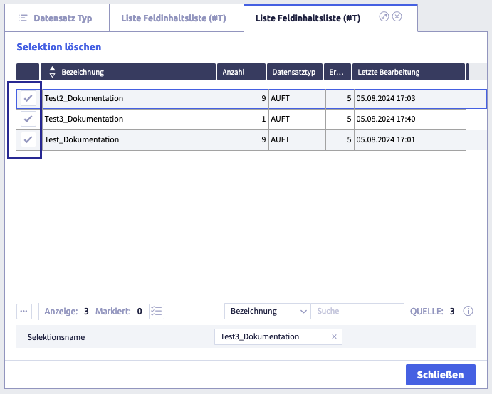
Selections and then Save selectionThe following window opens:
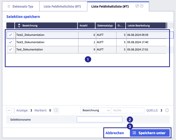
The image shows the dialog for saving a selection: (1) list with the existing selections, (2) field Selection name, (3) buttons Save as / Cancel
-
enter a selection name
-
click the button Save as
The selection, i.e. the list with the previously selected entries, will be displayed.
Notes on working with selections
- A selection contains records of one record type. Therefore, it should be used with list definitions that were created to use the same record type. This guarantees that field contents from the records of the selection can be displayed.
- The selection can be edited like a simple list, for example:
Load a selection
-
open a record (and a compatible list definition to see list entries directly)
-
in the selection menu, select
Selections and then Load selection.The following window opens:
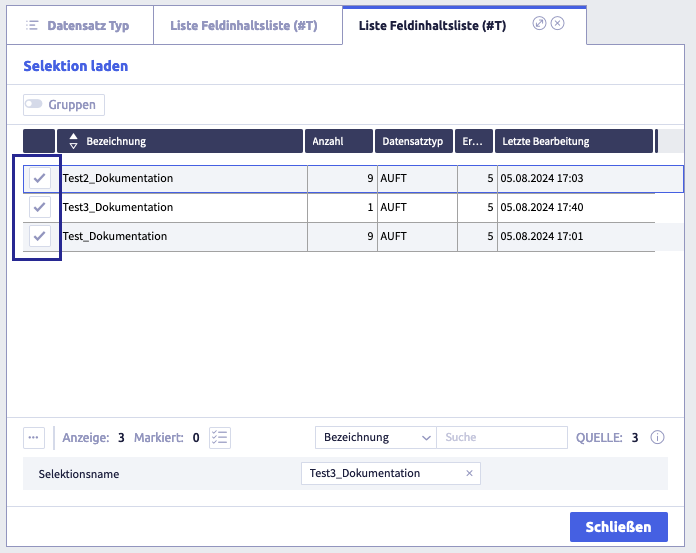
If you click the button Close, the previously opened list view will be displayed again.
-
click the button with the tick for the desired selection
The desired selection opens
Notes on working with selections
- A selection contains records of one record type. Therefore, it should be used with list definitions that were created to use the same record type. This guarantees that field contents from the records of the selection can be displayed.
- The selection can be edited like a simple list, for example:
Add entries to a selection
-
open a record (and a compatible list definition to see list entries directly)
-
mark the entries you want to add to the desired selection
Sort or filter the list view as required.
-
in the selection menu, select
Selections and then Save selectionThe following window opens:
The image shows the dialog for saving a selection: (1) list with the existing selections, (2) field Selection name, (3) buttons Save as / Cancel
-
click the button with the checkmark for the desired selection
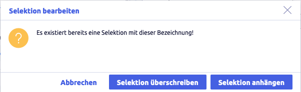
The following window opens:
-
click the button Append selection (or Cancel)
The entries are added to the selection.
The previously opened list view will be displayed again.
Notes on working with selections
- A selection contains records of one record type. Therefore, it should be used with list definitions that were created to use the same record type. This guarantees that field contents from the records of the selection can be displayed.
- The selection can be edited like a simple list, for example:
Delete entries from a selection
-
open a record
-
in the selection menu, select
Selections and then Load selectionThe following window opens:
If you click the Close button, the previously opened list view is displayed again.
-
click the button with the checkmark for the preferred selection
The required selection opens
-
mark the entries you want to remove
-
select in the selection menu
Remove entries and then Remove selected entriesThe entries will be removed from the list.
-
in the footer, click the button Select all
-
in the selection menu
select Selections and then Save selectionThe following window opens
The image shows the dialog for saving a selection: (1) list with the existing selections, (2) field Selection name, (3) buttons Save as / Cancel
-
click the button with the checkmark for the selection you want to overwrite
The following window opens:
-
click the button Overwrite selection (or Cancel)
The updated selection is displayed.
Notes on working with selections
- A selection contains records of one record type. Therefore, it should be used with list definitions that were created to use the same record type. This guarantees that field contents from the records of the selection can be displayed.
- The selection can be edited like a simple list, for example:
Delete a selection
You can delete a selection from any list view.
-
In the selection menu, select
Selections and then Delete selection.The following window opens:
If you click the Close button, the previously opened list view will be displayed again.
-
click the button with the checkmark for the selection to be deleted
A dialog box for deletion opens.
-
click the Yes (or No) button.
The selection is now deleted.
The previously opened list view will appear again.
Options for the column header
The following selection opens when you click on a column header:
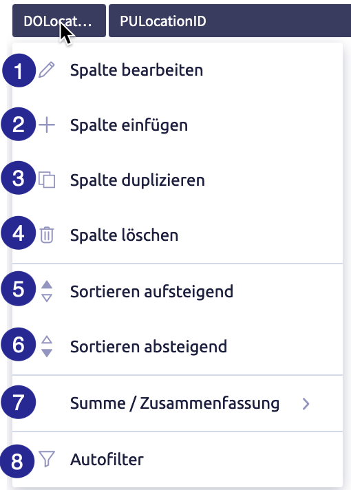
(1) edit column
, (4) delete column
, (6) sort descending
, (7) sum/summary, (8) auto filter
Table with all elements in the column header
| Name | Meaning | Note |
|---|---|---|
| edit column | define column display for the list view | editing depends on the permission of the user account |
| insert column | insert a column to the left of the current column | only available if the list view is being edited |
| duplicate column | only available if the list view is being edited | |
| delete column | only available if the list view is being edited | |
| sort ascending | sort list by this column in ascending order | |
| sort descending | sort list by this column in ascending order | |
| extended sort ascending | sort the list already sorted by at least one column by this additional column in ascending order (within the rows with the same field content in the already sorted column) | if the list is sorted by more than one column, a number is displayed in the column headers (1 for the first sort, 2 for the extended sort etc.) |
| advanced sort descending | sort the list of this additional column already sorted by at least one column in descending order (within the rows with the same field content in the already sorted column) | if the list is sorted by more than one column, a number is displayed in the column headers (1 for the first sort, 2 for the extended sort, etc.) |
| remove sorting | the column is no longer taken into account for sorting | |
| Sum / Summary | summary for all field types, sum for numeric field types | possible options: - Summary - Summary marked - Summary unmarked not relevant in the editor |
| Auto filter | filter list to reduce number of rows | not relevant in editor |
Sum / summary
The function Summary creates a list of the number of occurrences of each field content in this column (for all rows, for selected rows and for the corresponding unselected rows).
The function Summary is available for all field types/columns.
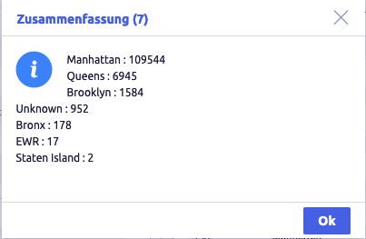
As an example, the image shows the summary for all field contents of the PULocation_borough column and the occurrence of the respective borough of New York.
For a column with numeric fields, you can, in addition to the summary, determine the sum of all field contents (for all rows, for selected rows and for the corresponding unselected rows).
Auto filter
The auto filter can be used to shorten the displayed list. It is possible to add an auto filter to more than one column, as when sorting by column. In addition, a shortened list can still be sorted.
It is advisable to use the auto filter for field contents that occur more than once.
When opening the auto filter, all field contents will be highlighted. Select the field content you want to filter. The list can be sorted by a column.
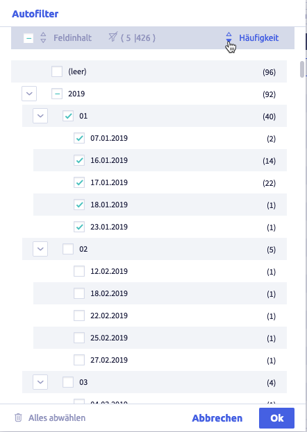
The image shows an example of an auto filter for the field contents of the First registration column and the occurrence of the respective field contents, sorted by frequency.
This is what the list looks like after auto filtering:
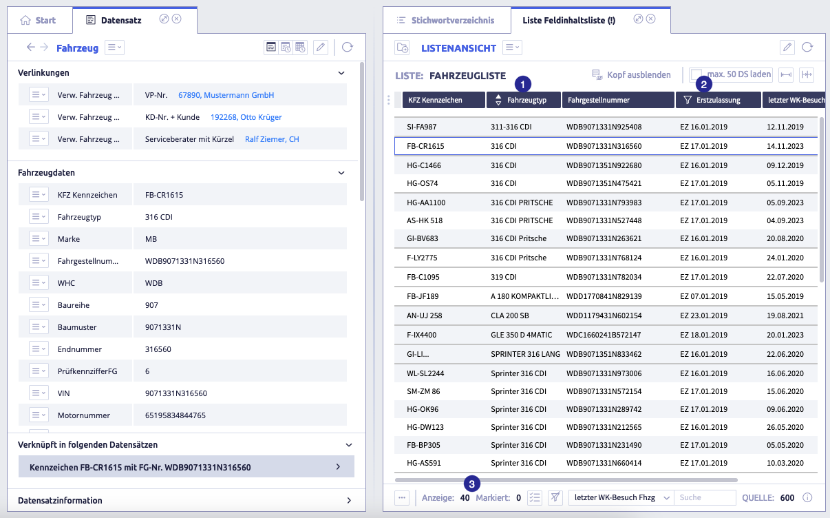
The image shows a list that uses a car filter: (1) sorted column vehicle type, (2) column first registration with auto filter, (3) number of rows that correspond to the auto filter
Bulk deletion of records
With the plugin Bulk deletion it is possible to delete several records at the same time.
-
open or create a list or selection with records
-
select the records you want to delete
-
click the plugin button Bulk deletion in the quick launch bar
The following window opens:
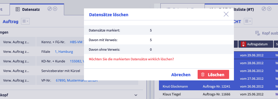
-
click the button Delete
(or Cancel)The records will be deleted from the system.