Dashboard configuration
Structure of a dashboard
A dashboard consists of one or more tabs. Each tab is configured individually and contains so-called labels, which graphically represent data sources.
Graphics can be integrated in each tab. Several chart types are available for the graphical display.

The image shows an unconfigured empty dashboard.
A dashboard configuration is based on a portal and consists of:
- name for the configuration (Name Konfiguration in the screenshot at the top left)
- one or more tabs (Tab1 Name, ...)
-
several labels (Label 1 to Label 3 in the screenshot)
-
Each label can contain a filter or a graphic related to the selected portal.
Filter and graphic refer to the portal for which the dashboard is configured.
-
To arrange the various labels, the entire area of a tab is divided into a virtual grid consisting of freely definable rows and columns. The rows are numbered so that the columns are assigned letters, similar to spreadsheets. When configuring each label, the size must then be defined manually. For example, the entire area can be divided into 5 columns of 3 rows each, with Label 1 extending from A1 to A3, Label 2 from B1 to E1 and Label 3 from B2 to C2.

Configuration
Dashboards are configured using the button Dashboard in the quick launch bar.
The following actions are possible for dashboard configurations:
Requirements for configuration
The following elements are needed to configure a dashboard based on a portal:
- configured portal with groups and rows
- lists, which are called from the portals
- pivot configuration(s) in lists
Add a dashboard configuration
-
click the button Dashboard in the quick launch bar, to call up the dashboard administrator
If dashboards already exist, the following window opens:
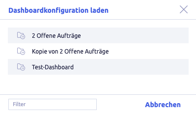
Click Cancel to close the window.
-
click the button Add

The following window opens:
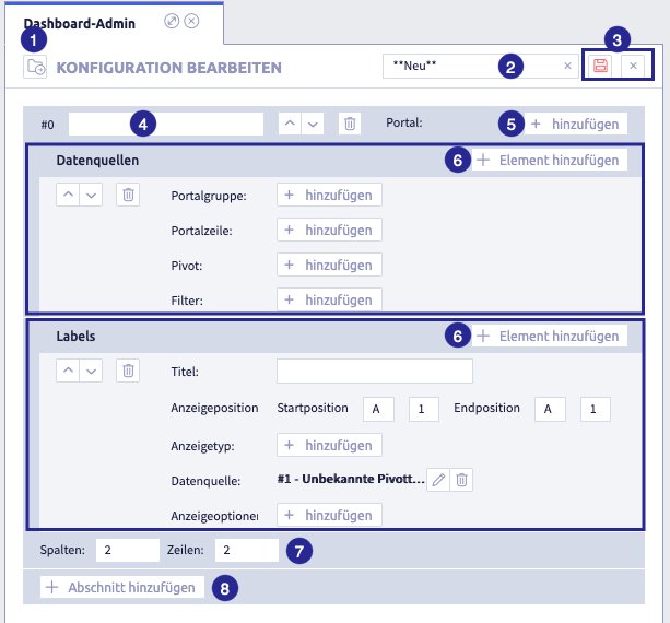
The image shows the empty dashboard editor incl. an already added section (tab) with an opened element each Data sources and Labels: (1) button Load configuration
 , (2) field for dashboard name, (3) buttons Save
  and Cancel
  , (4) field for section (tab) name, (5) button Add to assign a portal, (6) button Add element , (7) size of the grid on the section (tab), (8) button Add section
 -
enter a name for the dashboard
This name is used for the dashboard assignment to user templates.
This ensures that only certain dashboards are released to selected users.
-
click the button Add section
The section appears as a tab in the configured dashboard.
-
enter a name for the section (tab)
-
select the portal in the section (tab)
The dashboard displays data from this portal.
-
click the button Add element
next to Data sources -
define the data sources for the section (tab):
- select portal group
- select portal row
- select pivot
- select filter fields
-
click the button Add element
next to Labels -
definine labels
-
if required, add further sections (tabs) to the dashboard by clicking the button Add section
Edit all rows as required.
-
click the button Save
(or Cancel) -
further possibilities:
Edit a dashboard configuration
-
click the button Dashboard in the quick launch bar, to call up the dashboard administrator
The following window opens:
-
select a dashboard configuration
The following window opens:
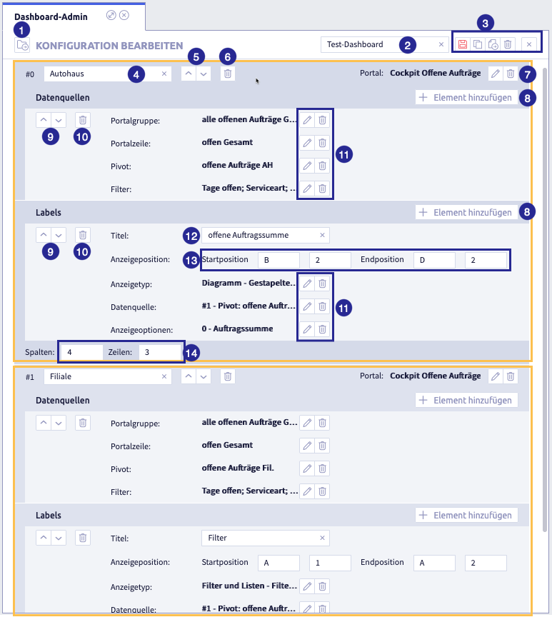
The image shows the dashboard editor with 2 sections (tabs), both framed in yellow: (1) button Load configuration
, (2) field for dashboard name, (3) buttons Save , Copy  , Export
  , Delete
  and Cancel , (4) field for labeling the section (tabs), (5) buttons for sorting the sections (tabs), (6) button Delete the section (tabs), (7) buttons Edit
  and Delete of the portal, (8) button Add element , (9) buttons for sorting, (10) button Delete , (11) buttons Edit and Delete of the elements, (12) name of the label, (13) coordinates of the start and end position of the label, (14) total size of the grid (columns x rows) of the section (tabs)
 -
edit all elements in the sections (tabs) one after the other as required:
- name of the dashboard
- portal as source
- name of the section (tab)
- data sources
- labels
- newly added sections (tabs)
Tip: see also the action steps under add a dashboard
-
click the button Save
(or Cancel) -
further possibilities:
Create a copy of the dashboard configuration
-
click the button Dashboard in the quick launch bar, to call up the dashboard administrator
The following window opens:
-
select a dashboard configuration
The following window opens:
The image shows the dashboard editor with 2 sections (tabs), both framed in yellow: (1) button Load configuration
, (2) field for dashboard name, (3) buttons Save , Copy , Export , Delete and Cancel , (4) field for labeling the section (tabs), (5) buttons for sorting the sections (tabs), (6) button Delete the section (tabs), (7) buttons Edit and Delete of the portal, (8) button Add element , (9) buttons for sorting, (10) button Delete , (11) buttons Edit and Delete of the elements, (12) name of the label, (13) coordinates of the start and end position of the label, (14) total size of the grid (columns x rows) of the section (tabs) -
click the button Create copy
-
change the name of the dashboard
-
edit all elements in the sections (tabs) one after the other as required:
- name of the dashboard
- portal as source
- name of the section (tab)
- data sources
- labels
- newly added sections (tabs)
Tip: see also the action steps under add a dashboard
-
click the button Save
(or Cancel) -
further possibilities:
Delete a dashboard configuration
-
click the button Dashboard in the quick launch bar, to call up the dashboard administrator
The following window opens:
-
select a dashboard configuration
The following window opens:
The image shows the dashboard editor with 2 sections (tabs), both framed in yellow: (1) button Load configuration
, (2) field for dashboard name, (3) buttons Save , Copy , Export , Delete and Cancel , (4) field for labeling the section (tabs), (5) buttons for sorting the sections (tabs), (6) button Delete the section (tabs), (7) buttons Edit and Delete of the portal, (8) button Add element , (9) buttons for sorting, (10) button Delete , (11) buttons Edit and Delete of the elements, (12) name of the label, (13) coordinates of the start and end position of the label, (14) total size of the grid (columns x rows) of the section (tabs) -
click the button Delete
The following window opens:
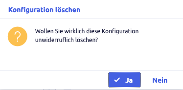
-
click Yes (or No)
The following window opens:
-
further possibilities:
Export a dashboard configuration
Dashboards exported in that way can be imported back into a CortexEngine.
-
click the button Dashboard in the quick launch bar, to call up the dashboard administrator
The following window opens:
-
select a dashboard configuration
The following window opens:
The image shows the dashboard editor with 2 sections (tabs), both framed in yellow: (1) button Load configuration
, (2) field for dashboard name, (3) buttons Save , Copy , Export , Delete and Cancel , (4) field for labeling the section (tabs), (5) buttons for sorting the sections (tabs), (6) button Delete the section (tabs), (7) buttons Edit and Delete of the portal, (8) button Add element , (9) buttons for sorting, (10) button Delete , (11) buttons Edit and Delete of the elements, (12) name of the label, (13) coordinates of the start and end position of the label, (14) total size of the grid (columns x rows) of the section (tabs) -
click the button Export
The following window opens:
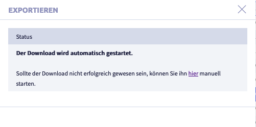
A .tar.gz file is downloaded and saved in the download folder (or the folder that was set for this in the browser).
The file name will be generated automatically.
-
click the button Cancel
to close the export windowThe open dashboard configuration will be displayed again.
-
further possibilities:
Import a dashboard configuration
Exported dashboard configurations from another CortexEngine can be imported into the current CortexEngine using the Import button.
-
click the button Dashboard in the quick launch bar, to call up the dashboard administrator
If dashboards already exist, the following window opens:
Click Cancel to close the window.
-
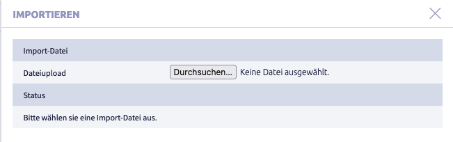
click the button Import

The following window opens:
-
click the button Select file
A window with a file folder opens.
-
select a file
The following formats are suitable for import:
- .tar
- .tar.gz
-
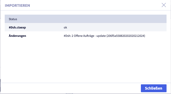
click the button Import
The following window opens (as an example import of a .tar.gz file):
-
click the button Close
The following window opens:
-
further possibilities:
Data sources
From the selected portal you can then select one or more entries as a data source.
Please note that a data source can also contain a filter. It is not possible for multiple data sources in a configuration to use the same filter. You must create separate filters for multiple data sources.

Portal group
A portal group is a user-created compilation of portal configurations that are created and managed in the system settings. These groups can be assigned to a user via a start tab button. This means the user can only select from portals that are grouped together based on theme or functionality.
Portal row
A portal row in a portal group is a level within a portal that contains selection results in the form of lists or pivot tables.
Pivot
The Pivot setting is used to evaluate information based on a list in the form of pivot tables. It is based on the previously selected portal row.
Filter
In a pivot table created in the data source in the Uniplex Dashboard Admin, a filter can be applied to limit the data displayed. A filter is a condition set in the pivot definition and applied to the data in the pivot table. This means that only the data that meets the defined criteria will be displayed.
The screenshot illustrates which parts of a portal the individual settings within a portal refer to. You can individually select a group and a row from a portal, as well as add one or more pivots to the selected row. The filter may contain several fields from the list.

Labels
Once one or more data sources have been defined, the area for the individual labels (graphics or filters) is configured. First define the grid on which the individual labels are distributed.
Each label is assigned a title, the position in the grid, a display type, the reference to the data source and other display options.

1. Title
The title is the display name of the label in the dashboard
Example of an empty dashboard with labels 1, 2 etc.
2. Display position
The display position refers to the position a label is displayed in the Dashboard Admin. A label is an area within a dashboard that contains a pivot table, a list or graphics. The display position defines both the order and size of the labels when the dashboard is opened.
3. Display type
In the Dashboard Admin, there is the Display type settings area, which determines what type of graphic or filter is displayed in a label (an area within the dashboard). The available display types are:
- Graph: the visual representation of data, as a bar chart, line chart or pie chart.
- Filter: the displayed data is limited on the basis of conditions
Display types

4. Data source
The data source setting specifies which pivot from the data sources area is to be used for the visualization.
5. Display options
The following chart types are available for graphical display:
- line chart
- pie / ring chart
- bar chart
- "speedometer"
The preparation of the graphics is based on the D3js library and is therefore available for future developments.
The display options vary according to the selected display type. Some parameters are valid for all display types, whereas others are for specific types. Some display types, such as bar and line charts, allow the use of two value ranges so that a second size axis can be used.
Display option Stacked bars and Normalized stacked bars
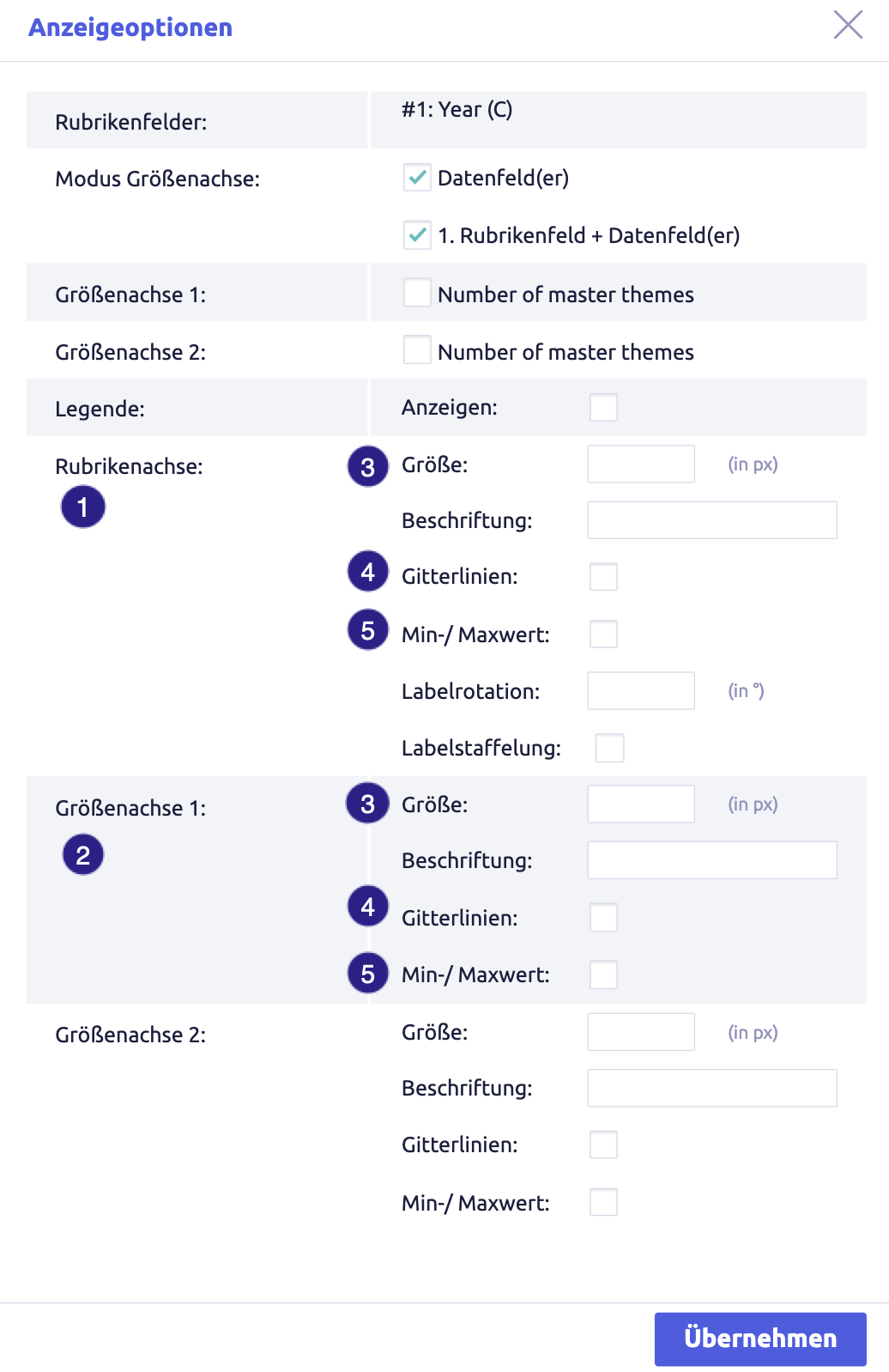
- category axis: refers to the horizontal baseline (x-axis), offers options such as label rotation and staggering, both can only be used individually
- size axis: refers to the vertical axis (y-axis), represents the vertical sizes that are displayed on the left (and/or right) in line and bar charts
- size: defines the distance of the axis to the edge of the label for both axes
- grid lines: the display of vertical or horizontal auxiliary lines
- min/max value: determine whether these values are to be displayed in full on the respective axis
Display option (grouped) Bars, Line
- category axis: refers to the horizontal baseline (x-axis), offers options such as label rotation and staggering, both can only be used individually
- size axis: refers to the vertical axis (y-axis), represents the vertical sizes that are displayed on the left (and/or right) in line and bar charts
- size: defines the distance of the axis to the edge of the label for both axes
- grid lines: the display of vertical or horizontal auxiliary lines
- min/max value: determine whether these values are to be displayed in full on the respective axis
Pie/ring charts and "speedometers" provide fewer options, as no axes are defined here.
Display option Pie & ring

For pie/ring charts, only the field to be used for the size axis needs to be activated. You can optionally activate the legend and specify a percentage size for the ring opening if required.
A speedometer is the representation of a value against a scale (from minimum to maximum). The scale may also be divided into several (also color-coded) sections.
Display option Speedometer

The individual sections of a speedometer must be available as columns within the pivot list in the same way as the actual value in order to be able to activate them in this configuration. If the individual sections require color coding, the text color of a column must be configured in the pivot list. The colors you define there are used for the scaling.
Example configuration

The newly created dashboard appears as follows:

Calling up the dashboard after configuration
Once successfully configured, the dashboard can be called up via the hamburger menu at the top left of the header.
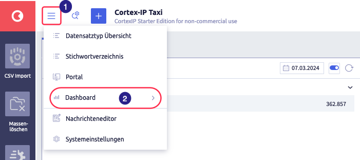
The image shows the call of a dashboard: (1) hamburger menu, (2) dashboard(s)