Starting templates
The starting template defines the start tab, which is displayed immediately after login and cannot be closed. The start tab may contain buttons with certain important and recurring functions so that these functions can be accessed very easily and quickly. You can group these functions by sections.
Image of a configured start tab

The image shows a start tab: (1) section Lego-Overview with five function buttons, (2) section Details with two function buttons
The following actions are possible for starting templates:

The image shows the starting templates: (1) navigation, (2) button Groups, (3) button Edit
, (4) a list with all starting templates, (5) button Add
, (6) buttons with options for export and import
The two buttons Edit and Add open the editor the starting template is edited with.
If the function *Groups is active, the starting templates can be organized into groups for simplified management.
Warning
- Changes in system settings often only take effect when a restart is carried out after closing the system settings (menu item under the button with the user name at the top right, see also introduction).
- If another user with admin rights is currently editing this system setting, the red icon lock
 appears in the header and a warning message appears with the name of the currently active user.
Add a starting template
To add a starting template, click the button Add .

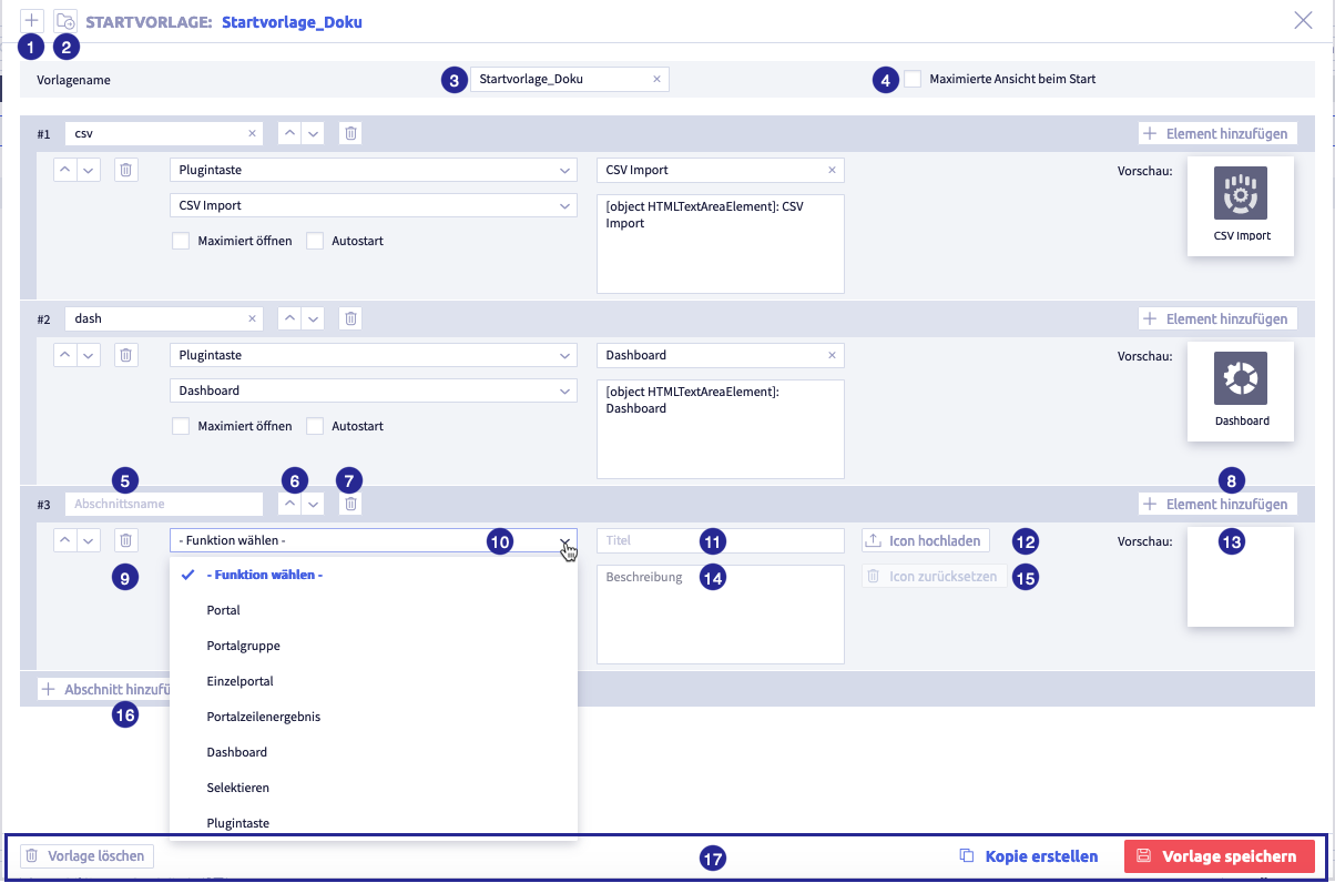
The image show the editor: (1) button Create template
, (3)field Template name, (4) checkbox Maximized view on startup, (5) button Add section
Table with all elements of the editor
| Name | Meaning | Note |
|---|---|---|
| button Create template | add new template | |
| button Load template | load existing template | |
| field Template name | name to identify the starting template | |
| checkbox Maximized view on startup | If the checkbox is activated, the tab of the starting template takes up the entire width of the window after login. | |
| field Section name | name to identify the section | |
| button Delete section | ||
| button Add element | Element that is added to a section. The element contains the function. | A section can contain several elements, if possible with the same function. |
| button Delete element | ||
| select Select function | see table All functions | |
| field Title | name of element | The name is partially filled in automatically and can be edited. |
| button Upload icon | this is what the button for this section looks like in the start tab | the icon is partially uploaded automatically and can be changed |
| button Reset icon | ||
| button Add section | Each section created creates a button in the start tab. | |
| button Delete template | Deletion is only possible if the starting template is not used by a user. | |
| button Create copy | use the currently open starting template as a template for a new starting template | |
| button Save template |
You will find information on the section and its elements under edit.
Edit a starting template
The image shows the editor with a new section and element: (1) button Create template
, (8) button Add element
, Save template
Table with all elements of the editor
| Name | Meaning | Note |
|---|---|---|
| button Create template | add new template | |
| button Load template | load existing template | |
| field Template name | name to identify the starting template | |
| checkbox Maximized view on startup | If the checkbox is activated, the tab of the starting template takes up the entire width of the window after login. | |
| field Section name | name to identify the section | |
| button Delete section | ||
| button Add element | Element that is added to a section. The element contains the function. | A section can contain several elements, if possible with the same function. |
| button Delete element | ||
| select Select function | see table All functions | |
| field Title | name of element | The name is partially filled in automatically and can be edited. |
| button Upload icon | this is what the button for this section looks like in the start tab | the icon is partially uploaded automatically and can be changed |
| button Reset icon | ||
| button Add section | Each section created creates a button in the start tab. | |
| button Delete template | Deletion is only possible if the starting template is not used by a user. | |
| button Create copy | use the currently open starting template as a template for a new starting template | |
| button Save template |
Table with all functions
| Name | Meaning | Note |
|---|---|---|
| portal | click the button in the start tab to open the portal tab. All portals will be available using the button Load portal | configure portals |
| portal group | Click the button in the start tab to open the portal tab. All portals in this group are available using the button Load portal. | a portal group is created in the portal system settings (accessible using the button Groups) |
| single portal | Click the button in the start tab to open the portal tab with this portal. Only this portal is available using the button Load portal(../10_portals.en.md) | configure portals |
| portal row result | click the button in the start tab to open the list with the result of the selected portal row | configure portal row result |
| dashboard | click the button in the start tab to open the selected dashboard | configure dashboard |
| select | click the button in the start tab to open a list with a defined selection | configure search |
| plugin button | click the button in the start tab to open the selected plugin | selection depends on plugin templates |
| checkbox Open maximized | When the checkbox is activated, a list will be opened across the entire window width and covers the start tab | |
| checkbox Autostart | When the checkbox is activated, the element, e.g., a list, will be displayed immediately after login | Autostart can only be activated for one element. The checkbox is inactive for all other elements. |
| checkbox Without portal permission | When the checkbox is activated, there is no check as to whether the user is allowed to see the portal in question. |
User permissions for each function affect the display in the start tab
If a user does not have permission to execute a certain configuration, this function will not not displayed in the start tab.
Duplicate a starting template
A starting template can be used as a template for another starting template. For this purpose, click the button Create copy in the editor and edit the template as required.
If the template name is not changed, the new starting template is saved as Copy of X.
Table with all elements of the editor
| Name | Meaning | Note |
|---|---|---|
| button Create template | add new template | |
| button Load template | load existing template | |
| field Template name | name to identify the starting template | |
| checkbox Maximized view on startup | If the checkbox is activated, the tab of the starting template takes up the entire width of the window after login. | |
| field Section name | name to identify the section | |
| button Delete section | ||
| button Add element | Element that is added to a section. The element contains the function. | A section can contain several elements, if possible with the same function. |
| button Delete element | ||
| select Select function | see table All functions | |
| field Title | name of element | The name is partially filled in automatically and can be edited. |
| button Upload icon | this is what the button for this section looks like in the start tab | the icon is partially uploaded automatically and can be changed |
| button Reset icon | ||
| button Add section | Each section created creates a button in the start tab. | |
| button Delete template | Deletion is only possible if the starting template is not used by a user. | |
| button Create copy | use the currently open starting template as a template for a new starting template | |
| button Save template |
Table with all functions
| Name | Meaning | Note |
|---|---|---|
| portal | click the button in the start tab to open the portal tab. All portals will be available using the button Load portal | configure portals |
| portal group | Click the button in the start tab to open the portal tab. All portals in this group are available using the button Load portal. | a portal group is created in the portal system settings (accessible using the button Groups) |
| single portal | Click the button in the start tab to open the portal tab with this portal. Only this portal is available using the button Load portal(../10_portals.en.md) | configure portals |
| portal row result | click the button in the start tab to open the list with the result of the selected portal row | configure portal row result |
| dashboard | click the button in the start tab to open the selected dashboard | configure dashboard |
| select | click the button in the start tab to open a list with a defined selection | configure search |
| plugin button | click the button in the start tab to open the selected plugin | selection depends on plugin templates |
| checkbox Open maximized | When the checkbox is activated, a list will be opened across the entire window width and covers the start tab | |
| checkbox Autostart | When the checkbox is activated, the element, e.g., a list, will be displayed immediately after login | Autostart can only be activated for one element. The checkbox is inactive for all other elements. |
| checkbox Without portal permission | When the checkbox is activated, there is no check as to whether the user is allowed to see the portal in question. |
User permissions for each function affect the display in the start tab
If a user does not have permission to execute a certain configuration, this function will not not displayed in the start tab.
Delete a starting template
A starting template can be deleted in the editor. For this purpose, click the button Delete template in the footer.
A starting template can only be deleted if it is not being used by a user.
Organize starting templates into groups
If the function Groups is active, the record types can be organized into groups for simplified management.
The following actions are possible:
- create groups
- rename groups
- delete groups
- add elements to a group
- remove elements from a group
Note
The actions are shown using the example Field management.
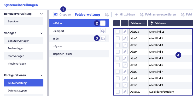
The image shows the field administration with active groups: (1) button Activate groups, (2) button Add group
, (4) fields from the currently active group
Create a group
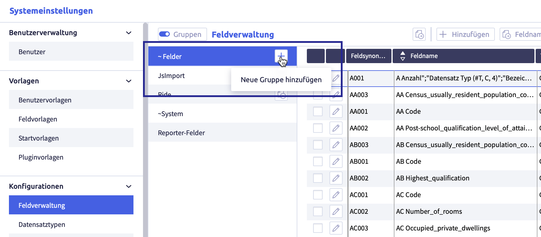
The image shows the field administration with active groups
Create user-defined groups
-
click the button Add group
A new row will be added:
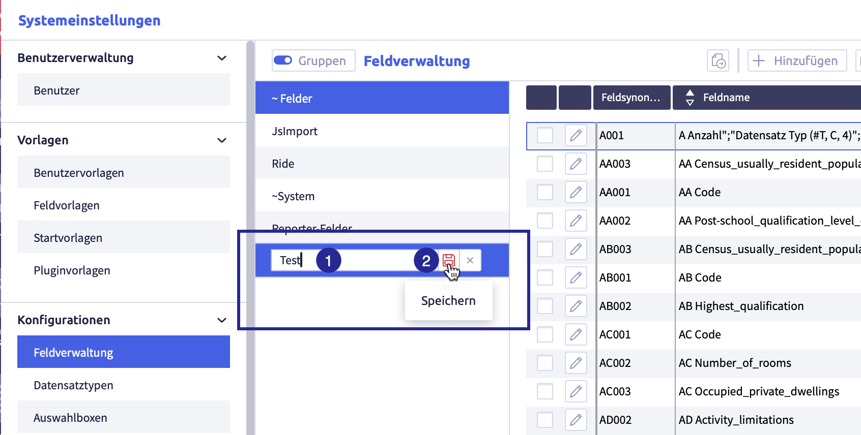
-
enter the name of the group
-
click the button Save

The list with the group names will be updated, the group has been sorted alphabetically.
Rename a group
-
click the group you want to edit
The button Edit
will appear.The image shows the group that can be edited:
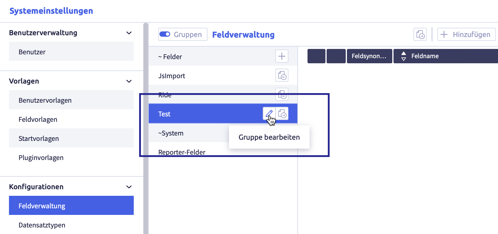
-
click the button Edit
The element can be edited or deleted.
The image shows the edit possibilities of the group:
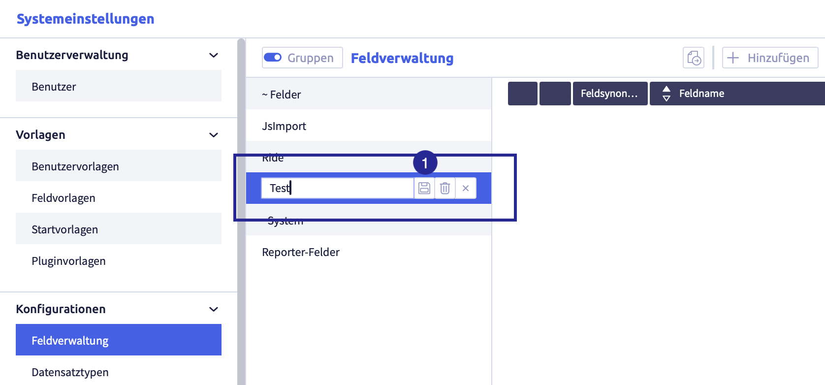
-
edit the group name
-
click the button Save
(or Cancel)The list with the group names will be updated, the group has been sorted alphabetically.
Delete a group
-
click the group you intend to edit
The button Edit
will appear.The image shows the group that can be edited:
-
click the button Edit
The element can be edited.
The image shows the edit possibilities of the group:
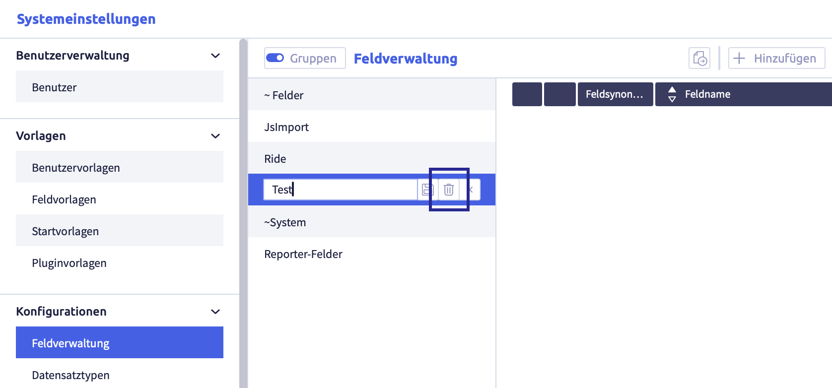
-
click the button Delete
The following confirmation window opens:
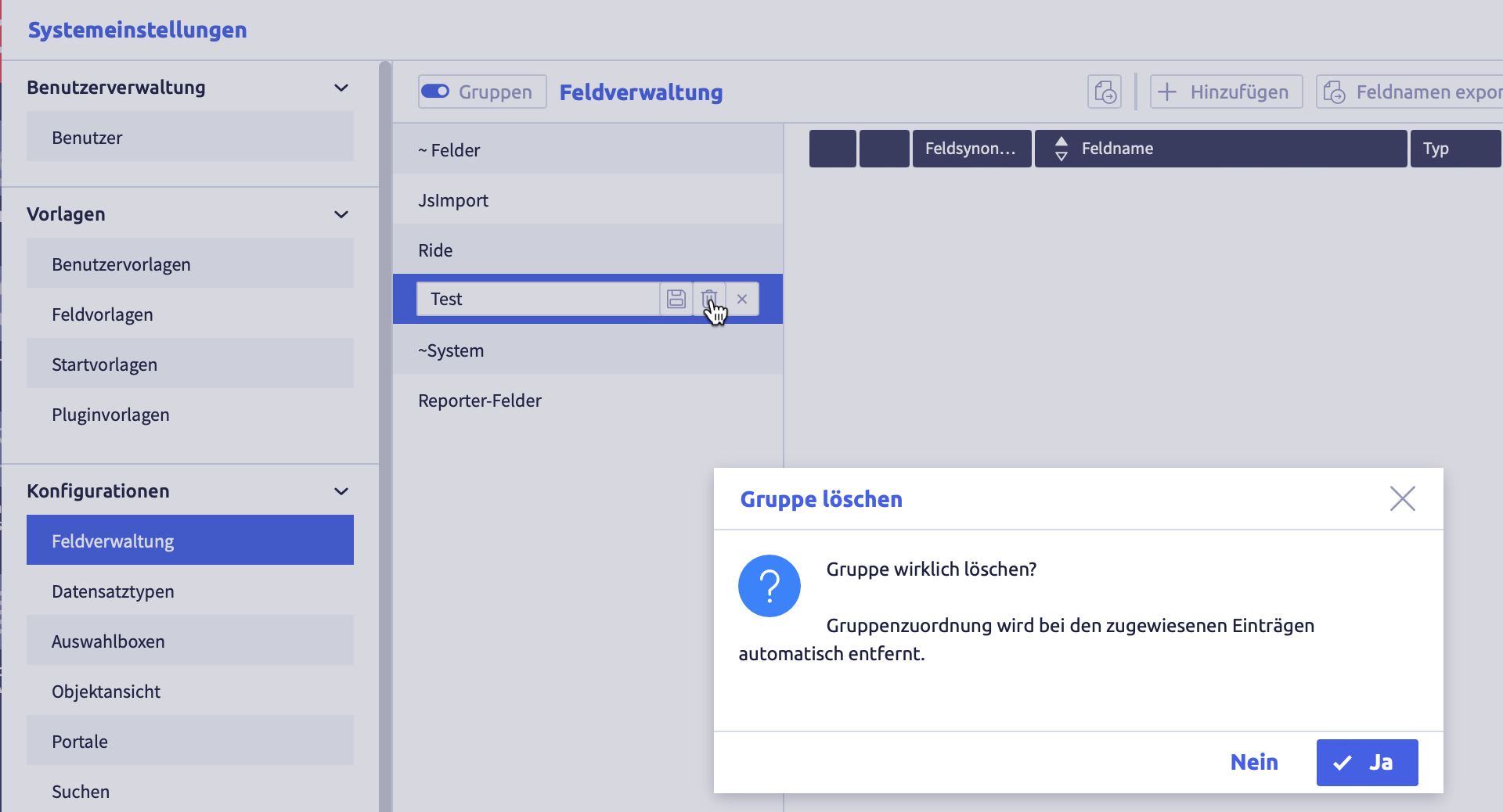
-
click the button Yes (or No)
The group will be deleted and the list of groups will be updated.
Links of elements to this group are automatically deleted.
Add elements to a group
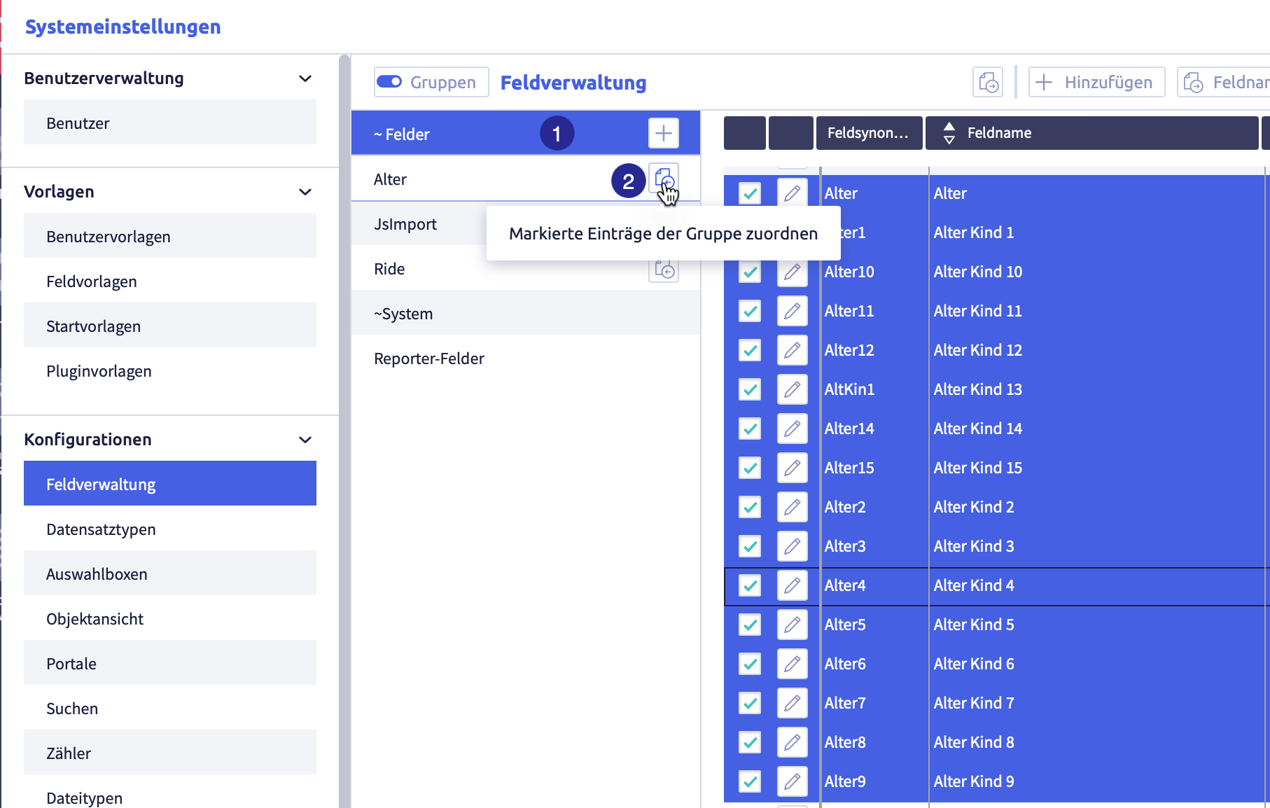
(1) selected group with selected elements you want to add to another group, (2) button Assign selected entries to the group
-
select a group from which you want to add elements to another group
-
select all the elements you want to add to the group
-
click the button Assign selected items to group
of the new groupThe elements are added to the group.
An element can belong to several groups.
Remove elements from a group
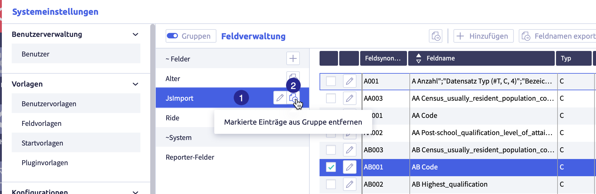
(1) selected group with selected elements to be removed from the group, (2) button Remove selected entries from group
-
click the group from which you want to remove elements
-
select all the elements you want to remove from the group
-
click the button Remove selected items from group
of the groupThe elements will be removed from the group.
Export and import starting templates
The following exports and imports are possible for starting templates:
Each export is only carried out for selected rows in the list of starting templates.
Image with buttons for export and import

The image shows the export and import buttons: (1) checkbox to select row, (2) button Export selected data as CSV
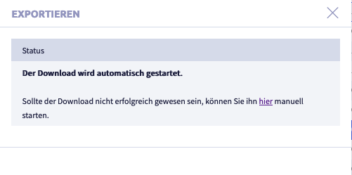
Export selected data as CSV file
Image with buttons for export and import
The image shows the export and import buttons: (1) checkbox to select row, (2) button Export selected data as CSV
-
select the rows you want to export
-
click the button Export selected data as CSV
The CSV file will be downloaded and saved in the download folder (or the folder that was set for it in the browser).
The file name will be generated automatically and will be called #Starting templates.csv.
A list with the following information will be exported:
| Column | Meaning | Note |
|---|---|---|
| template name | name of the starting template | |
| group | name of the group(s) of the starting template | |
| last edit | time of last edit | |
| last editor | user ID of the last editor |
Export selected templates
Starting templates exported this way can be imported back into a CortexEngine.
Image with buttons for export and import
The image shows the export and import buttons: (1) checkbox to select row, (2) button Export selected data as CSV
-
select the rows you want to export
-
click the button Export selected.
The following window opens:
A .tar file will be downloaded and saved in the download folder (or the folder that was set for this in the browser).
The file name will be generated automatically.
Import templates
Exported templates from another CortexEngine can be imported into the current CortexEngine by using the button Import.
Image with buttons for export and import
The image shows the export and import buttons: (1) checkbox to select row, (2) button Export selected data as CSV
-
click the button Import
The following window opens
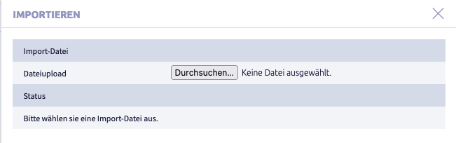
-
click the button Select file.
A window with a file folder opens.
-
select a file
The following formats are suitable for import:
- .tar
- .tar.gz
- #Stu.ctxexp
-
click the button Import
The following window opens (as an example import of a .tar file):
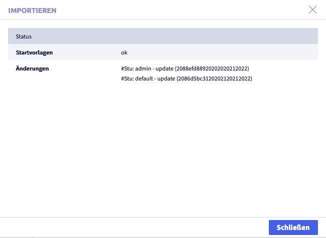
-
click the button Close.
The list with all starting templates will be displayed again.